The brief
The primary focus for this project was on customers who had already joined the platform, and their understanding of how to start and pay for projects. The overall goal was to increase the number of customers who can find and use services without sales assistance.
The core problem with the checkout was cart abandonment. Pricing works differently for different services and add-ons, and the possible combinations of these can become complex. In our data analysis, we saw duplicate file uploads for the same customer without checking out, showing us that customers were retrying the process. We concluded that pricing complexity and lack of payment clarity was the primary cause of cart abandonment. Customers needed to see where their money was going.
The existing checkout
Fig 01 The existing checkout. The customer uploads a file, selects language and number of speakers. There is little connection between account balance, what’s been uploaded, and what that means for the customer.
Fig 02 If the customer has a subscription, prices are hidden since they’re “covered.” But how much of the subscription is left? How long is the file? This information is not shown.
Fig 03 If the customer has an account balance, some prices are shown, but there is no connection between the balance, the files, and whether services are extra or will add to the balance.
Key questions the checkout needed to answer
Why do you need my file first? To determine whether the customer has enough account balance for transcription, the file needed to be uploaded before selecting services. This may feel a little backwards if they aren’t familiar with available services.
Which service does what? Amberscript offers different transcription services, each with unique pricing, and several add-ons, such as “verbatim” and translations, that all needed to be listed and easy to understand.
How is the final price calculated? The file length, plan type, and the user’s credits all affect the available services and final price. All elements need to be clear. They can buy time, in 1-hour segments, that can be used to transcribe files, or subscribe for a running balance that tops up every month.
My approach
To address these problems, I began to design a checkout that:
- Enabled customers to either upload a file first, or explore available services first. Some customers are fine with uploading their file right away, but some others want to explore a bit first.
- Clarified pricing. Their file length and plan type affect the pricing and available services. We needed to show what’s covered by their account balance, any overage charges, the difference between services, and which services can be added.
- Presented and described services in a scalable way, with room for adding future services. The core two products, transcription and subtitles, needed to be obvious choices, with explanations for the difference between automatic and manual review.
With the redesigned, clarified checkout flow, we expected a decrease in customer support requests, a greater variety in services used, and a decrease in duplicate file uploads.
Approach 1: Combining steps into one modal
First, I attempted to clarify that there were a few steps to this process, and we needed the file to determine what comes next. I combined the existing modal sequence into one modal with several sections, each one expanding when relevant, to guide the customer through what they needed to do.
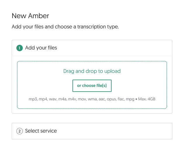
Fig 04 A clearer subheadline states what you need to do, and what comes next. The next step is visible but not expanded below.
Each step shows only what the customer needs now, with just enough indication of what comes next.
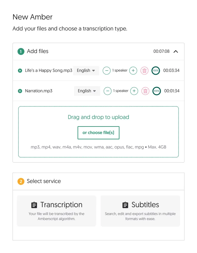
Fig 05 Once files are added, options for services begin to appear, since that’s when prices can start to be calculated.
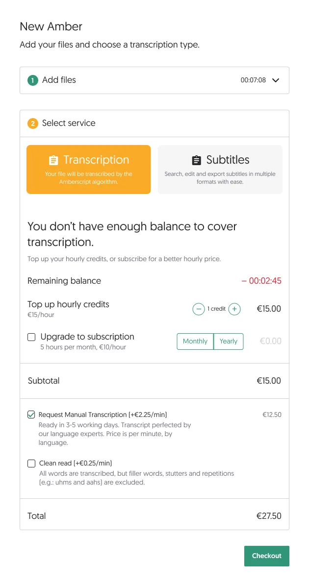
Fig 06 Once they select a service, we show whether they can cover it with their account balance, or if they need to buy credits or a subscription.
Usability testing showed us that there was simply too much text and important information crammed into this small modal, even when smartly hiding and showing parts of the interface. At a certain point, it all becomes relevant, and the customer needs a summary of everything. That’s hard to get when it’s all one big list. The first actions were well-guided, but the summary of charges and times was quite long and needed more explanatory text. It also would be difficult to scale with more services.
Either we had to make the steps smaller, or give ourselves more space than just a modal.
Approach 2: Breaking it down into smaller steps
To make all the important information on the services and payment more digestible, I designed a version that made the checkout into a few more steps.
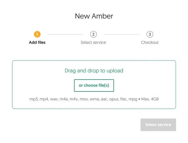
Fig 07 Steps delineated at the top of the modal, priming the customer for what’s next. This first step is minimal, encouraging file upload.
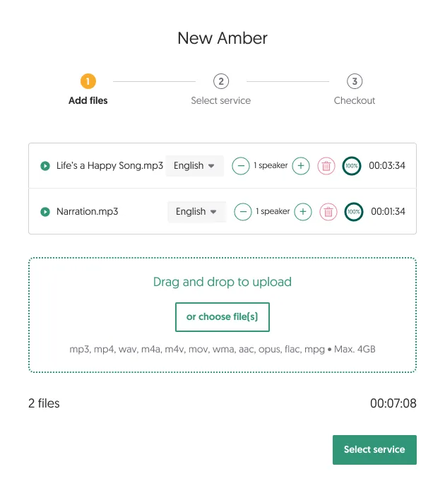
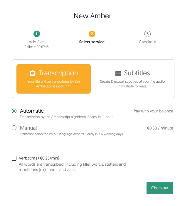
Fig 08 After uploading files, they can select their services. Depending on selections, the area below updates with available extra services and their pricing.
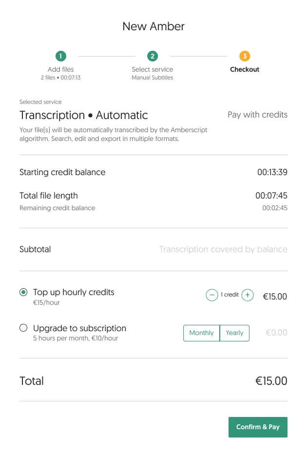
Fig 09 A checkout summary lays out which services cost what, letting them add credits or a subscription before proceeding to payment.
Breaking it down into smaller steps had its advantages. We could add extra information when relevant without overloading small screens, and the stepped process made it look simple. However, we were still missing the ability to get a summary of everything, including the files uploaded and their details. The checkout page was still too divorced from the actual files the customer was dealing with, which led to continued back-and-forth clicking between steps.
Approach 3: Giving everything more space
One thing I noted when the project started was that it would be nice to give customers the ability to either add their file first, or select a service first. The first two iterations didn’t allow this, mostly for space reasons.
I broke the checkout out of its modal-window confinement, and created a full-page design. This allowed more breathing room for important information and a more detailed summary area with pricing per file. This design learned from previous iterations that we should still show and hide details when relevant, so as not to overload the customer. It had to strike the right balance of detail and simplicity.
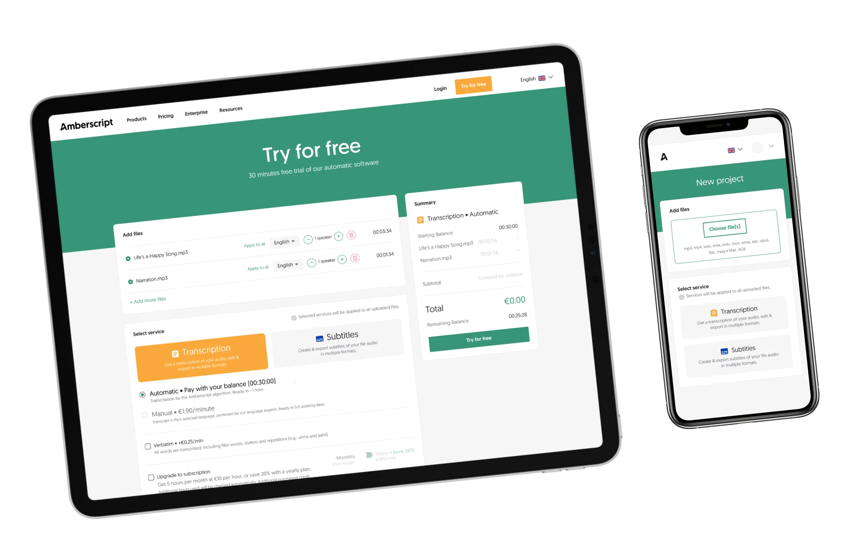
We went with this approach. It is flexible enough for all use cases, has space for more services, lets customers decide whether to choose services or upload files first, and shows a transparent breakdown of pricing in the summary.
Fig 10 No more numbered steps. The customer can upload files or select a service to start. In this empty state, the summary is hidden. It slides in after they begin interacting.
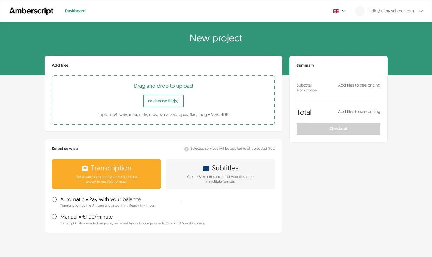
Fig 11 If they select a service first, the summary asks them to add files to see pricing details.
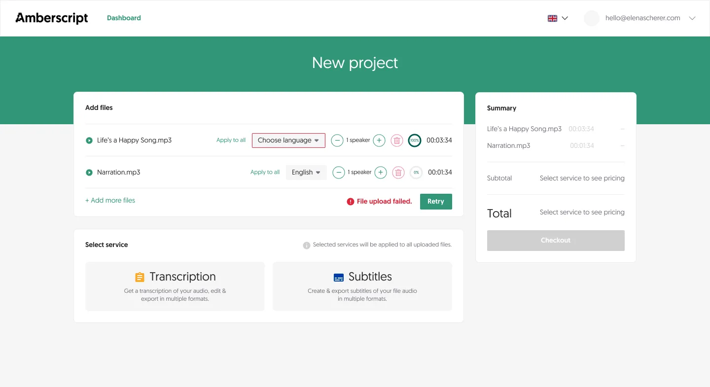
Fig 12 Adding files first starts to populate the summary sidebar, but no final prices until they’ve selected their services.
More desktop states
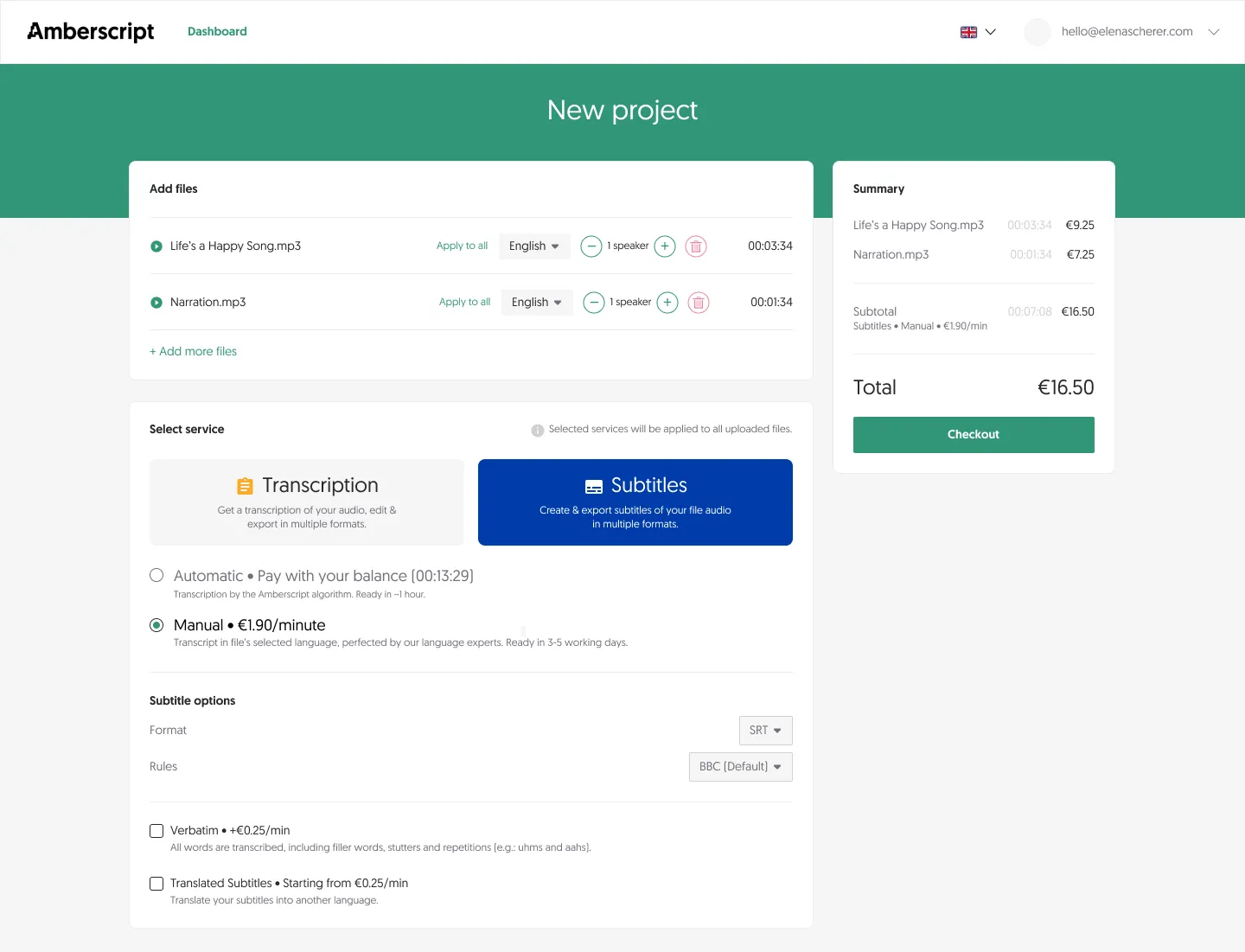
Fig 13 Subtitles checkout with manual review selected.
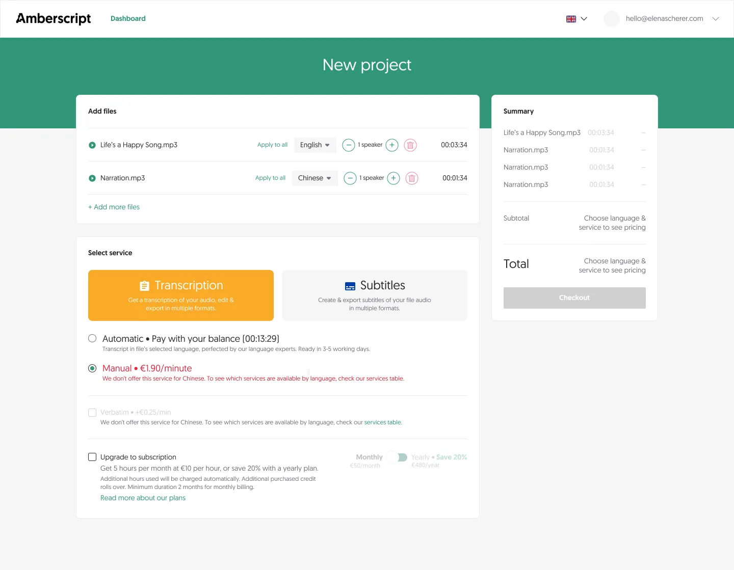
Fig 14 Error state if they choose a service not available for their file type or language.
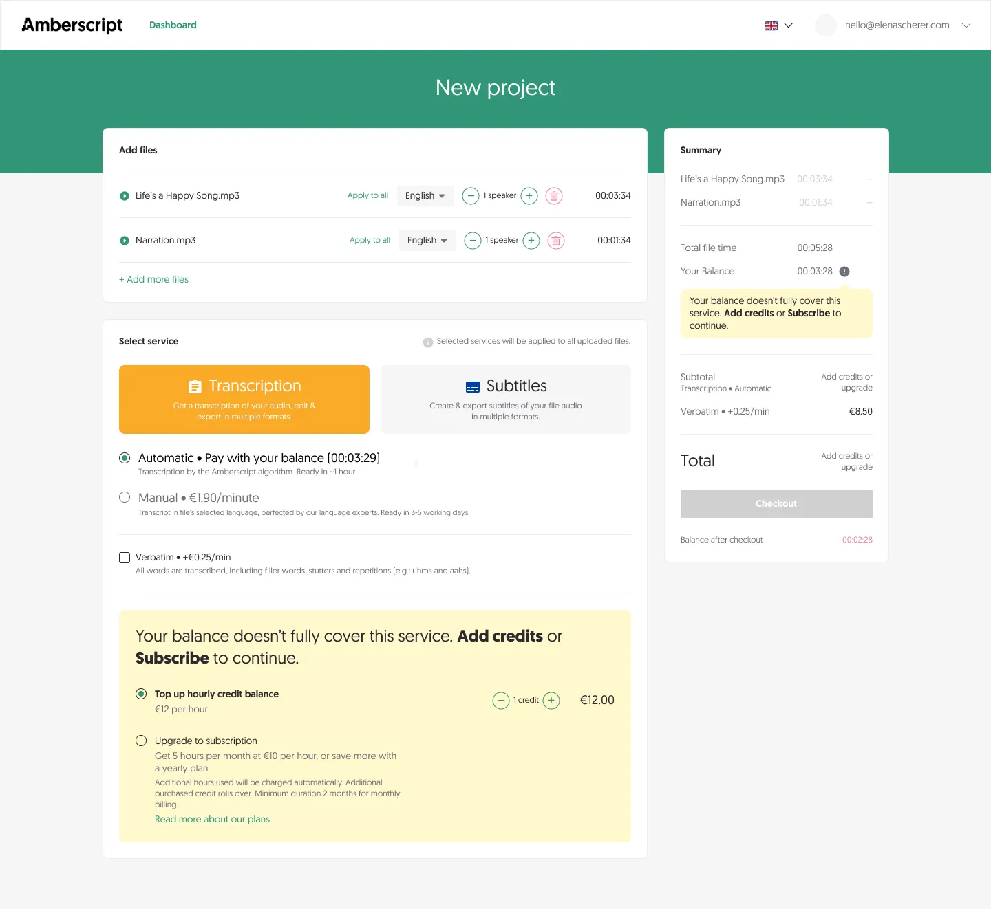
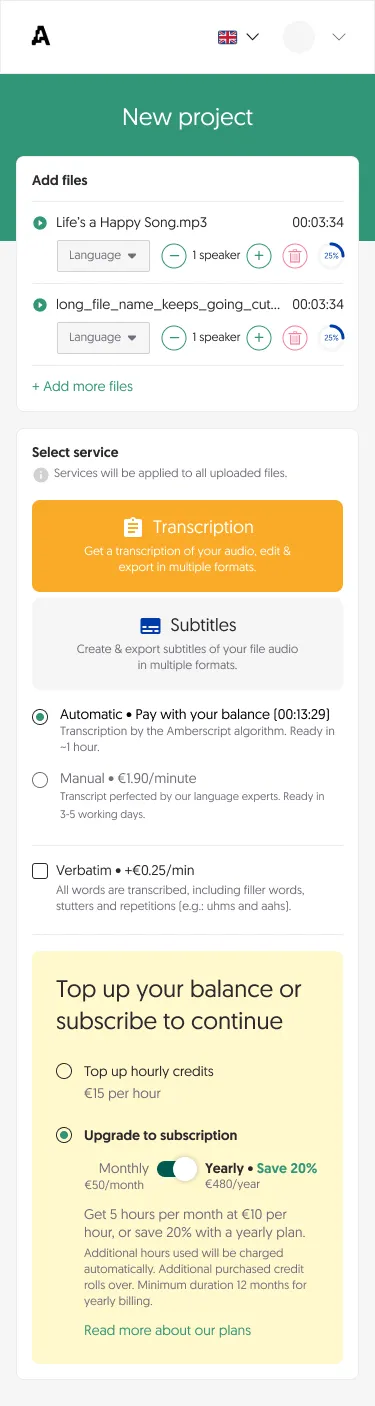
Fig 15 If their balance is insufficient, prompt them to add credits or subscribe.
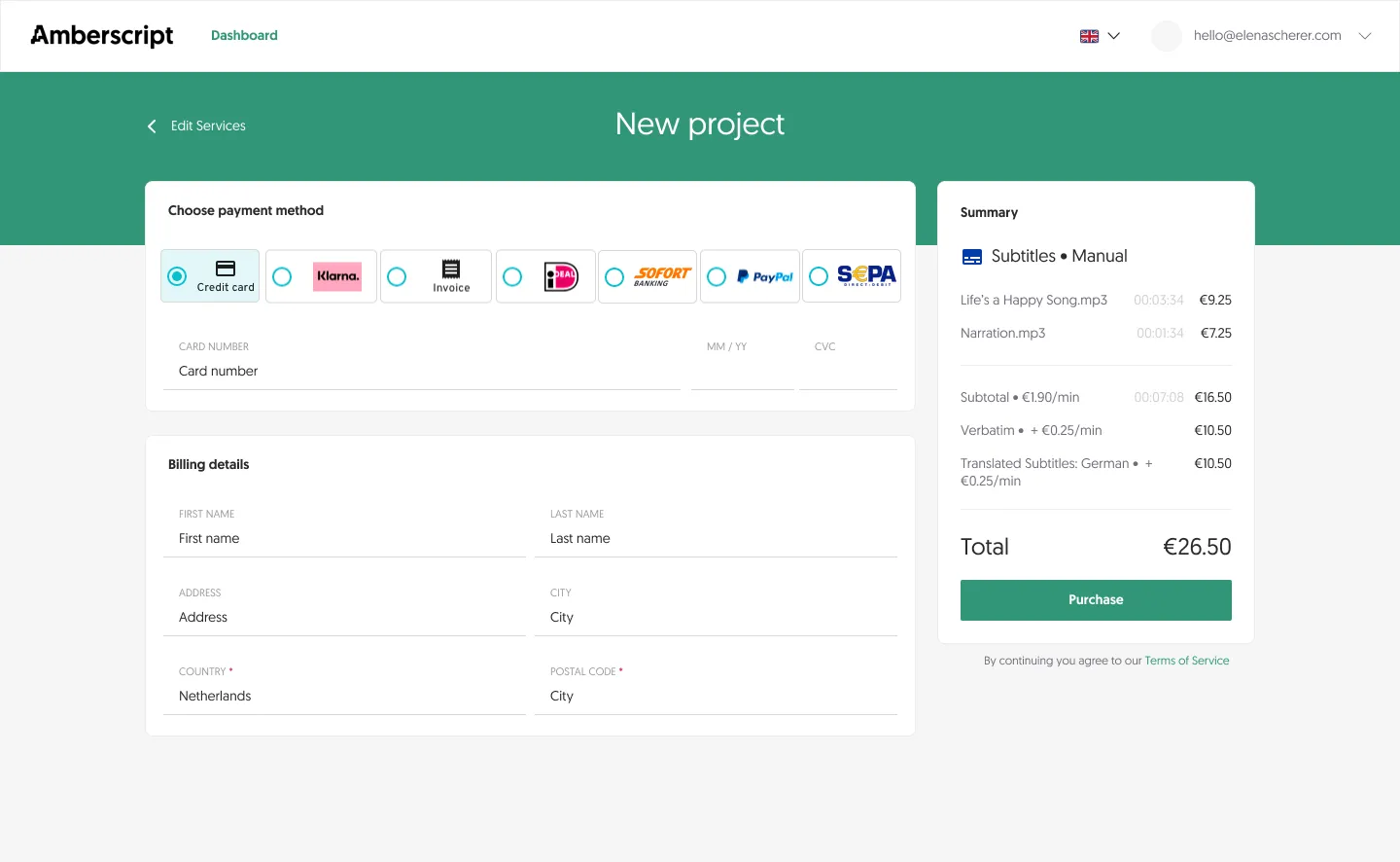
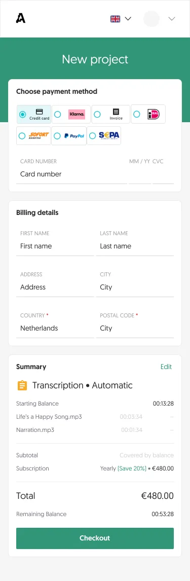
Fig 16 Payment page.

Fig 17 A version for the marketing website, letting new customers upload files and create an account in one go.
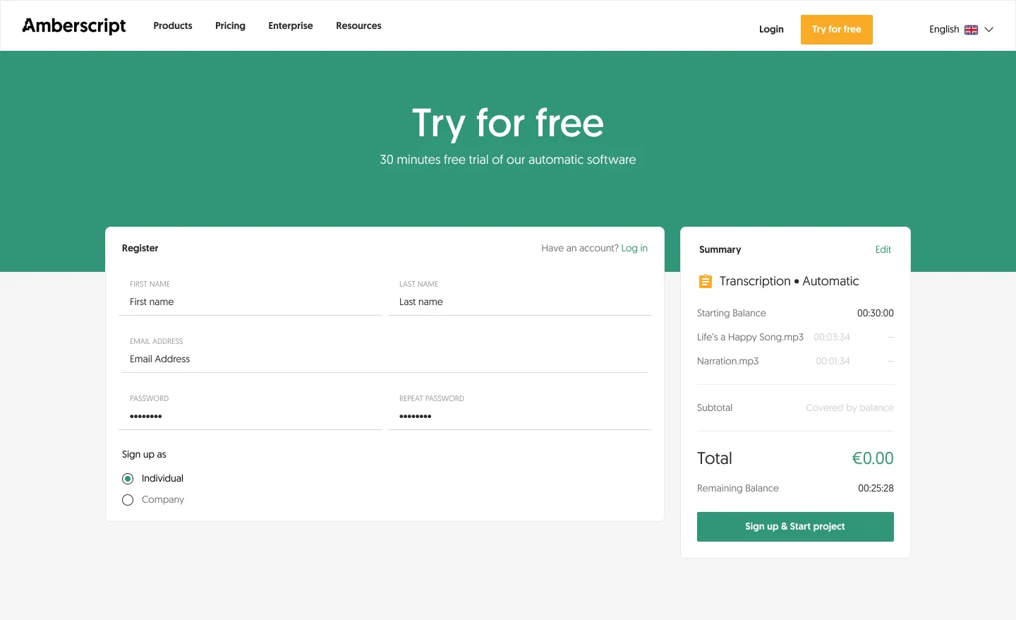
Fig 18 All new users get 30 minutes of free automatic transcription.
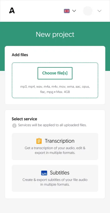
Mobile
Results
- Duplicate files per customer
- -24%