Research
We needed to understand how people research and purchase flights, so we could build something that matched their mental model. We ran several rounds of testing: street tests, internal and external surveys, testing with customer service executives, and live prototype testing with users.

These themes surfaced no matter who we asked:
- Flights are booked first when planning a trip. We noted this for future travel package work.
- Travelers prefer to book directly with the airline. We’d need to make it clear when we were linking out to a partner.
- Top three decision factors: price, number of stops (direct preferred), and departure time. Not everyone likes early-morning treks to the airport.
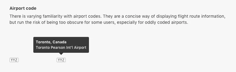
Fig 01 One surprise: many travelers had little familiarity with airport codes. I specified that every code must be accompanied by the full airport name.
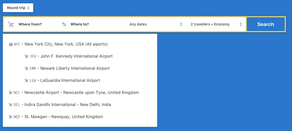
Fig 02 The search autocomplete includes both the airport code and full name.
Prototype 1: Building your trip
We built a prototype that let users select flights one at a time (outbound first, then return) instead of showing the entire round trip at once. The priority order of search results and filters was based on research: price, direct flights, departure time.
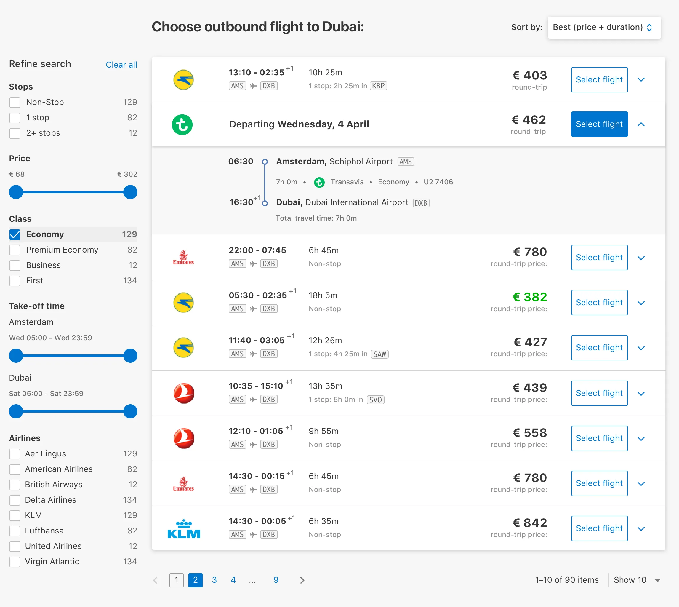
Fig 03 Select your outbound flight first.
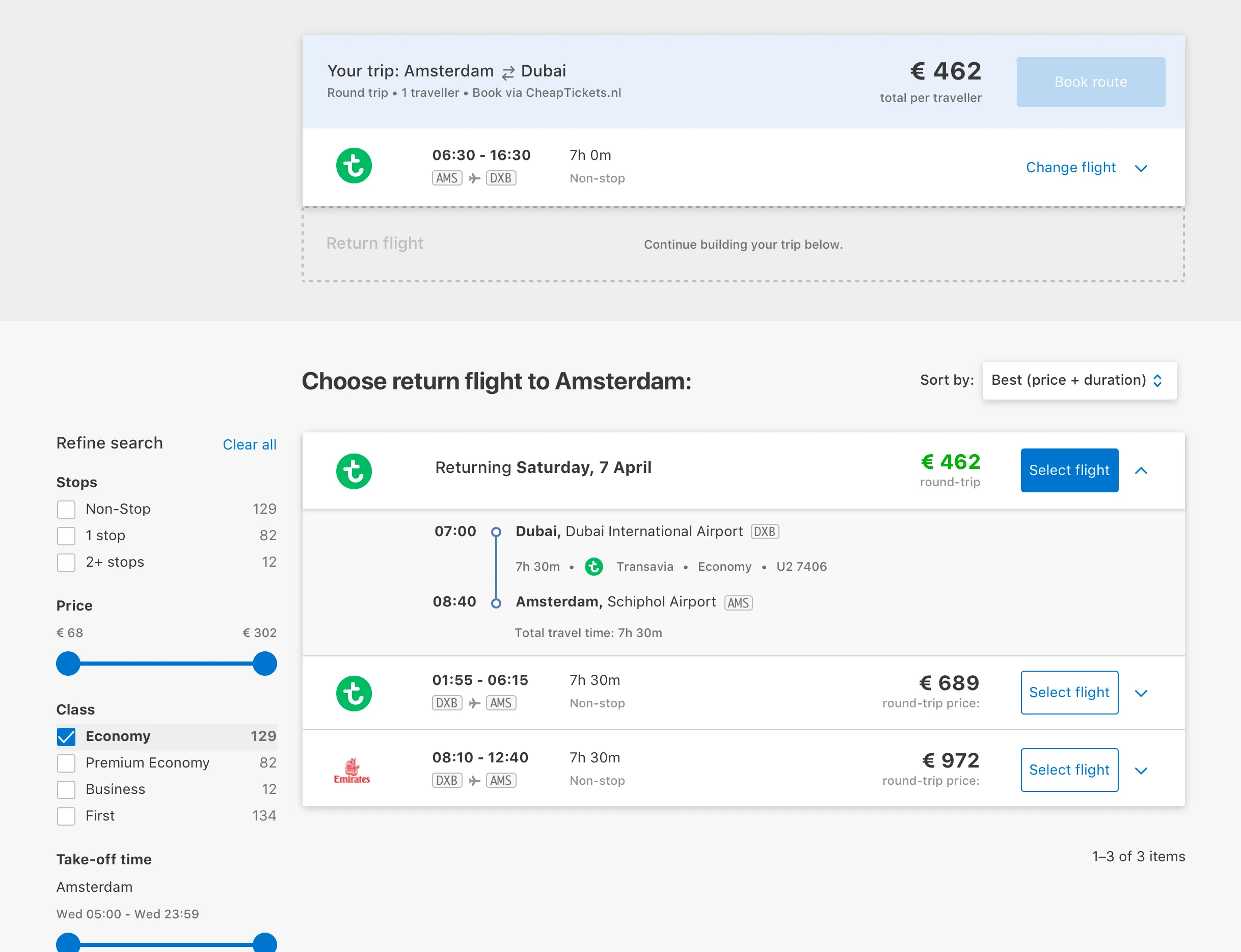
Fig 04 After selecting outbound, it pins to the top while you pick the return leg.
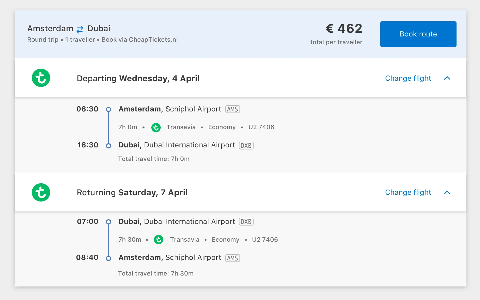
Fig 05 Full itinerary summary with a link to book.
Younger participants picked up the “build-your-itinerary” pattern quickly and liked seeing which parts of the trip were expensive. But most users found it too “jumpy.” Changing a selection meant going back to previous screens and redoing the trip build.
Prototype 2: Round trip results
Selecting flights one at a time worked for some, but not most. From our research, we knew many people used Skyscanner to research prices. They were used to seeing the full trip price in one go.
I redesigned for round-trip results shown together.
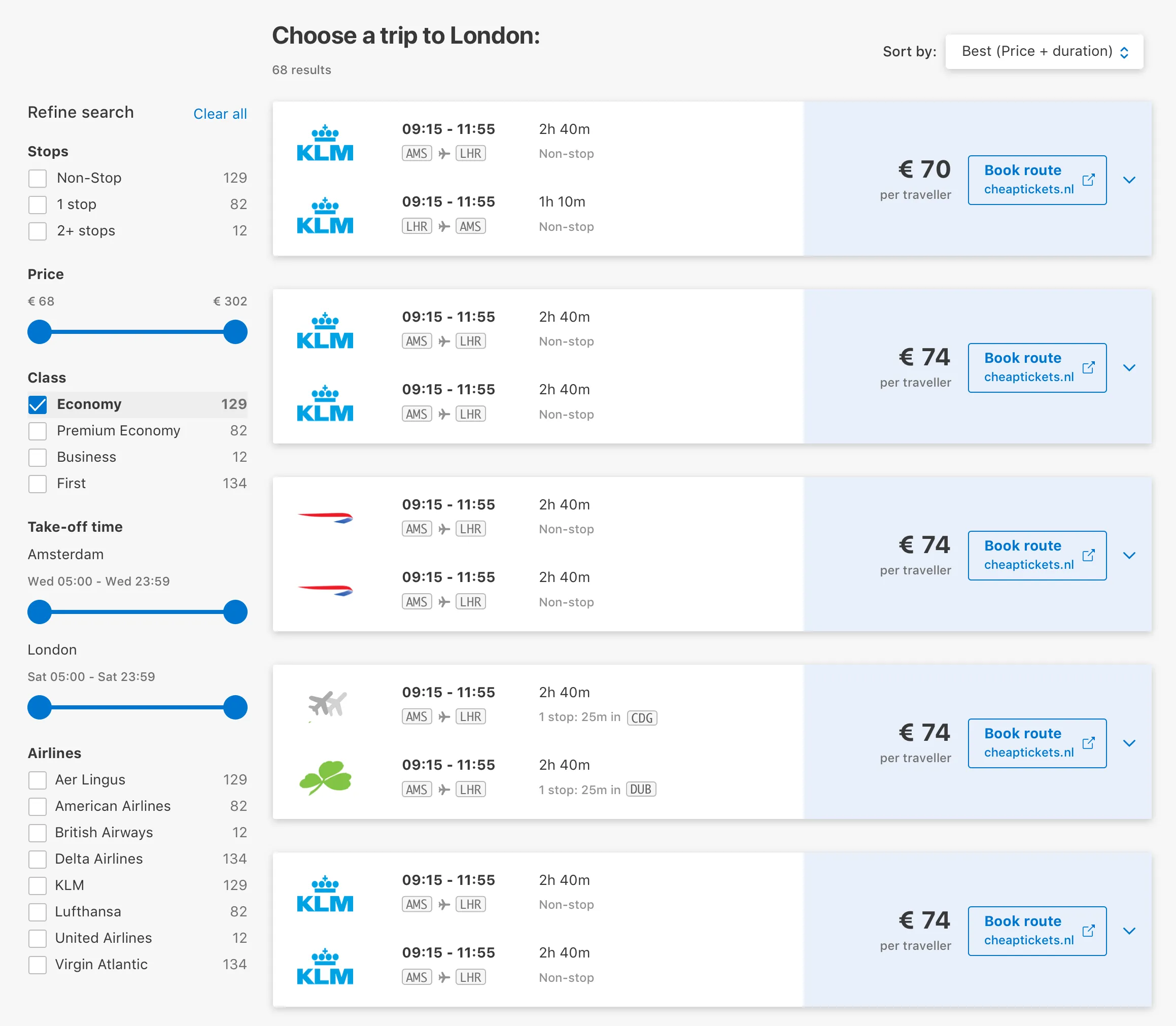
Fig 06 Round trip results showing outbound and return together with total price.
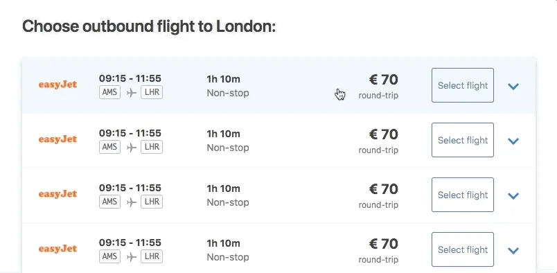
Multiple flight times
Another detail: airlines like KLM have multiple daily flights on popular routes. Instead of showing every possible combination, a selector lets users switch between available times without breaking the familiar search result pattern.
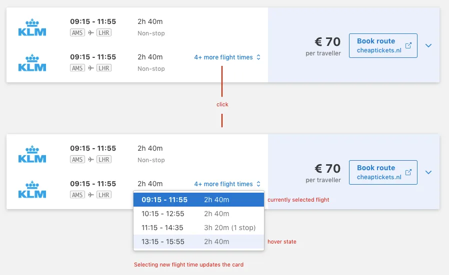
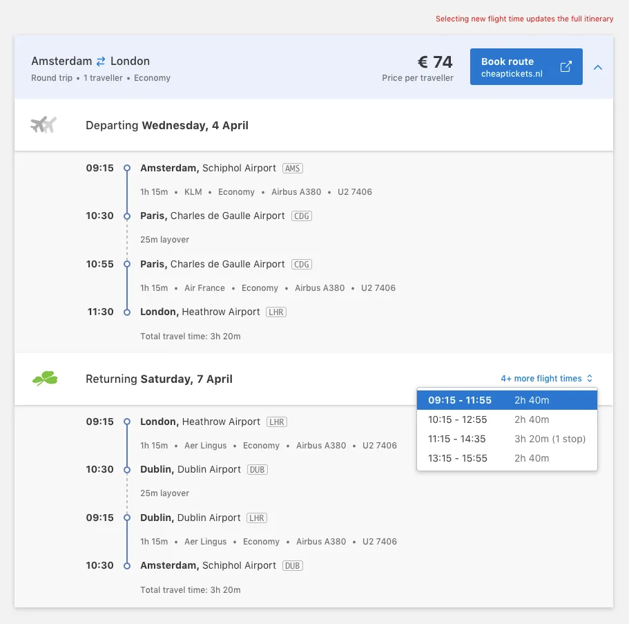
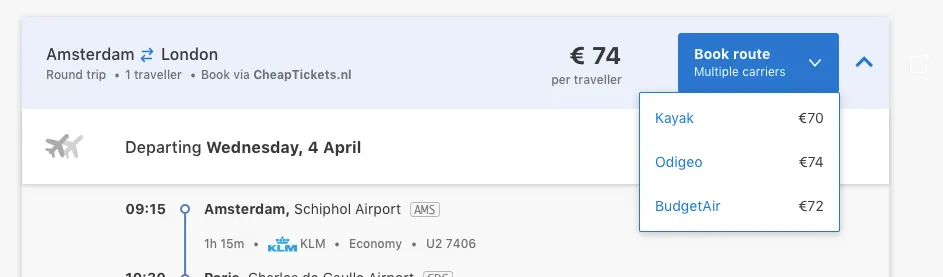
Fig 07 Time selectors for routes with multiple daily flights, and the external booking handoff.
Takeaways
I love airport codes and building itineraries leg by leg. Research told me most people don’t. We built something that matched how people actually shop for flights, not how I shop for flights.