What is a “note”?
You see a post with 743 notes and tap in, expecting conversation. Instead it’s mostly likes. There’s no way to tell from the outside whether a post has replies or reblogs, so the number promises more than it delivers. And when a post does have interesting conversation happening, a single aggregated count buries it.
User research confirmed this: “notes” as a term is genuinely confusing, especially for new users. You’re combining replies, reblogs, and likes into one number that tells you nothing about the nature of the engagement.

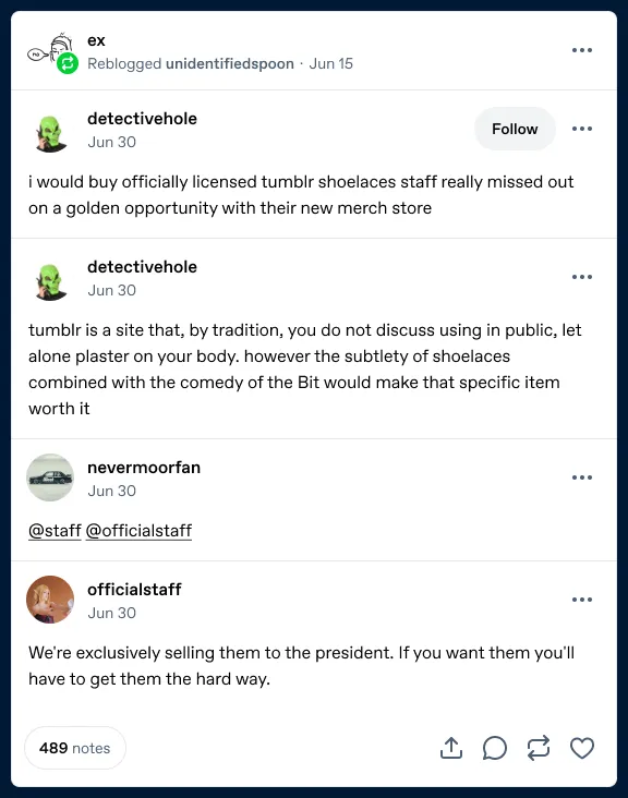
Fig 01 Two versions of the old post footer. Updated visual design, same problem: all engagement collapsed into a single number.
Designing the split footer
The fix was straightforward in concept: show separate counts for replies, reblogs, and likes so people can see at a glance what kind of engagement a post has, whether interesting conversation awaited.
It also needs to look visually balanced and have consistent action placement across posts with varying numbers of engagement, from zero to millions.
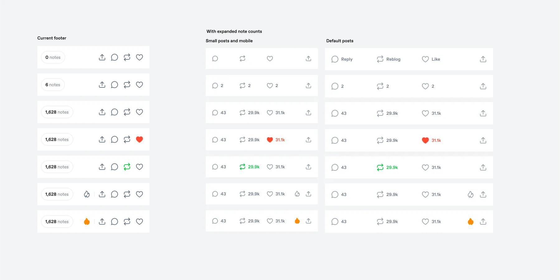
Fig 02 Early exploration (v1): old footer (left) vs. split footer at two sizes across seven states. The Blaze button is still present here.
These early explorations still included Blaze (the flame icon, our way for anyone to promote posts) in the footer. We later found that despite 76.7 billion post impressions in Q1 2025, only 1,922 Blaze campaigns were created on someone else’s post. Knowing this, we felt comfortable moving Blaze to the post’s overflow menu.
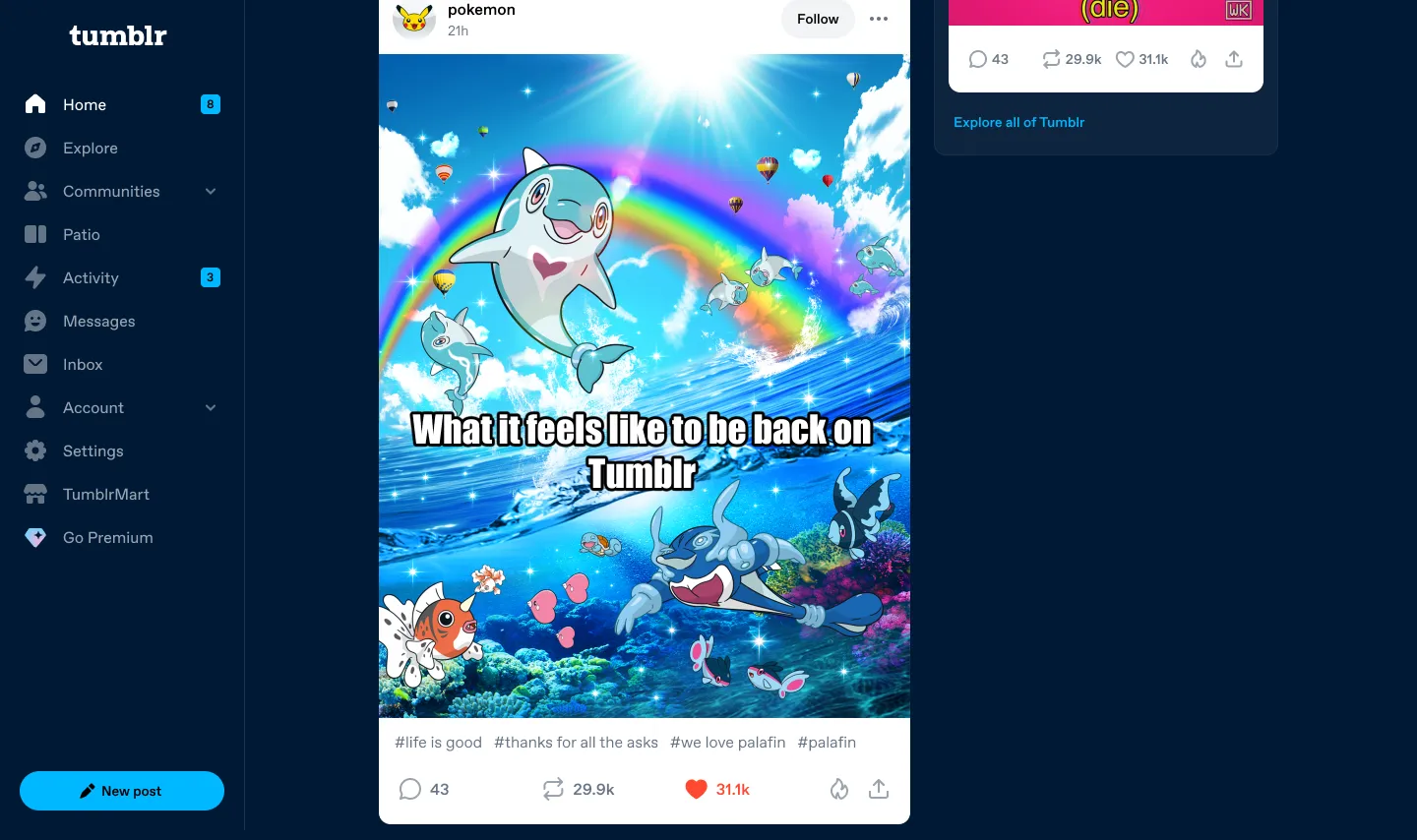
Fig 03 Split counts on desktop. Each post shows separate reply, reblog, and like counts in the footer.
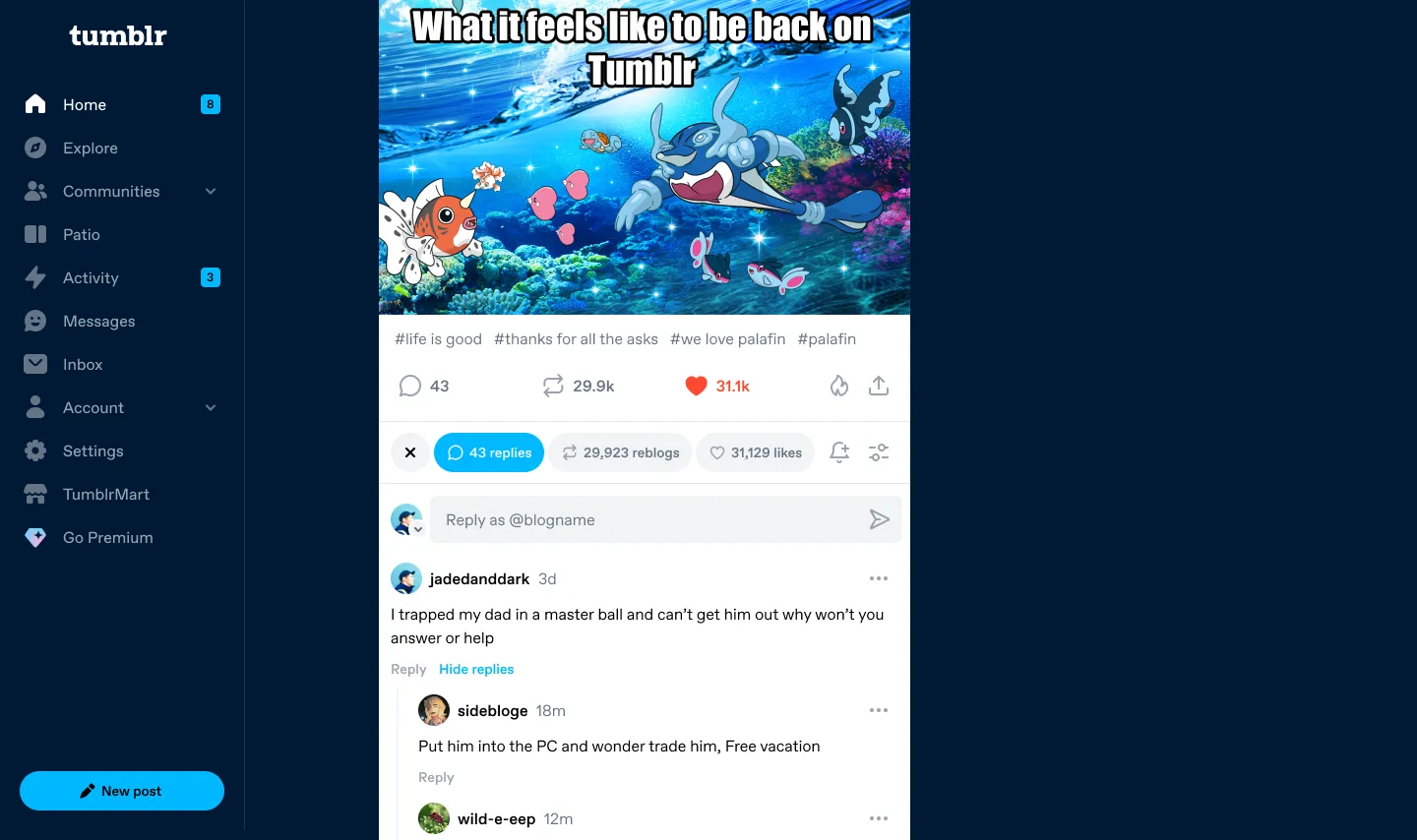
Fig 04 Tapping the reply count expands replies inline below the post. No page navigation required.
The Reblog Menu
See a post and want to spread it further? You can reblog it. This is a common interaction on many social platforms. But on Tumblr, you actually have a few options: Reblog (with optional commentary), fast reblog (instant, no compose screen), or reblog it to your queue (schedule it to post later). But fast reblog and queue actions were hidden behind keyboard shortcuts, or long-press interactions in the apps. The queue is unique to Tumblr, and we know people who use it retain better, and post more. But most never find it.
So we introduced a menu to show available actions when reblogging, betting that putting it in the path of reblogging would increase usage. There’s also a blog selector that remembers your last-selected blog, useful for people running multiple sideblogs.
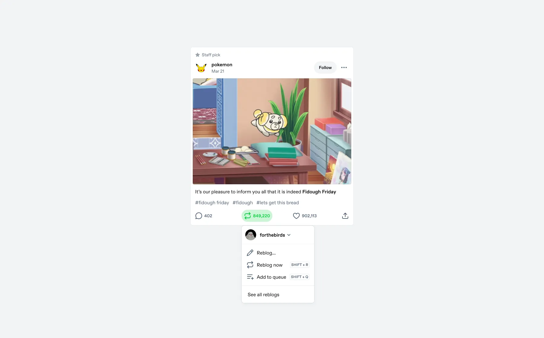
Fig 05 The Reblog Menu on desktop. Reblog, Reblog Now (with keyboard shortcut education), Add to Queue, See Reblogs, and a blog selector.
On desktop, the menu also educates users about keyboard shortcuts (Shift+R for quick reblog, Shift+Q for queue).
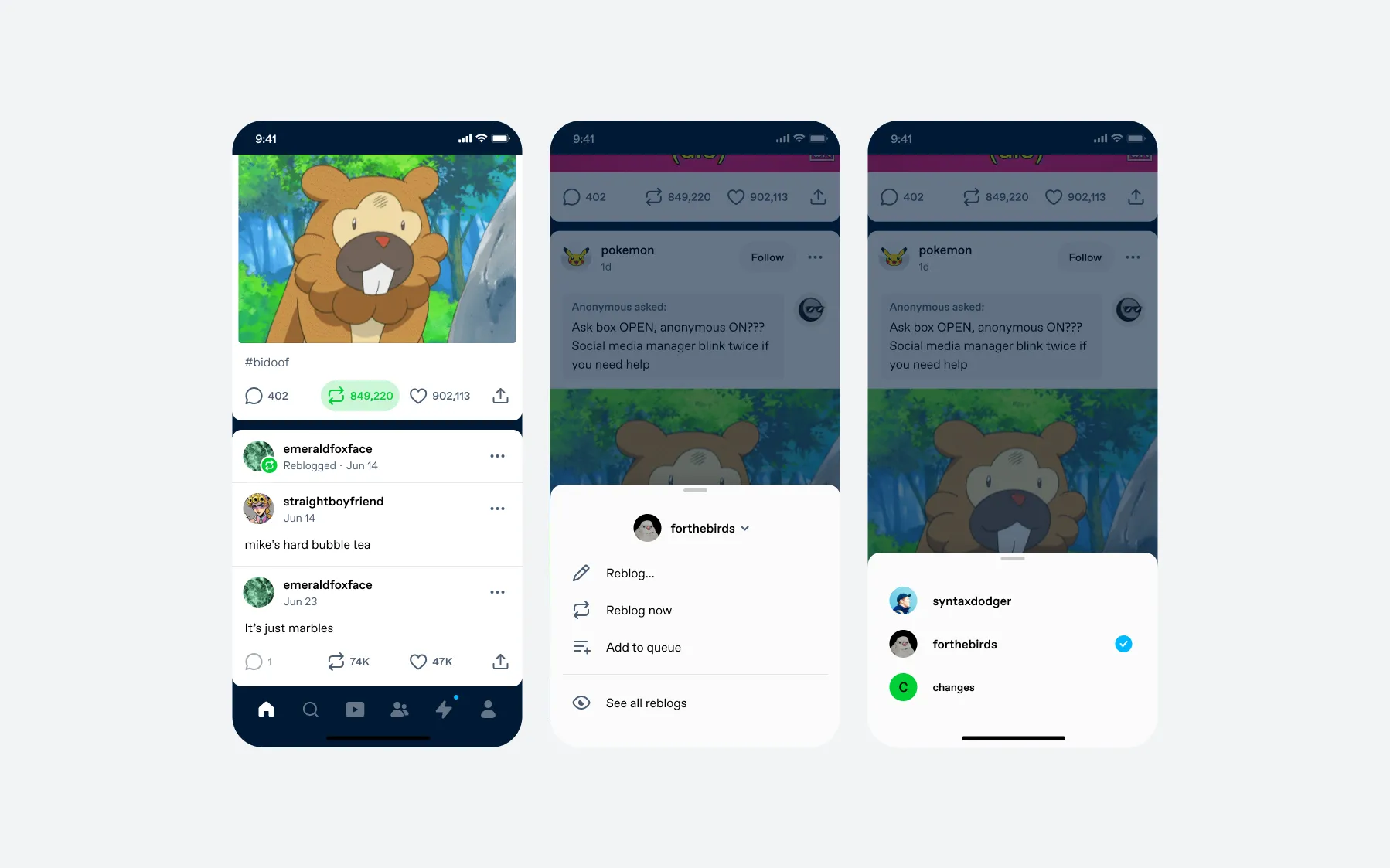
Fig 06 The Reblog Menu on mobile. Same options in a bottom sheet, plus a blog selector.
Results
This affects every post in every feed for millions of users, so we tested and iterated carefully. We ran six experiments across three platforms over nine months. The split-count variant won consistently across all markets:
- Users reading replies
- +192%
- Users writing replies
- +6%
- Reblog DAU
- +1.56%
- Fast reblog (iOS / Android)
- +99% / +96%
- Queue usage (iOS / Android)
- +157% / +103%
Reply readership tripled. Queue and fast reblog usage climbed. We launched cross-platform based on these results.
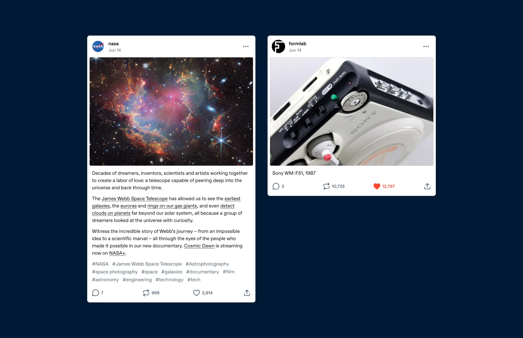
Fig 07 The shipped footer on original posts. Separate counts for replies, reblogs, and likes.

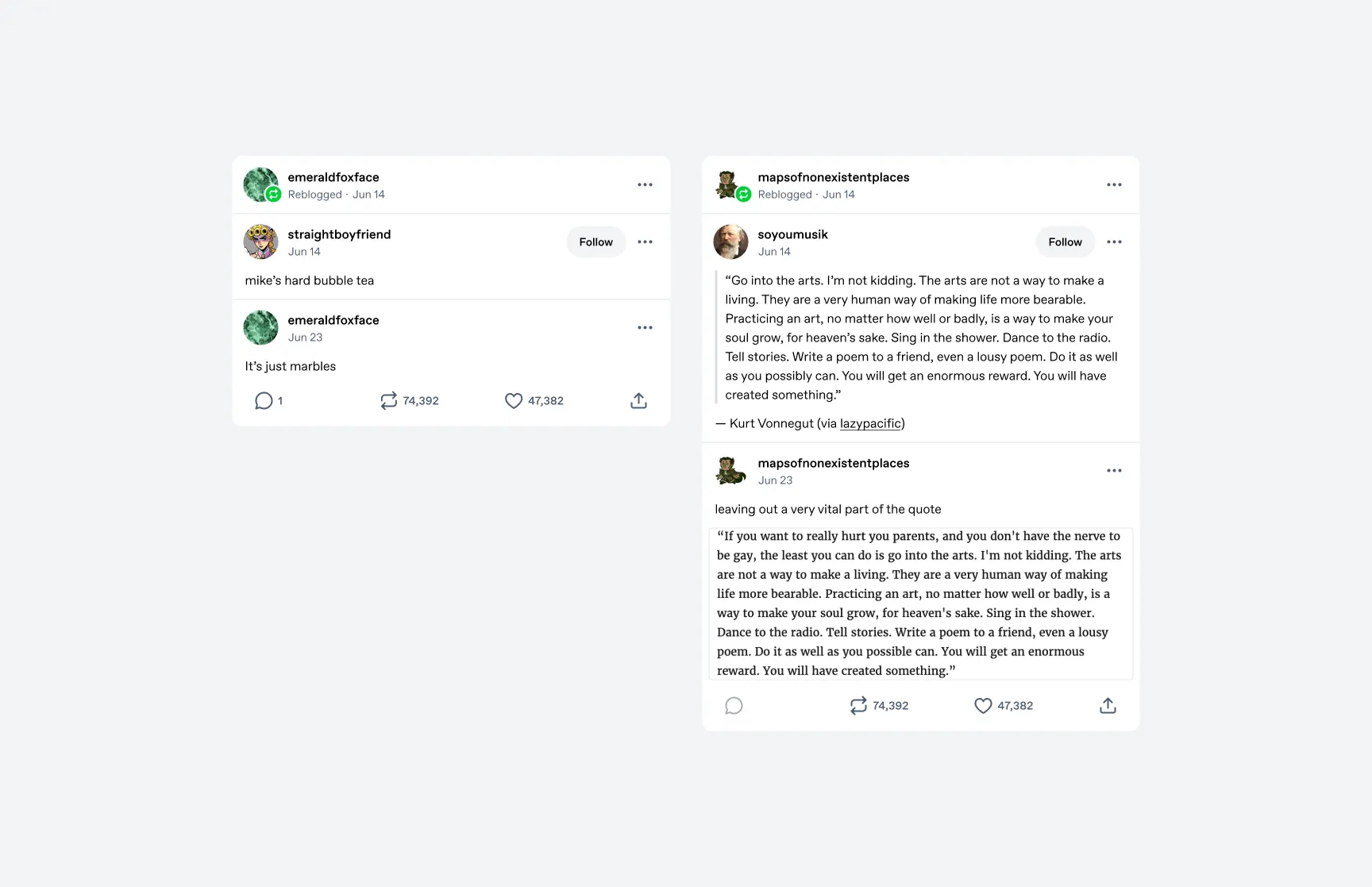
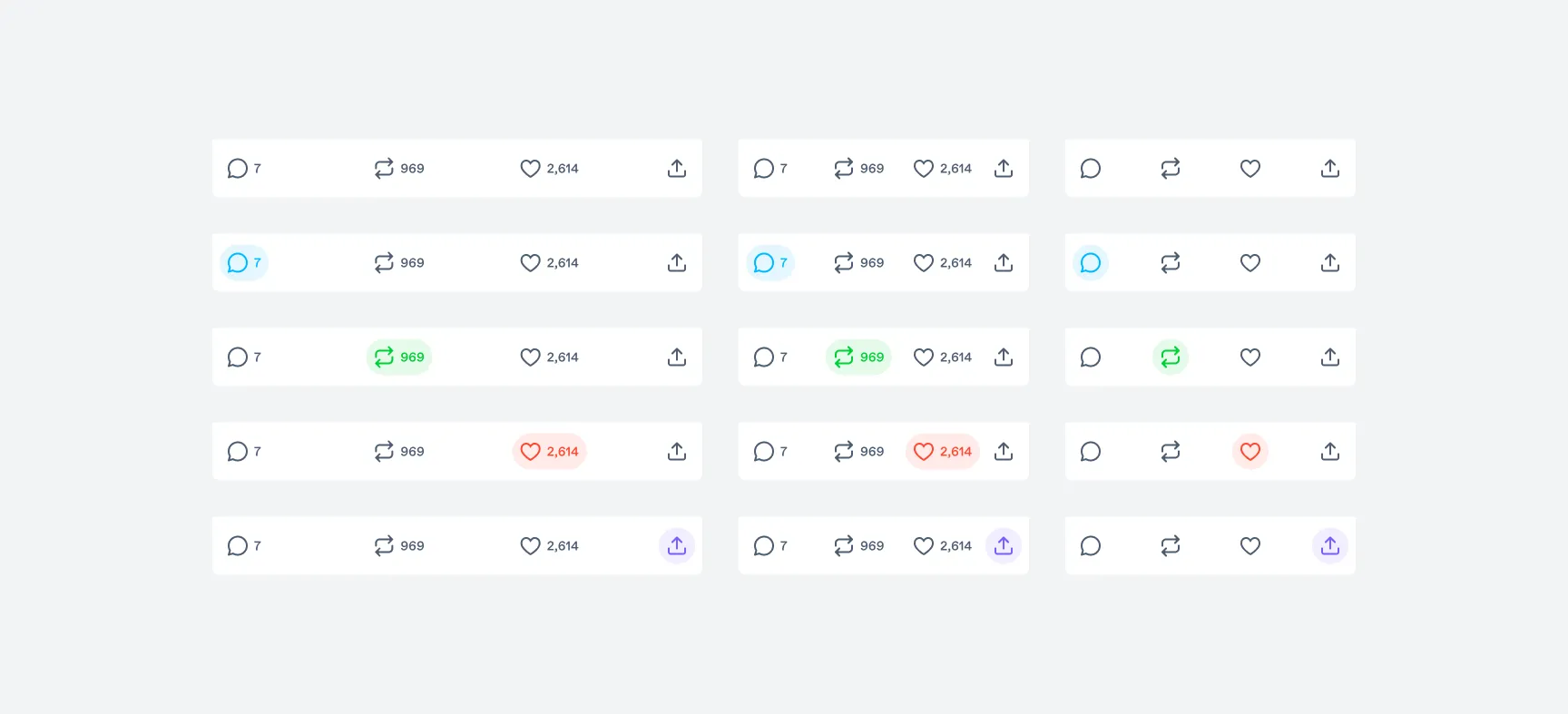
Fig 08 All footer states: default, reply active, reblog active, liked, and share active.