The problem
Tumblr’s interface had been accumulating visual inconsistency for years. Spacing values followed no pattern. A timestamp that added 39px of content made posts 108px taller, because uneven padding compounded through each element. The color situation was roughly 2,900 legacy palette variables spread across 985 SCSS files, maintained separately in three repositories, deprecated in spirit but thriving in practice.
We built the design system in parallel with feature work, with key engineers from each platform, and got buy-in by shipping improvements. If it made the work faster and the product better, people used it.
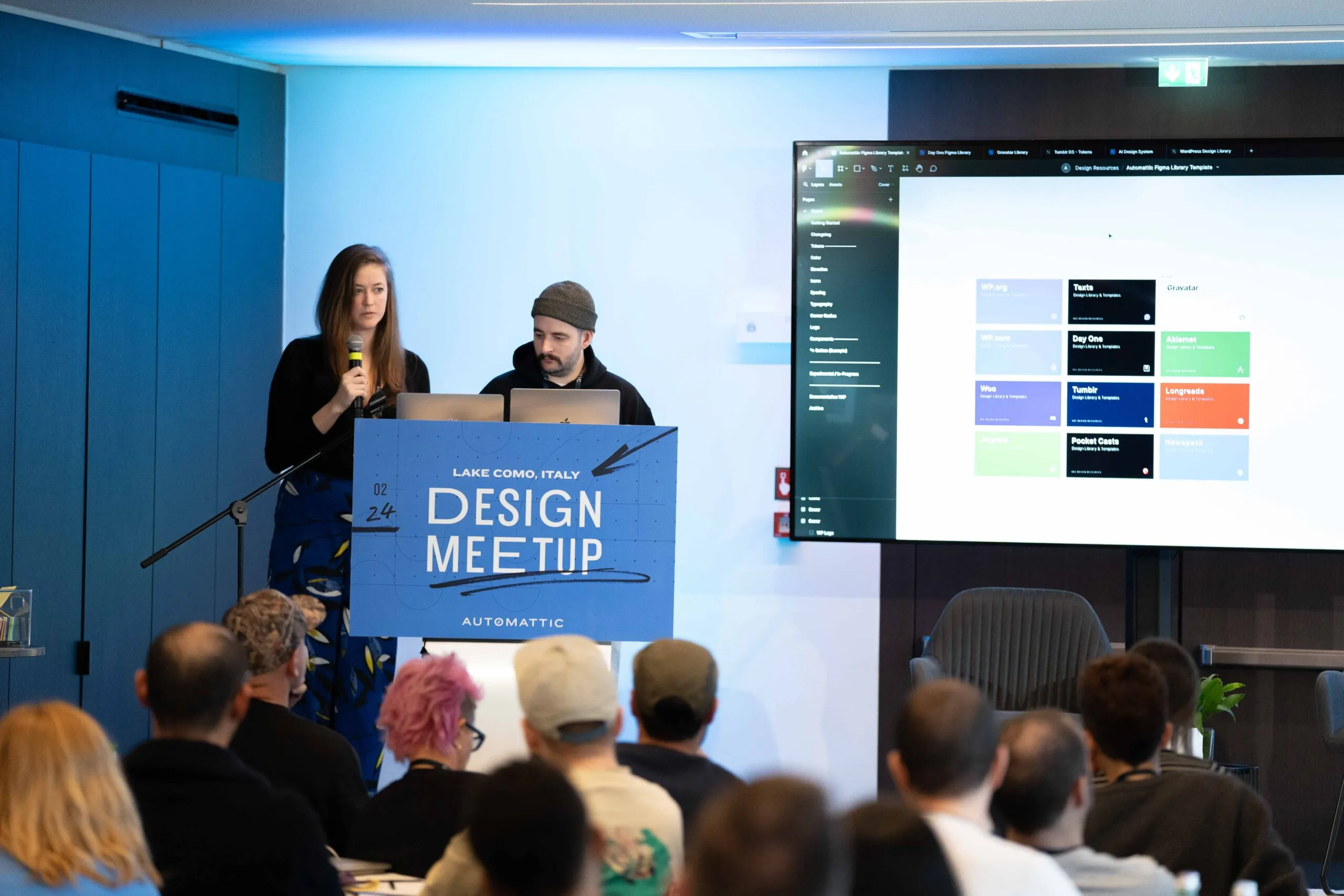
Fig 01 Sharing our process for Tumblr’s design systems work at the 2024 all-design meetup.
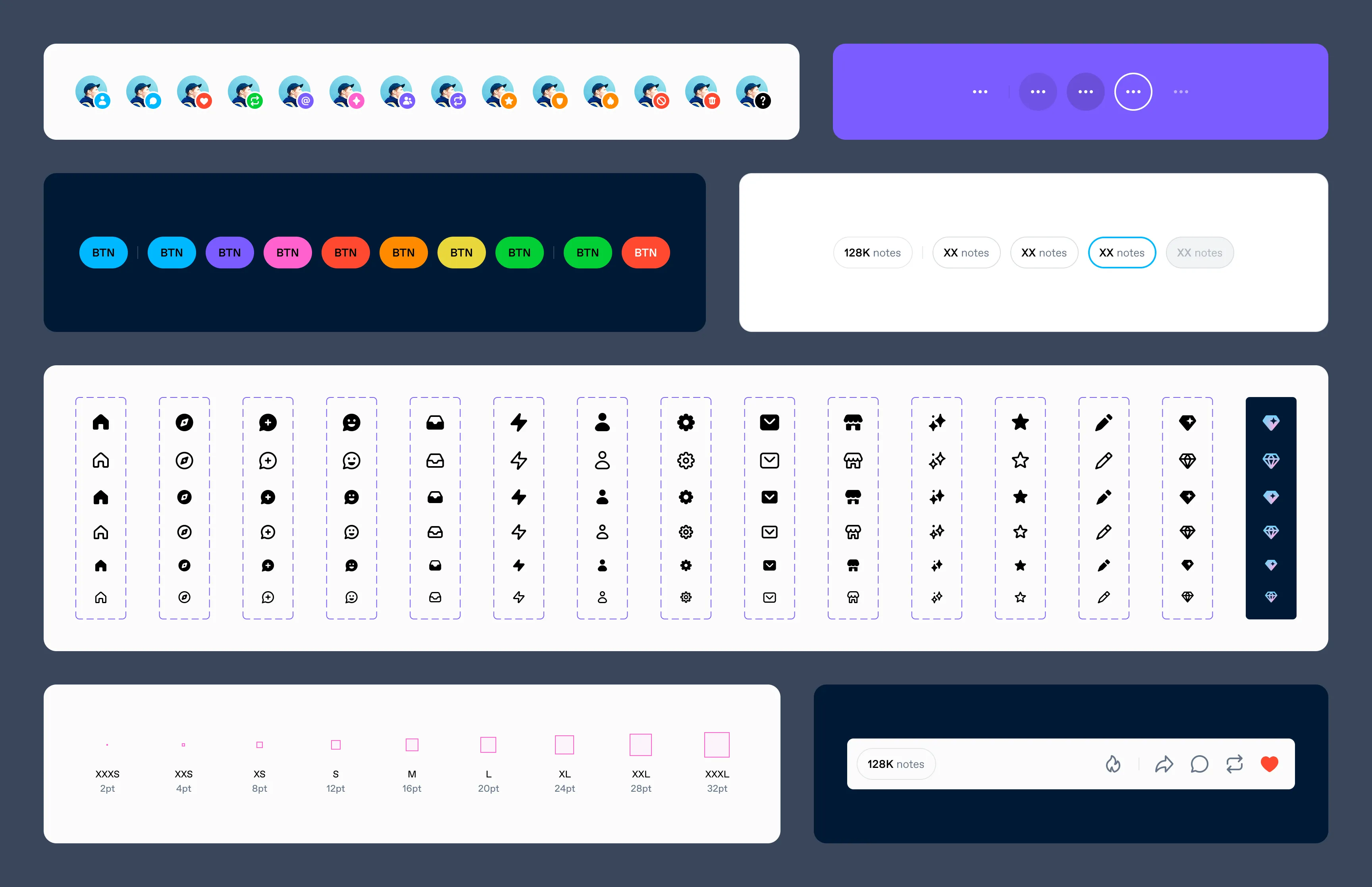
Tokens
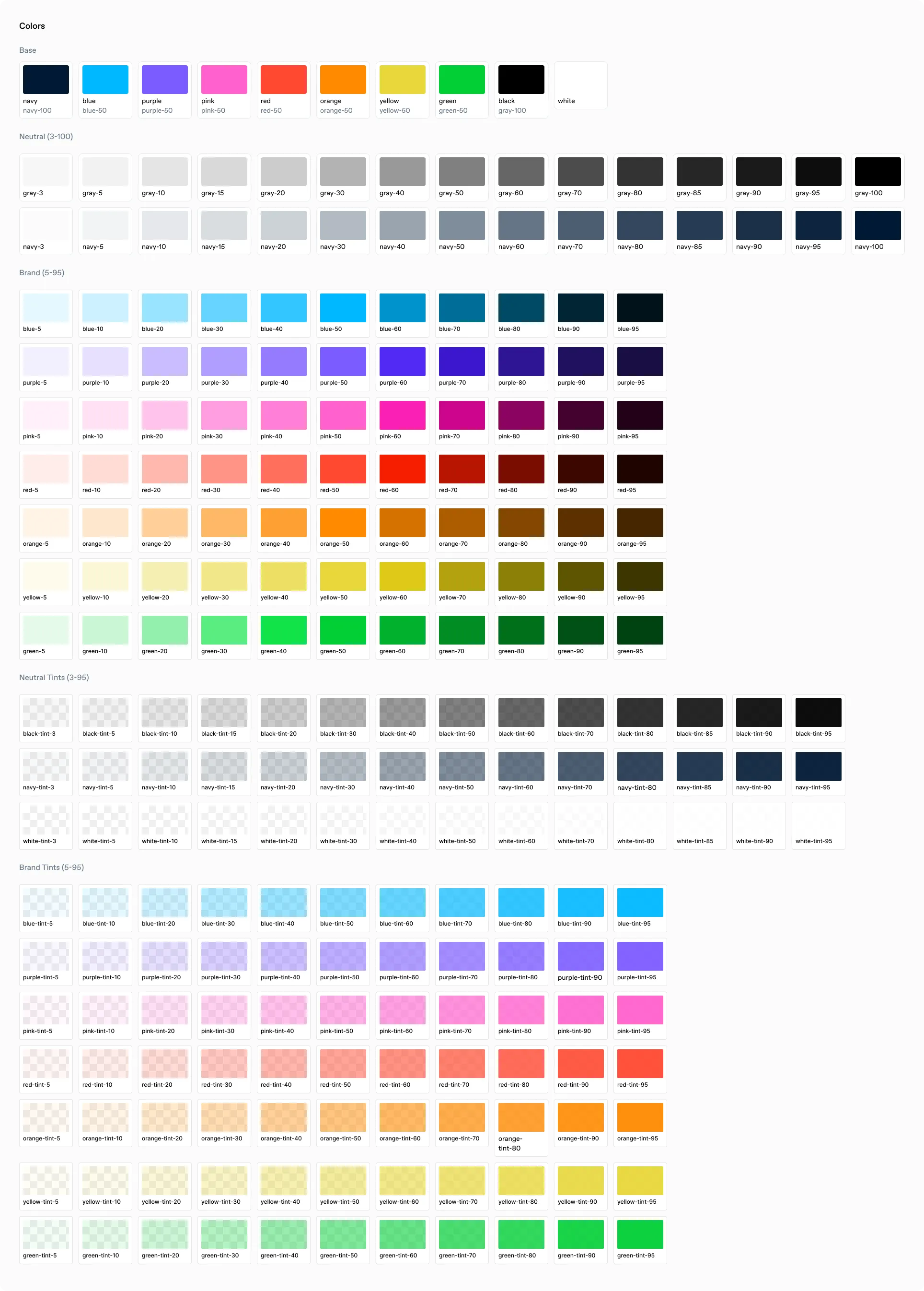
Colors
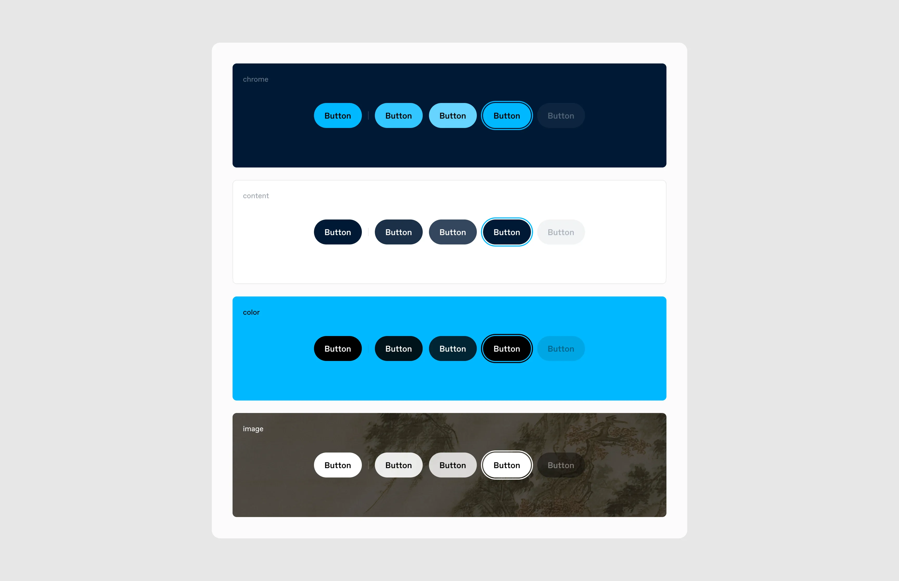
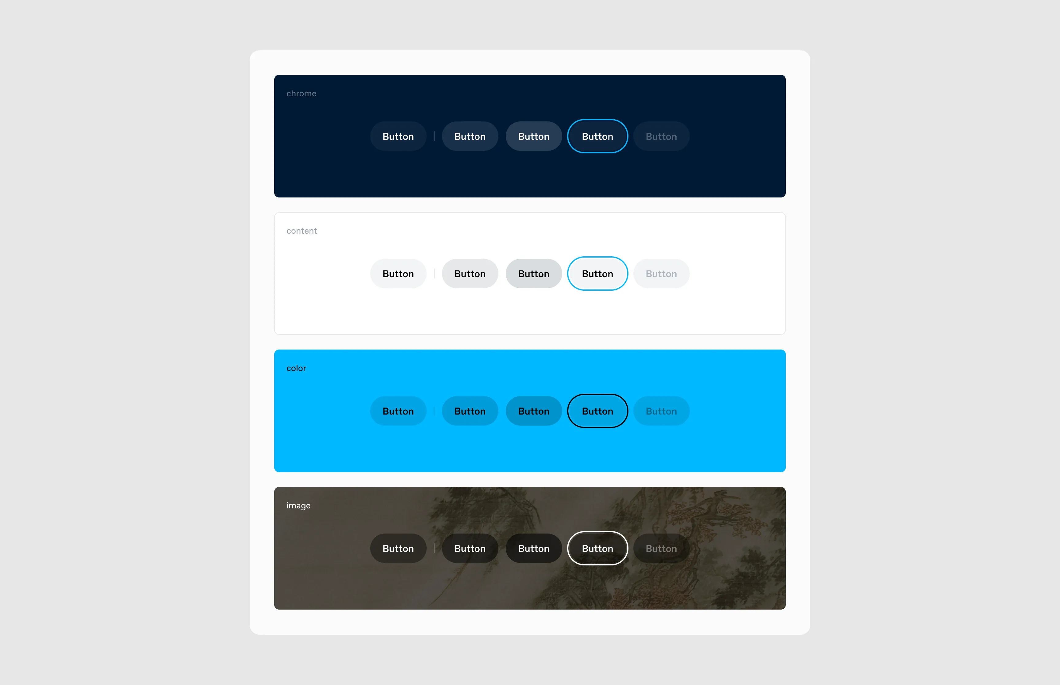
Tumblr has 12 color palettes (True Blue, Dark Mode, Cement, and nine others), all available on web, with a subset on iOS and Android. Each palette defines a complete set of about 207 semantic-to-design-token mappings. The chrome token, for example, defines the app’s background color: navy-100 in True Blue, dark gray in the Dark palette.
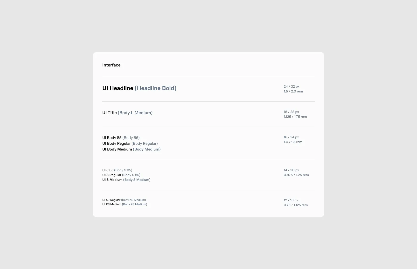
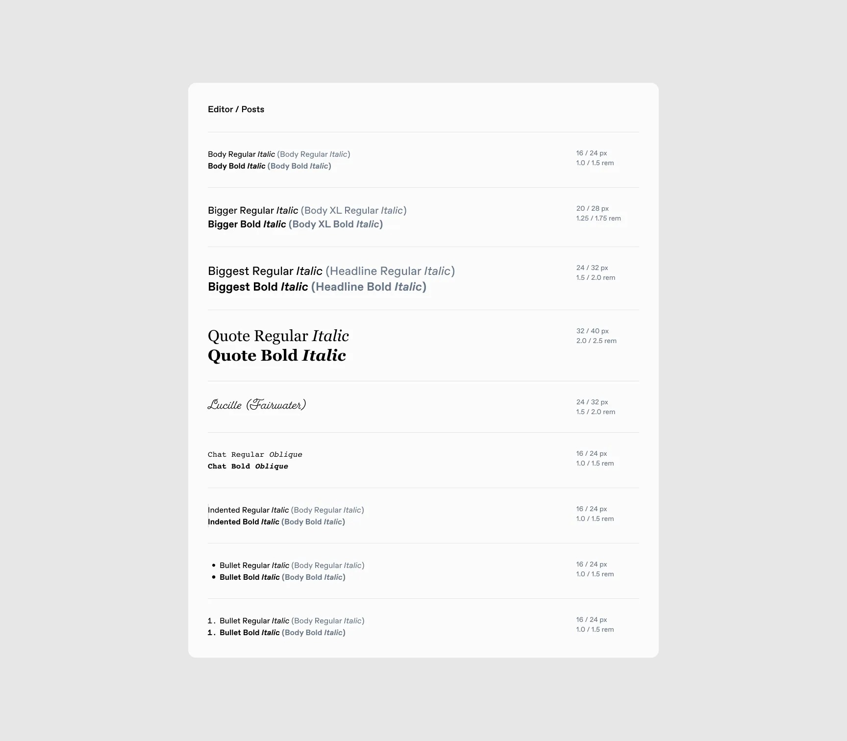
Typography
Typography uses semantic tokens, divided between the interface and the post editor. The editor has custom options for users to play with when creating posts, but we kept interface type restricted.
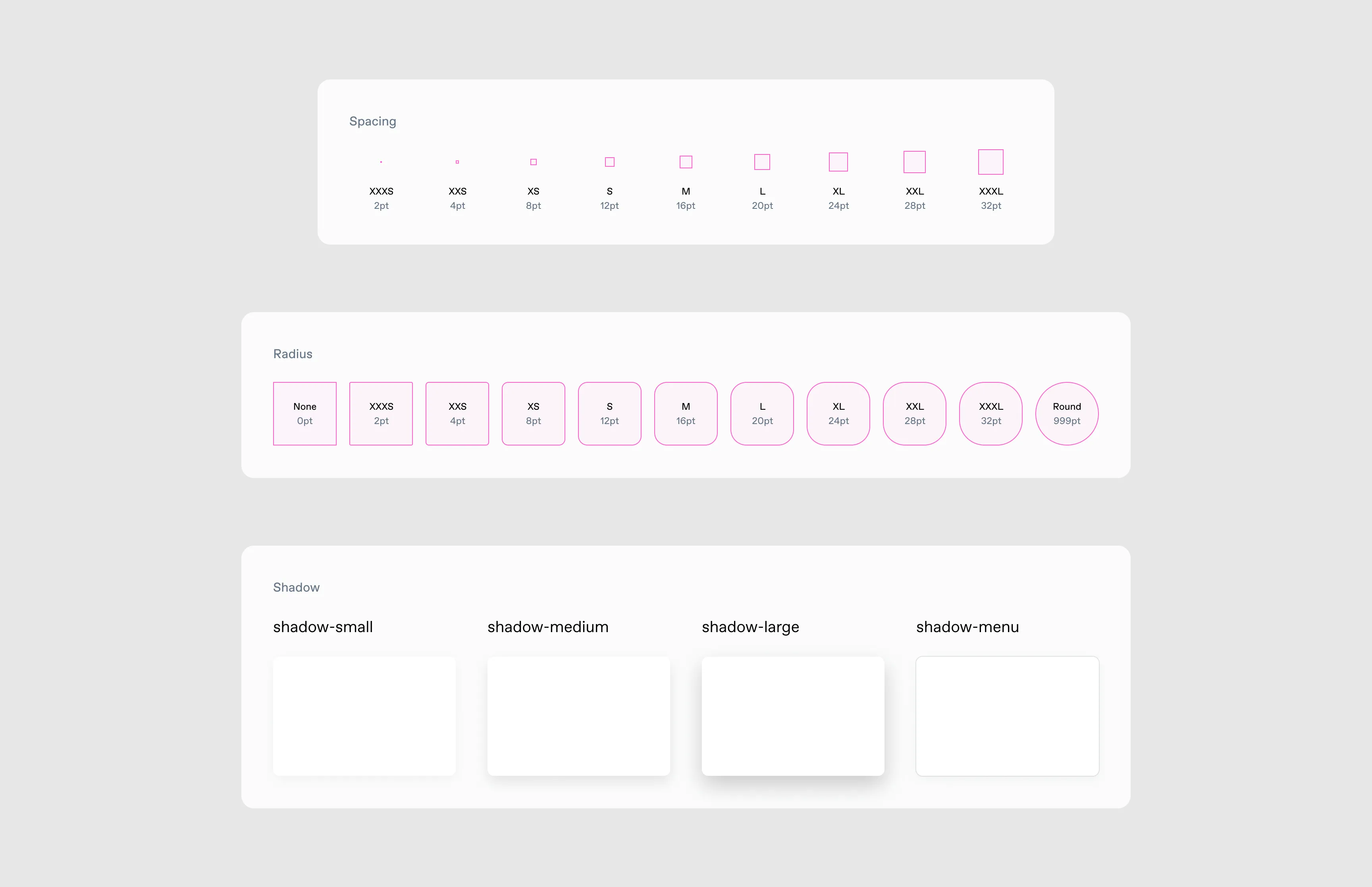
Spacing
Every spacing value in the iOS feed seemed to be a different number, with no consistent pattern. We standardized to multiples of 8 (subdividing to 4 when needed), which improved readability and information density. A minor shortening of the post footer alone had resulted in a 2.5% increase in post impressions, so we knew even small consistency gains compounded.
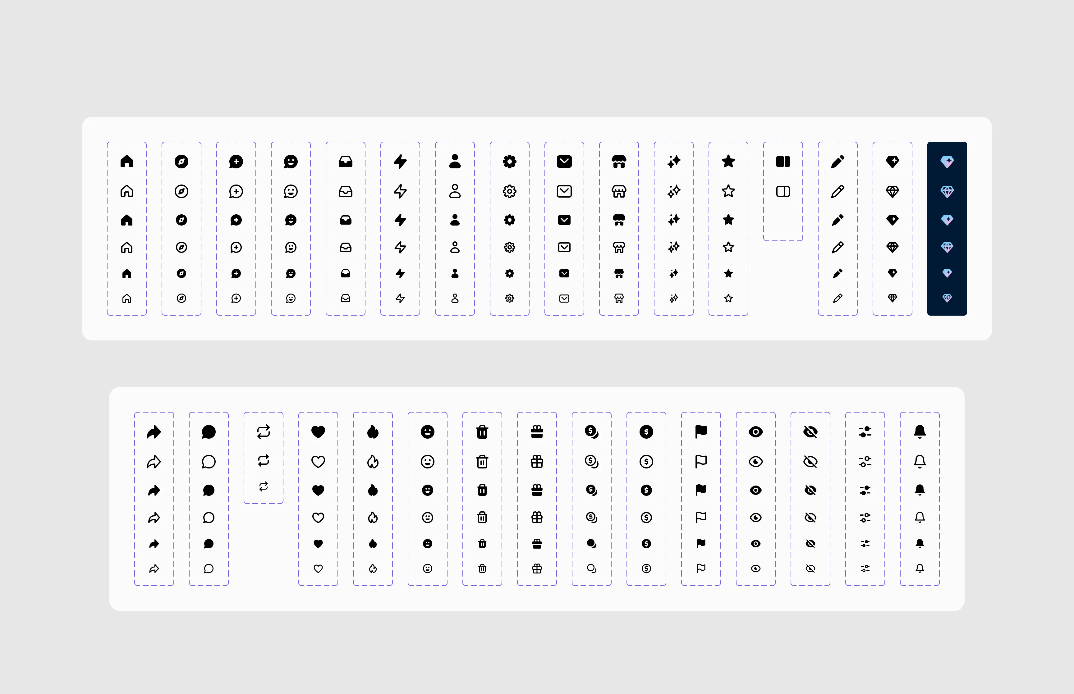
Iconography
Icons had been added haphazardly over years. We redrew them all, unified their visual language while aiming to keep that Tumblr vibe, gave ourselves outlined and filled versions, and optimized for 16px, 20px, and 24px sizing.
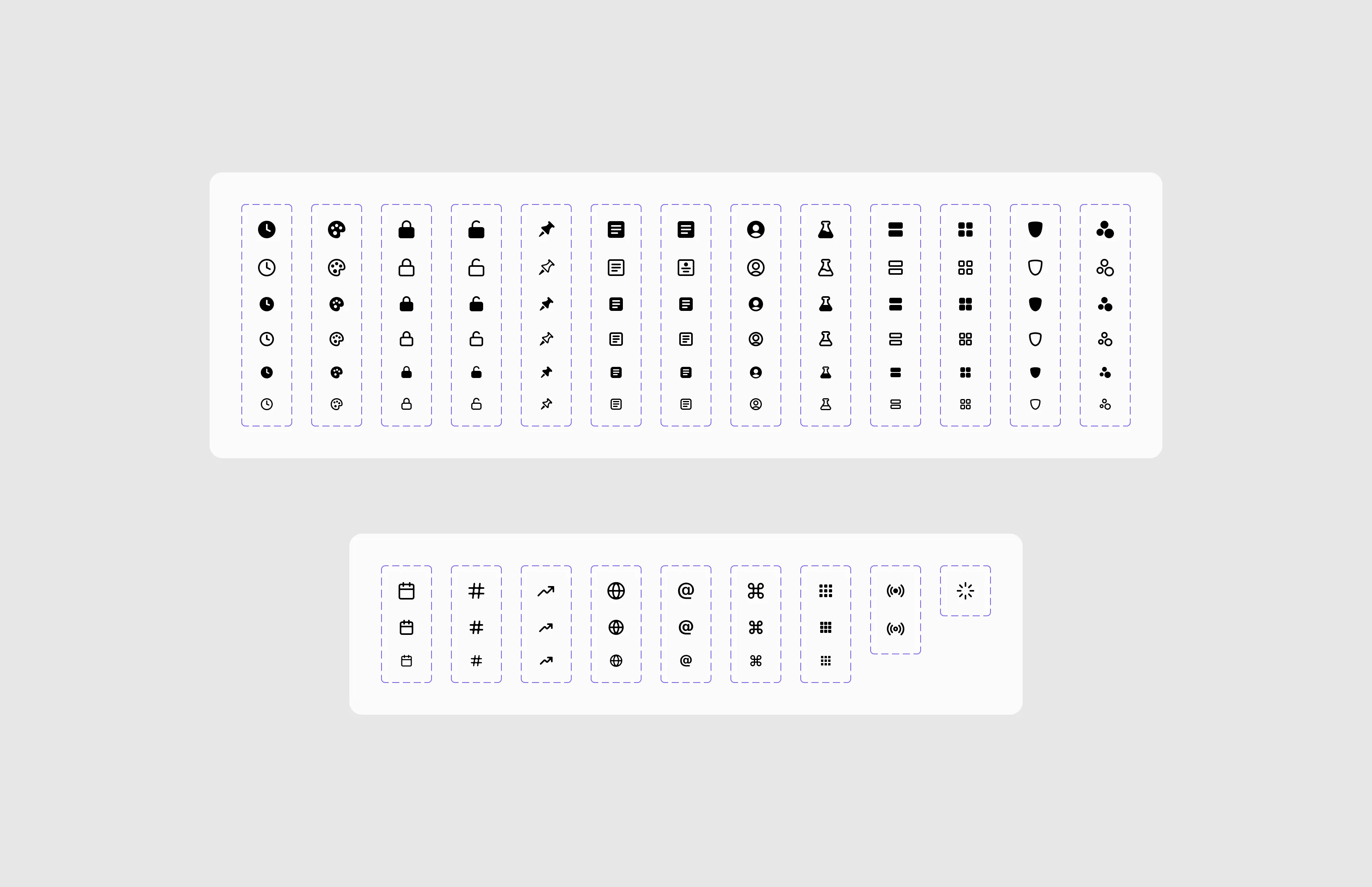
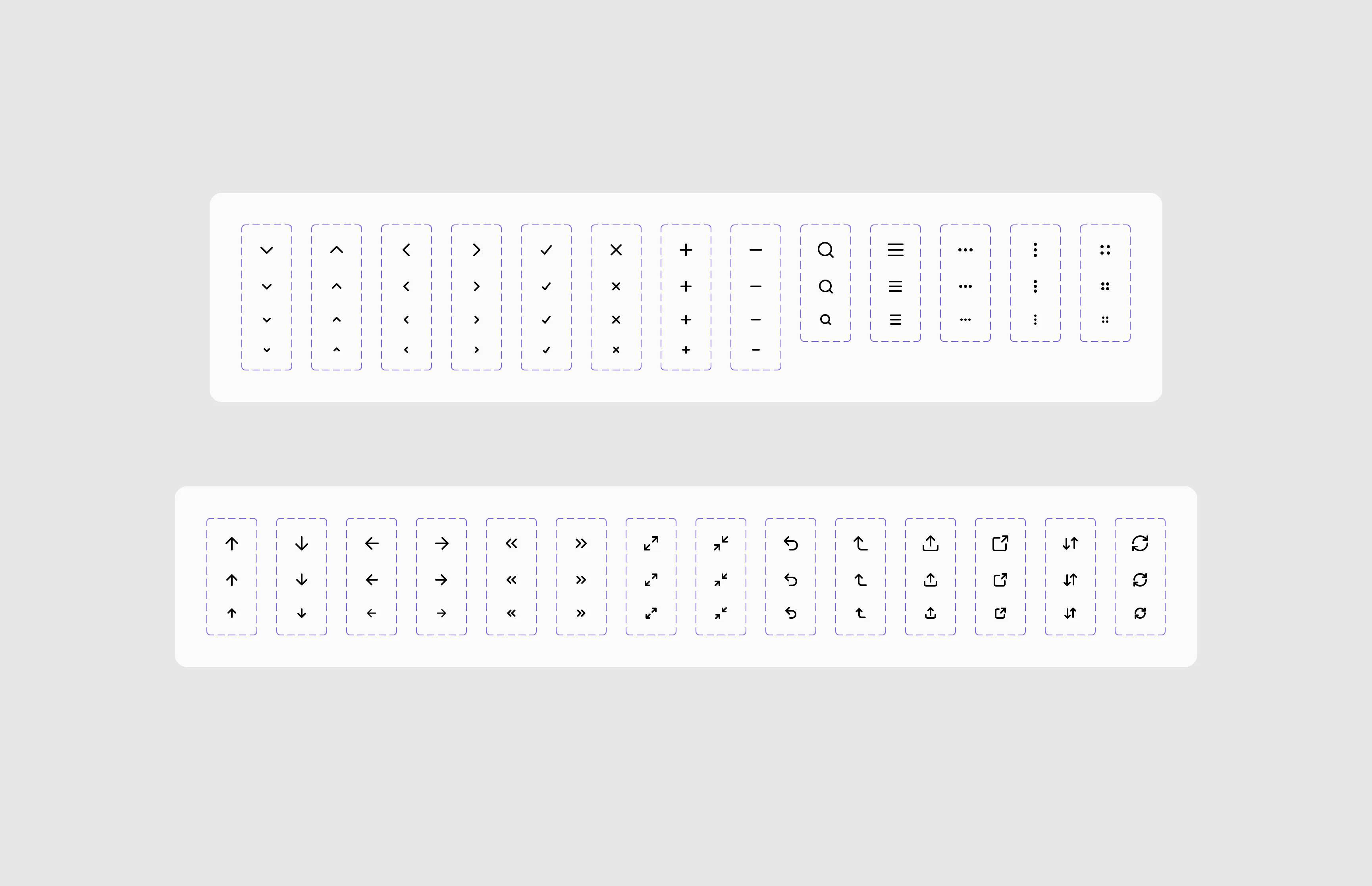
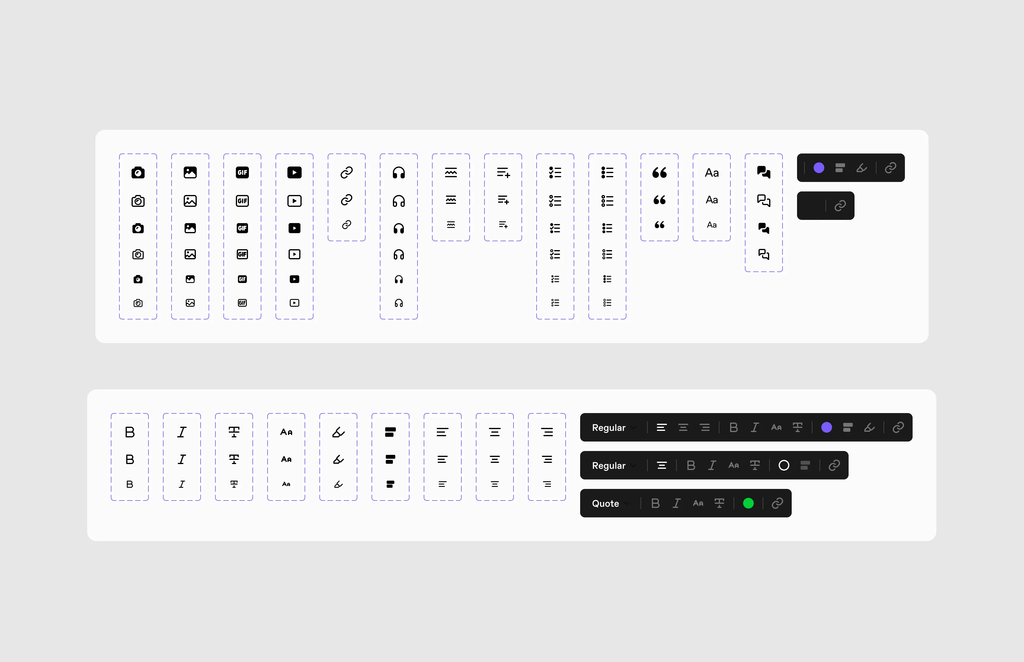
Components
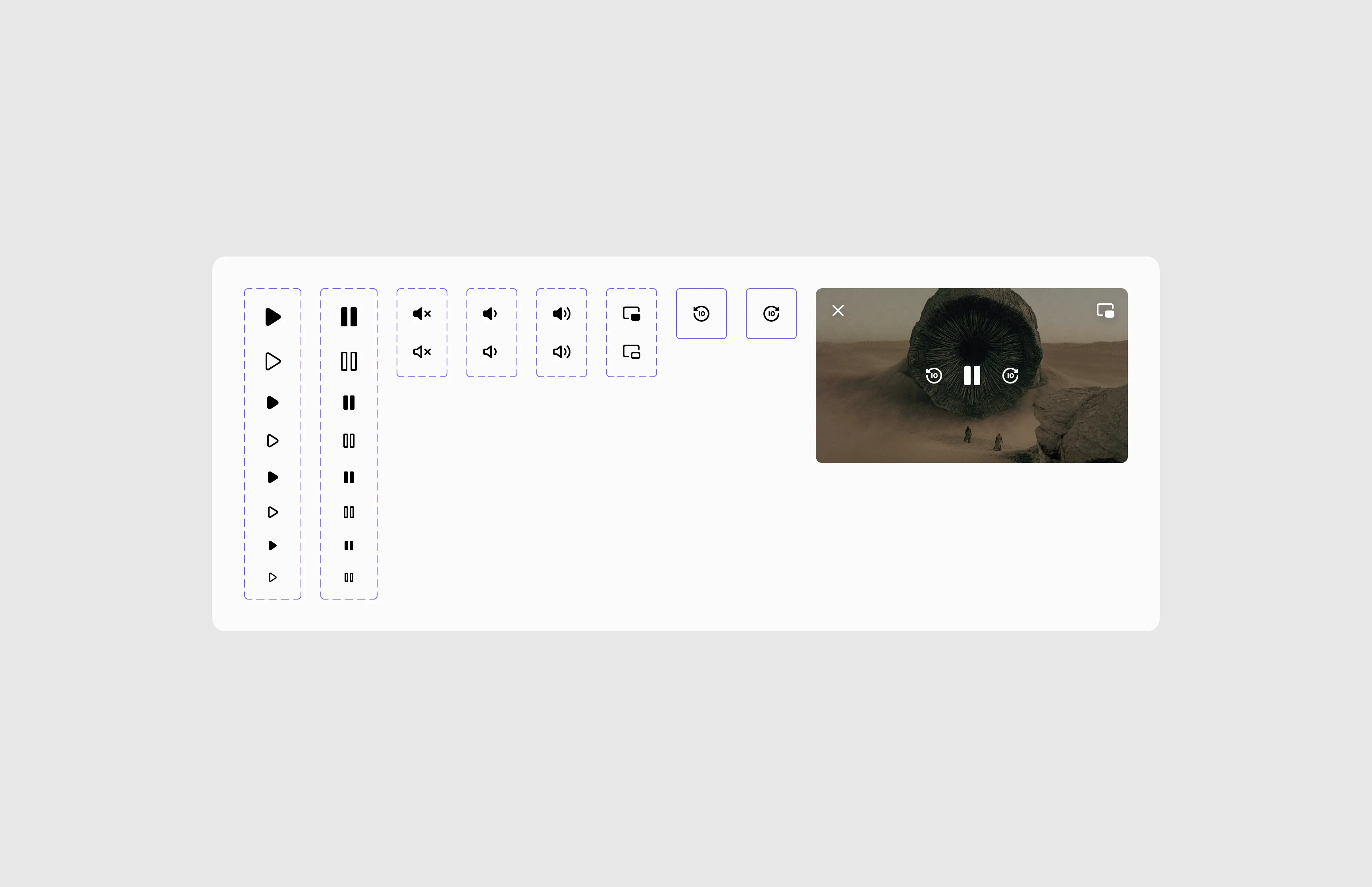
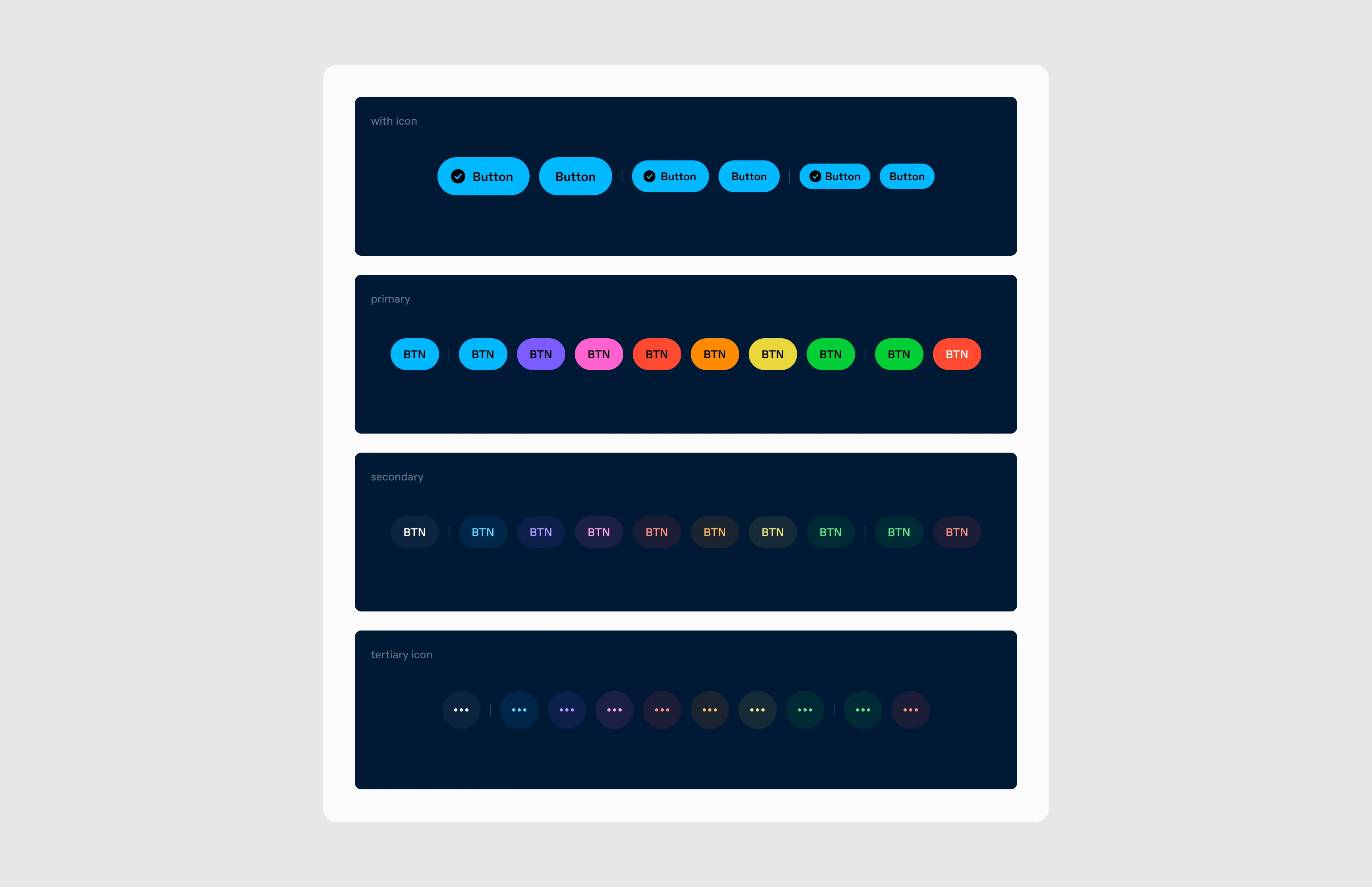
Buttons
Primary, secondary, and icon variations, plus a custom “notes” button that appears on every post (until we split the note count).
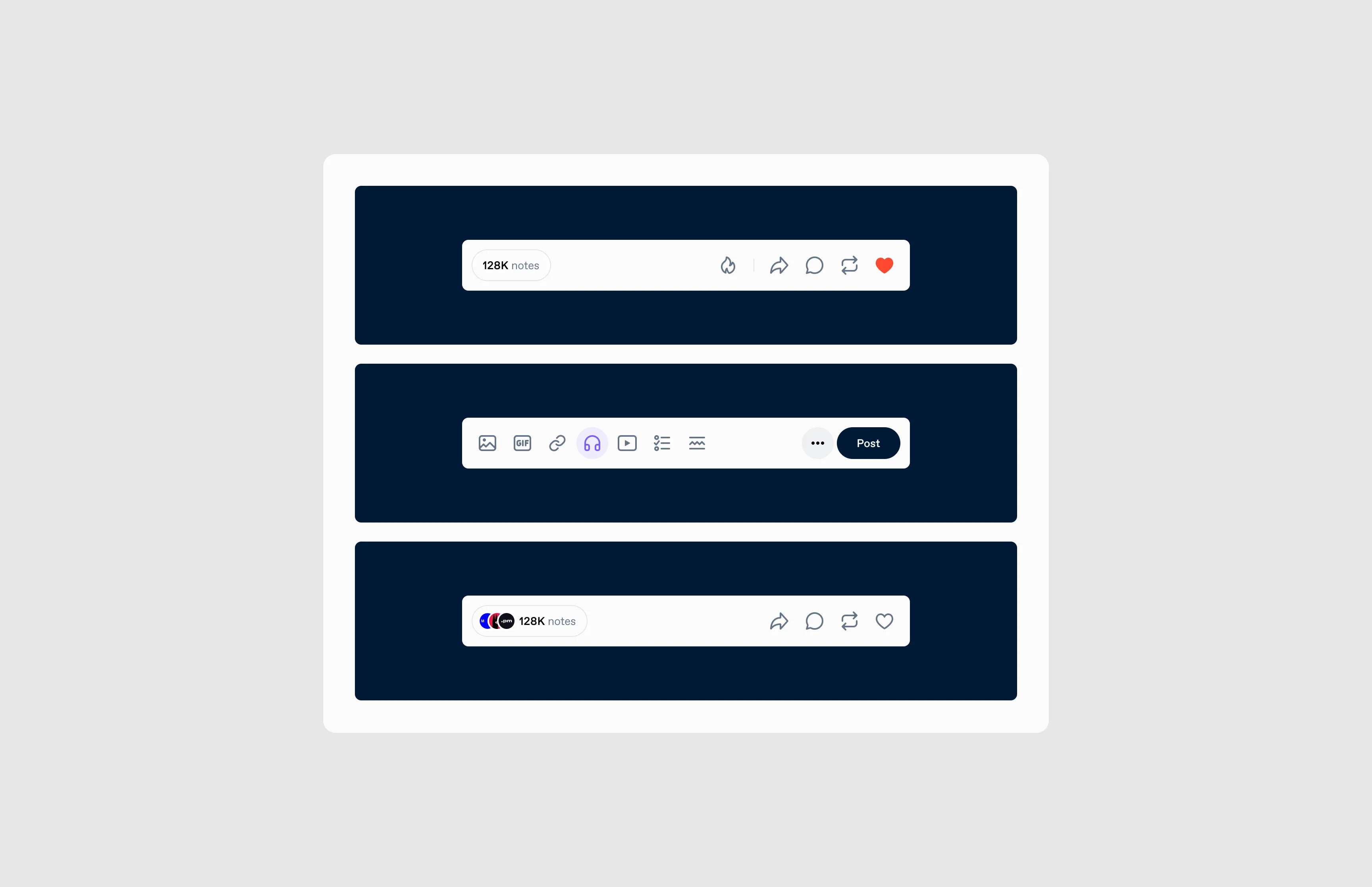
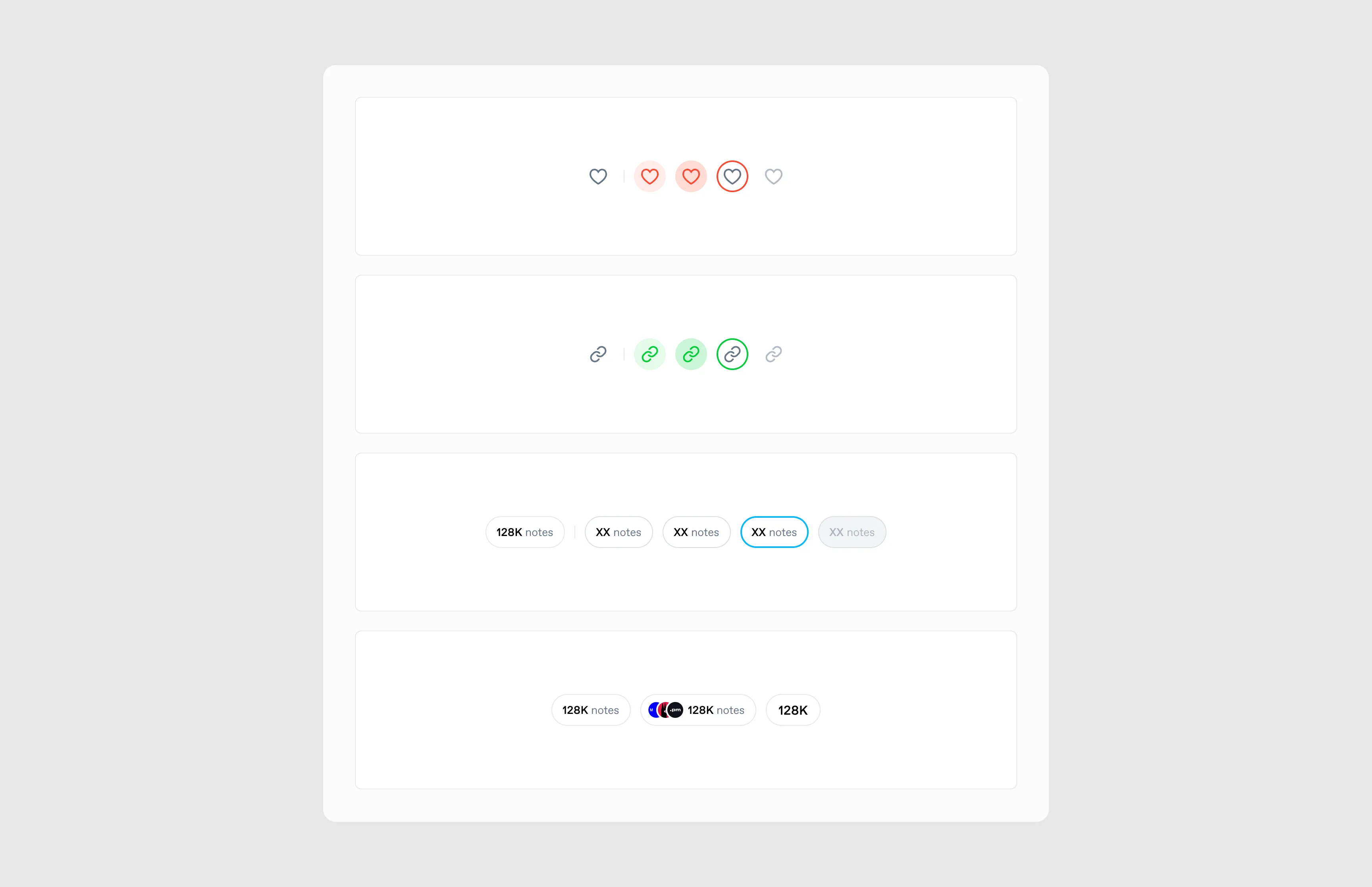
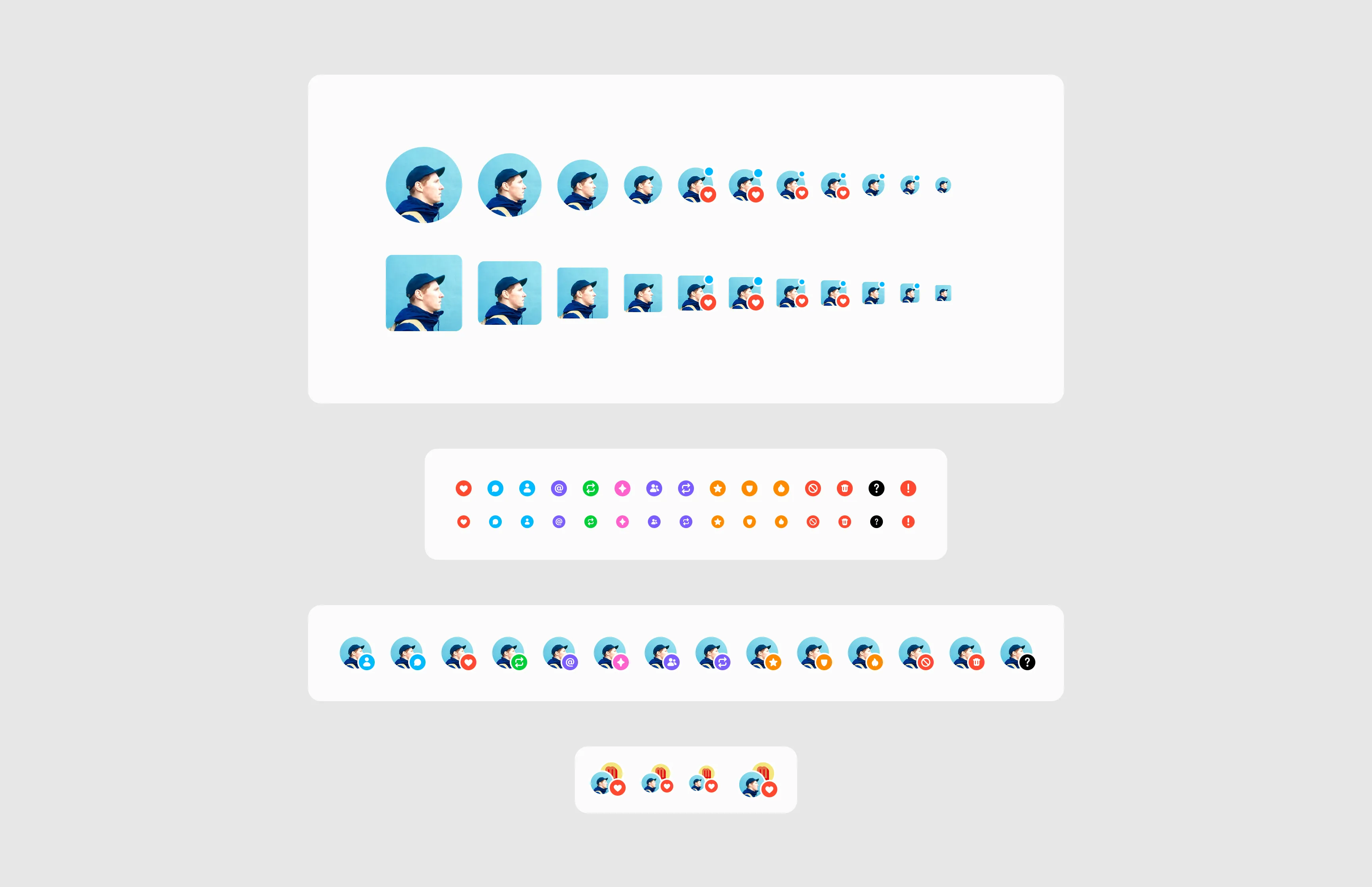
Avatar
The basic building block of identity on Tumblr. We needed several sizes and states, since it appears quite large on someone’s blog, but needs to be small when viewing a post or list of activity. We used this component to create a base for how we wanted to document components.
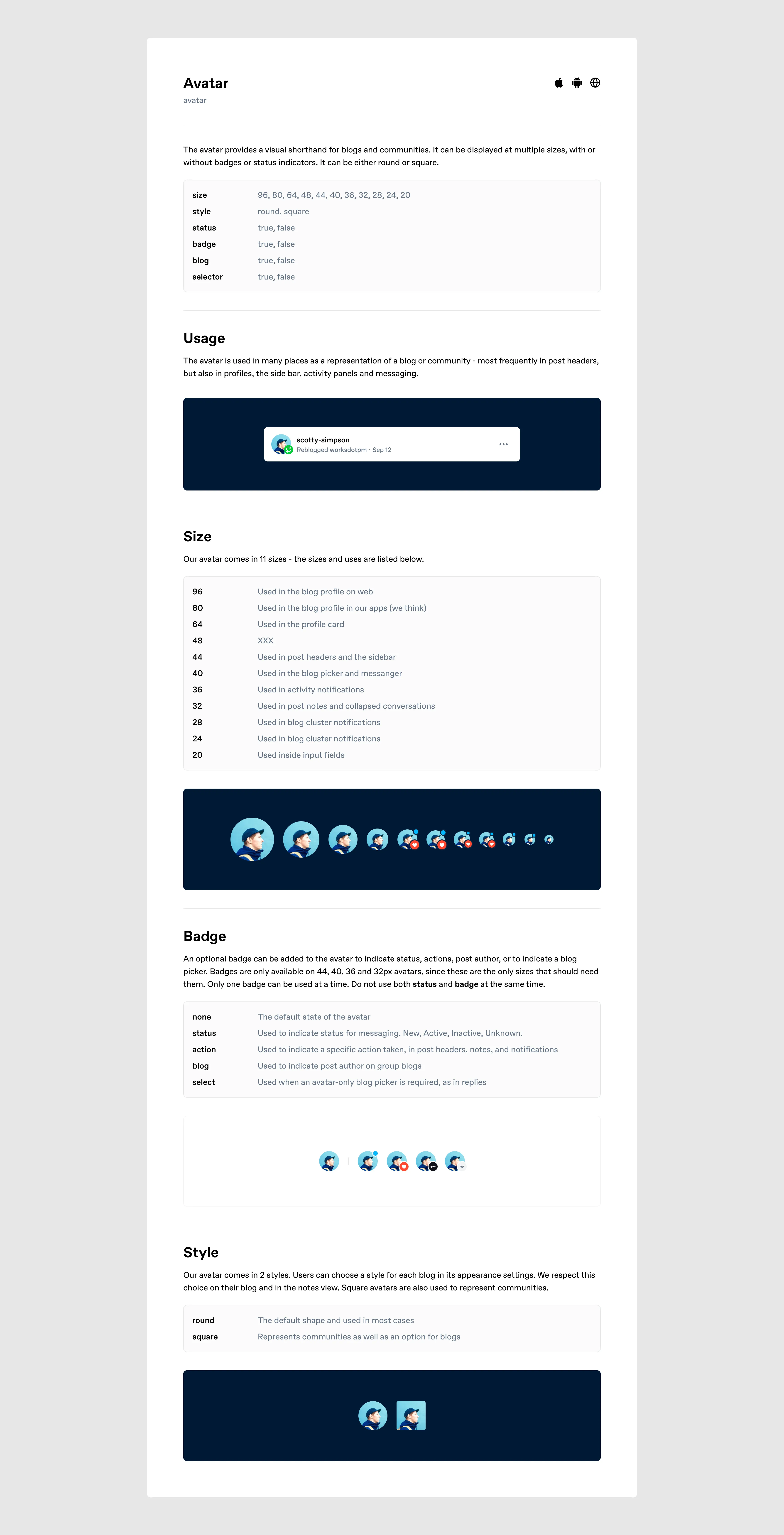
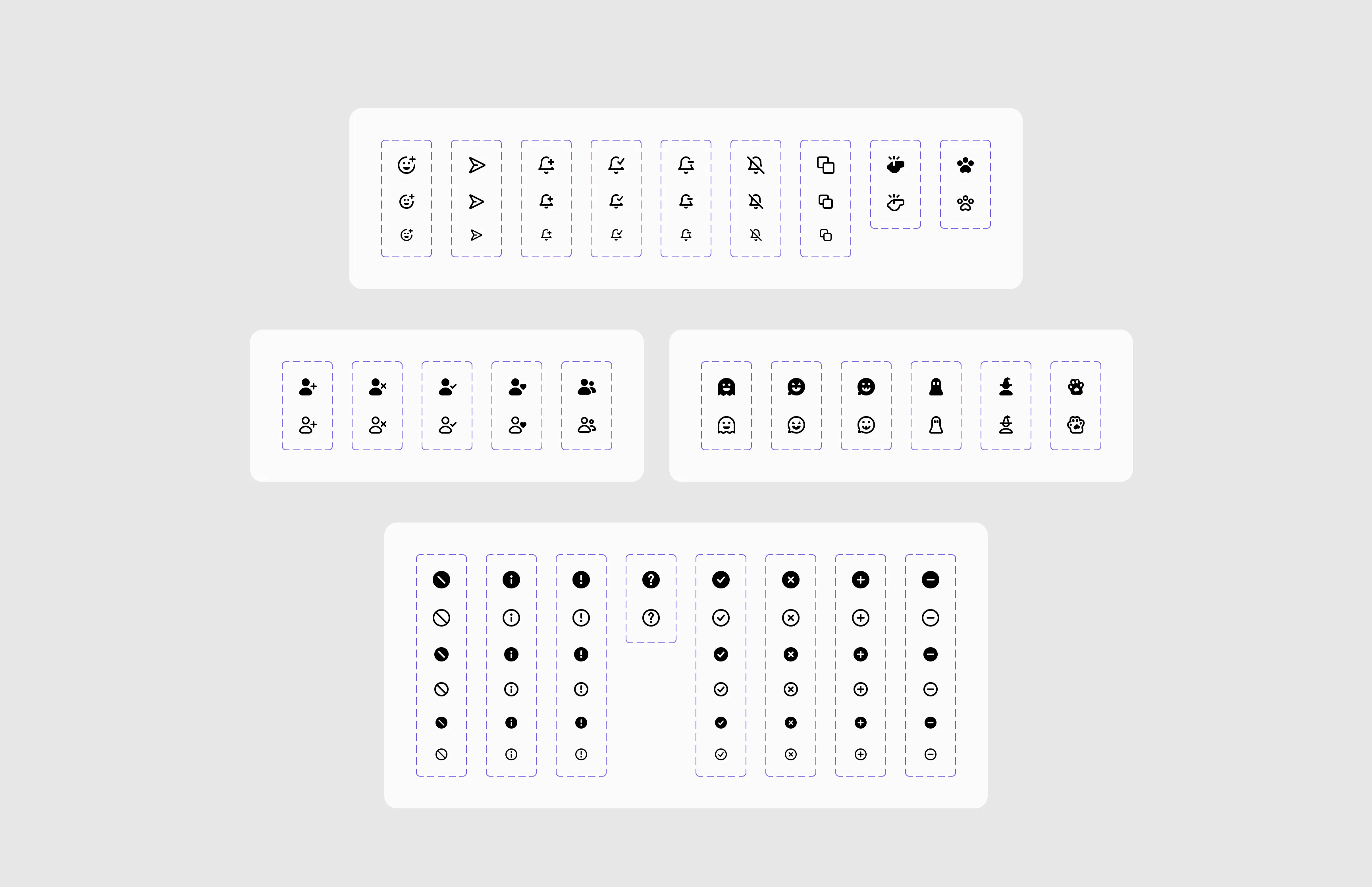
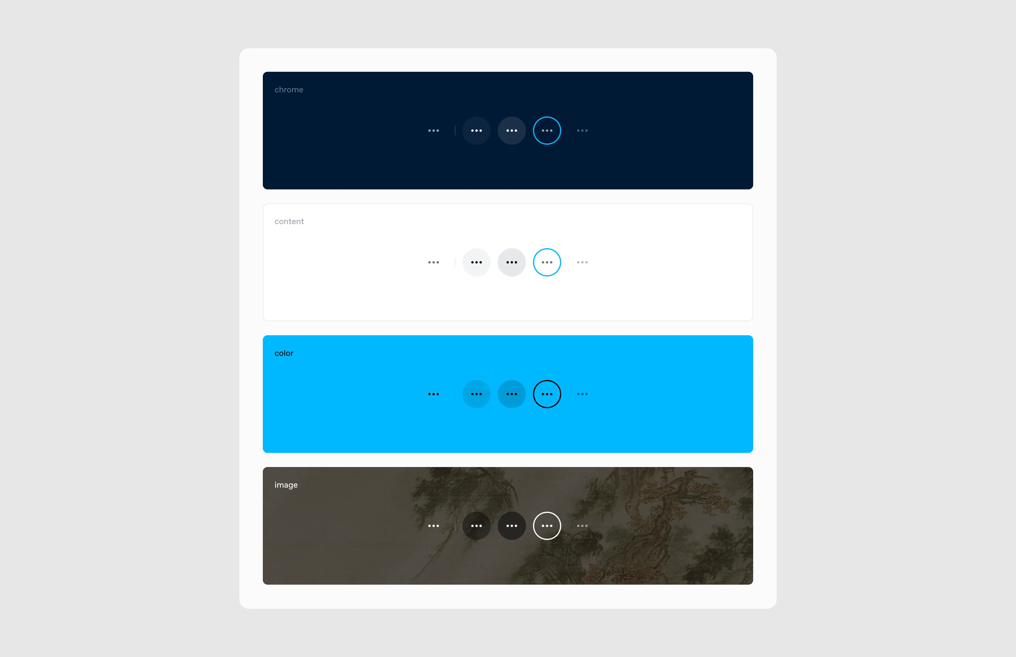
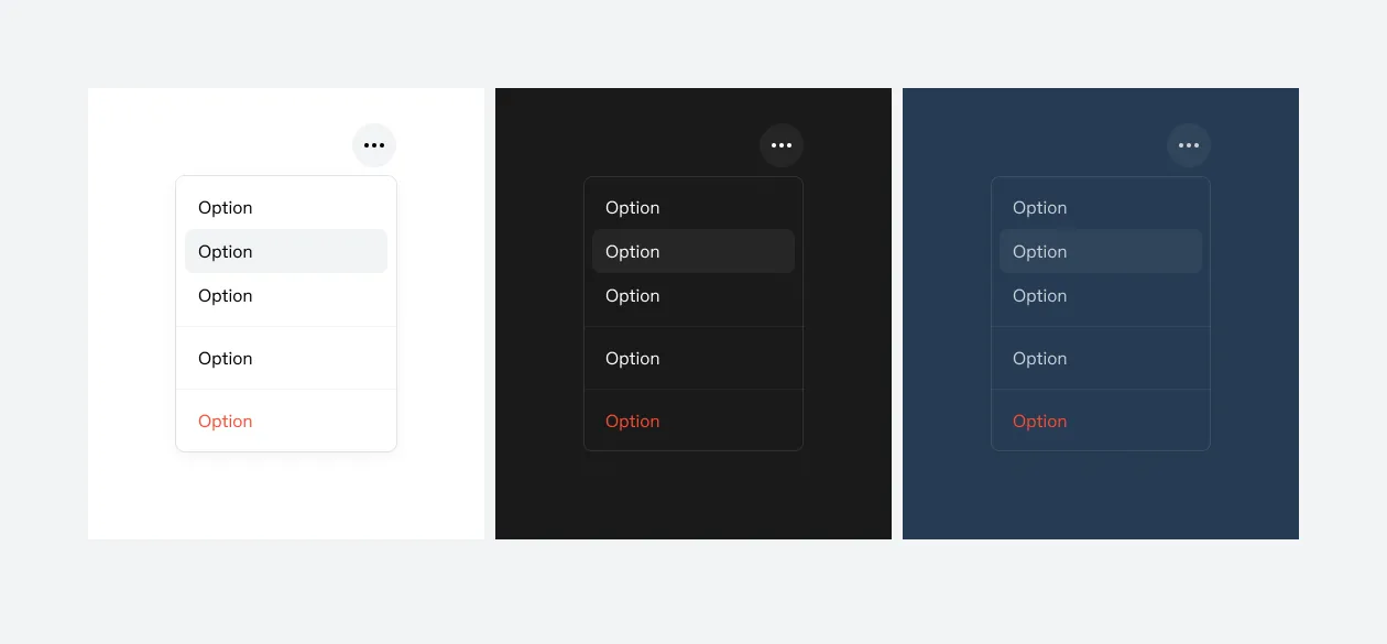
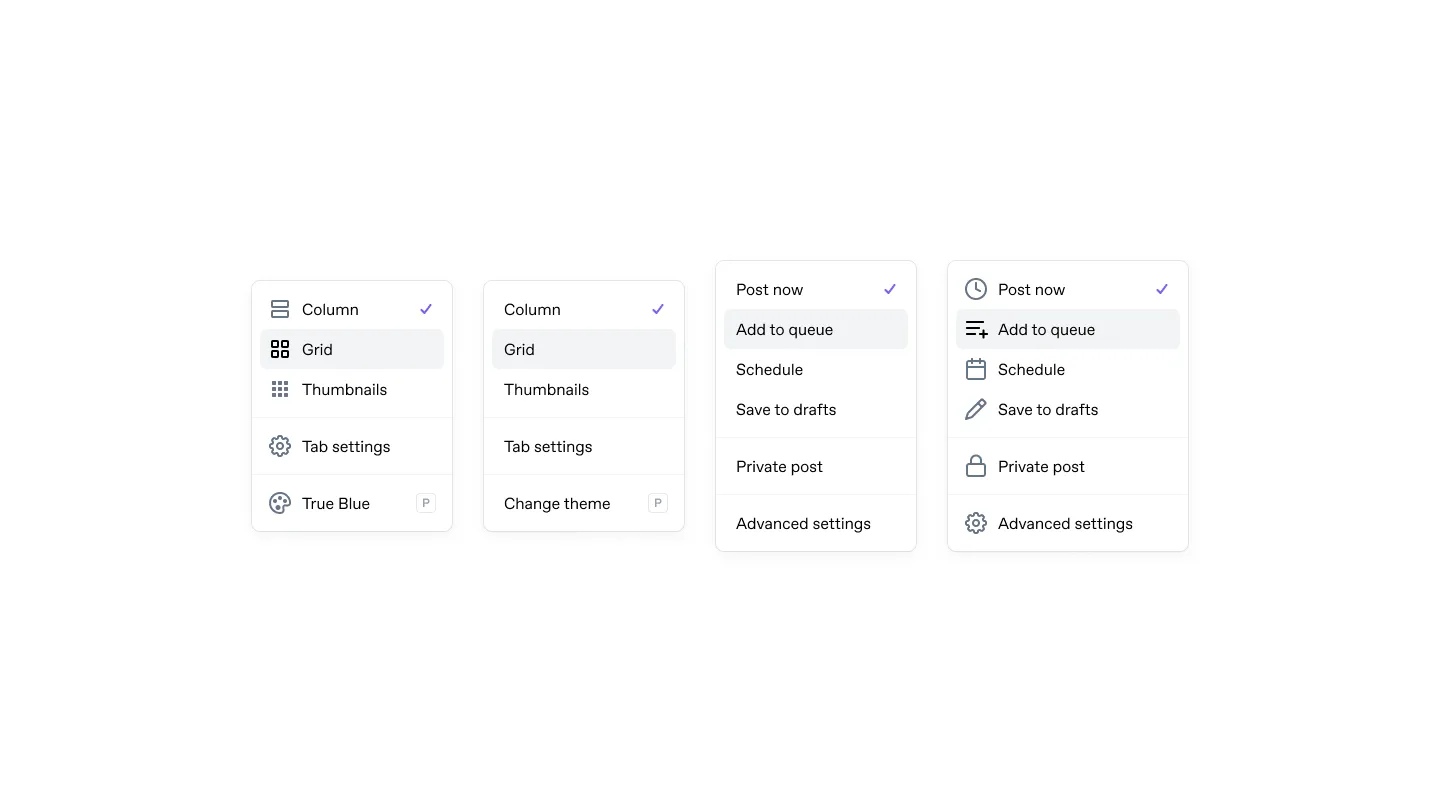
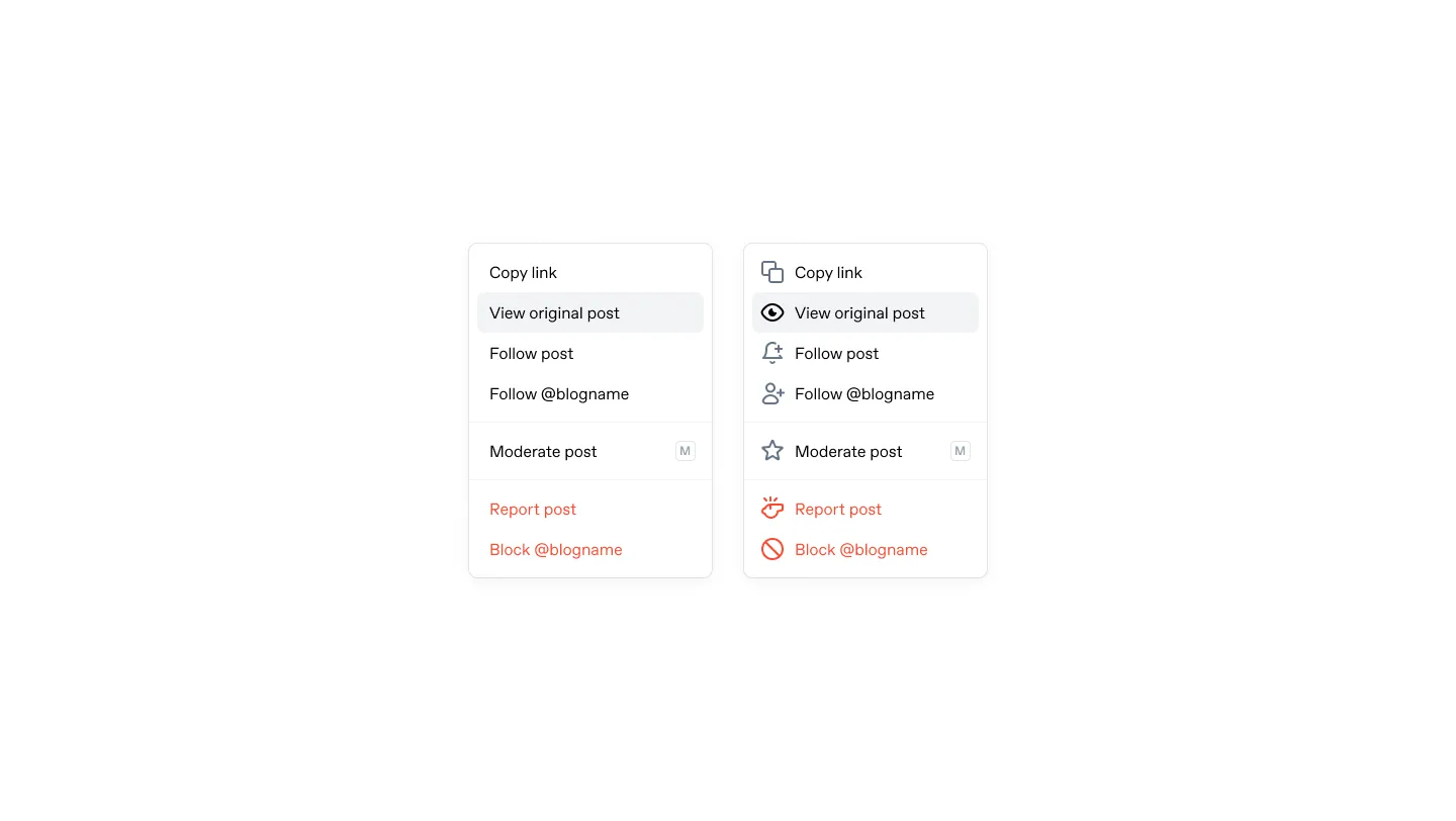
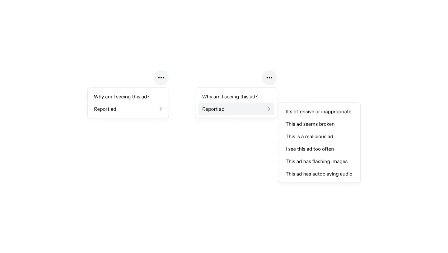
Menus
Menus appear throughout Tumblr: post overflow, publishing options, dashboard view selectors, ad reporting. We built a flexible menu component that handles icons, destructive actions, separators, submenus, and selection states.
Adoption
We still had 985 files using old variables.
We categorized the migration into three tiers: unambiguous replacements that could be automated, context-dependent ones where paletteBlack might map to $colorChromeFg or $colorContentFg depending on where the component sits in the hierarchy, and genuinely ambiguous cases that needed a human to look at the rendered UI and decide. I built internal tooling to speed up the second and third tiers, letting you click any element in the real UI, trace it back to its SCSS definition, and queue up replacements across files in a single pass.
Process
I set up a dedicated Friday session for design system work, open to designers, engineers, anyone contributing. The design team was already holding twice-weekly critique calls, which kept us aware of what was happening across product areas and helped us spot where to reuse components.
We tracked work on a GitHub project board across three lanes: design, engineering implementation (web, iOS, Android), and documentation (Storybook and Figma). We also introduced a requirement that a designer review all user-facing PRs. The team has reviewed about 200 since, and I’ve noticed fewer visual bugs as I use Tumblr outside of work.
Ongoing
From a design team retrospective: “Wish we had more design system work time. Feels like we have to fight hard for fundamental improvements.”
It happened alongside feature work, in whatever time we made for it. Alex Mititelu, a web engineer, did the theming rearchitecture that made the palette system work across 12 themes.
Communities, one of Tumblr’s largest recent features, was built on the design system. New features ship on tokens now. The legacy variables are still shrinking.