These projects came from paying attention to how Tumblr content moves through the world. I noticed problems, proposed fixes, and measured results.
Link previews
In September 2024, I sent a Tumblr post to a friend on Discord. The link preview showed a generic thumbnail, a truncated blog title as the page title, and no indication of what the post actually contained. On iMessage, it was worse: a tiny square with no useful information. On Bluesky, the OpenGraph metadata was so bad the preview was essentially blank.
I documented the problems in an audit post, which became the foundation for a full engineering project. We updated OpenGraph metadata for every post type (original posts, naked reblogs, reblogs with content) so that link previews render properly across platforms.
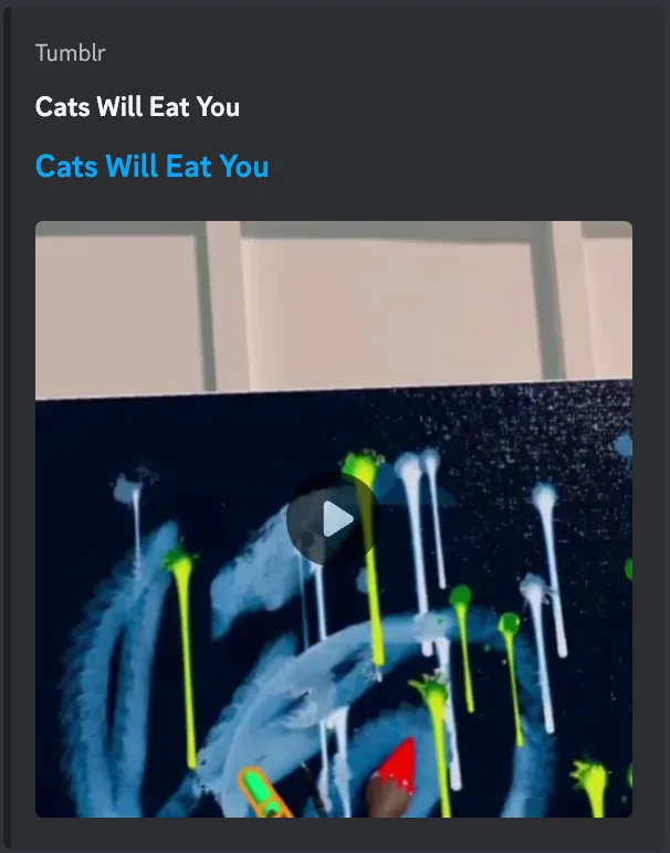
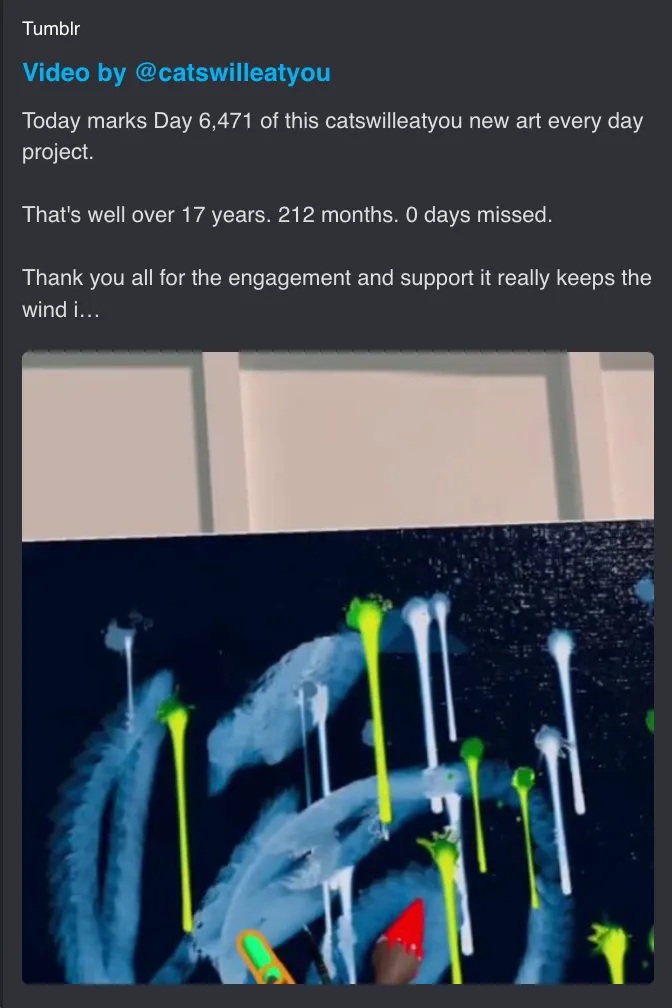
Fig 01 Before and after for a video post. The old preview repeated the blog name with no content. The fix surfaces the post type, author, and actual text.
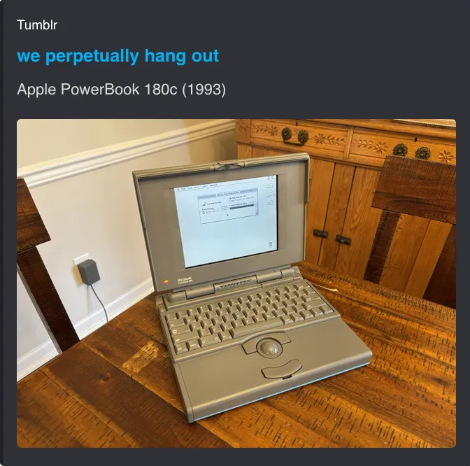
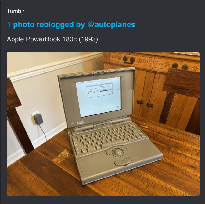
Fig 02 Before and after for a photo reblog. The old preview used the blog name as the title. The fix shows reblog attribution and the original post description.
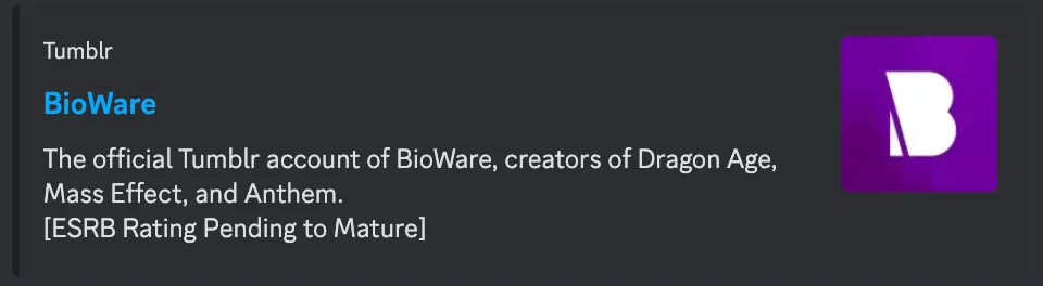
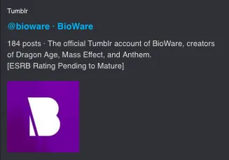
Fig 03 Before and after for a blog profile link. The old preview used the display name but was cramped. The fix shows the avatar larger and lays out the metadata more clearly.
In the year after the fixes shipped, permalink traffic from shared links grew 60%.
- Permalink traffic growth
- +60%
- Weekly views from shared links
- ~4M
Share sheet redesign
Tumblr’s old share sheet was designed around on-platform DMs. But usage data showed that we were underserving sharing off-platform (Discord, iMessage, other apps).
I redesigned the share sheet to make off-platform sharing easier, while keeping on-platform DMs accessible.
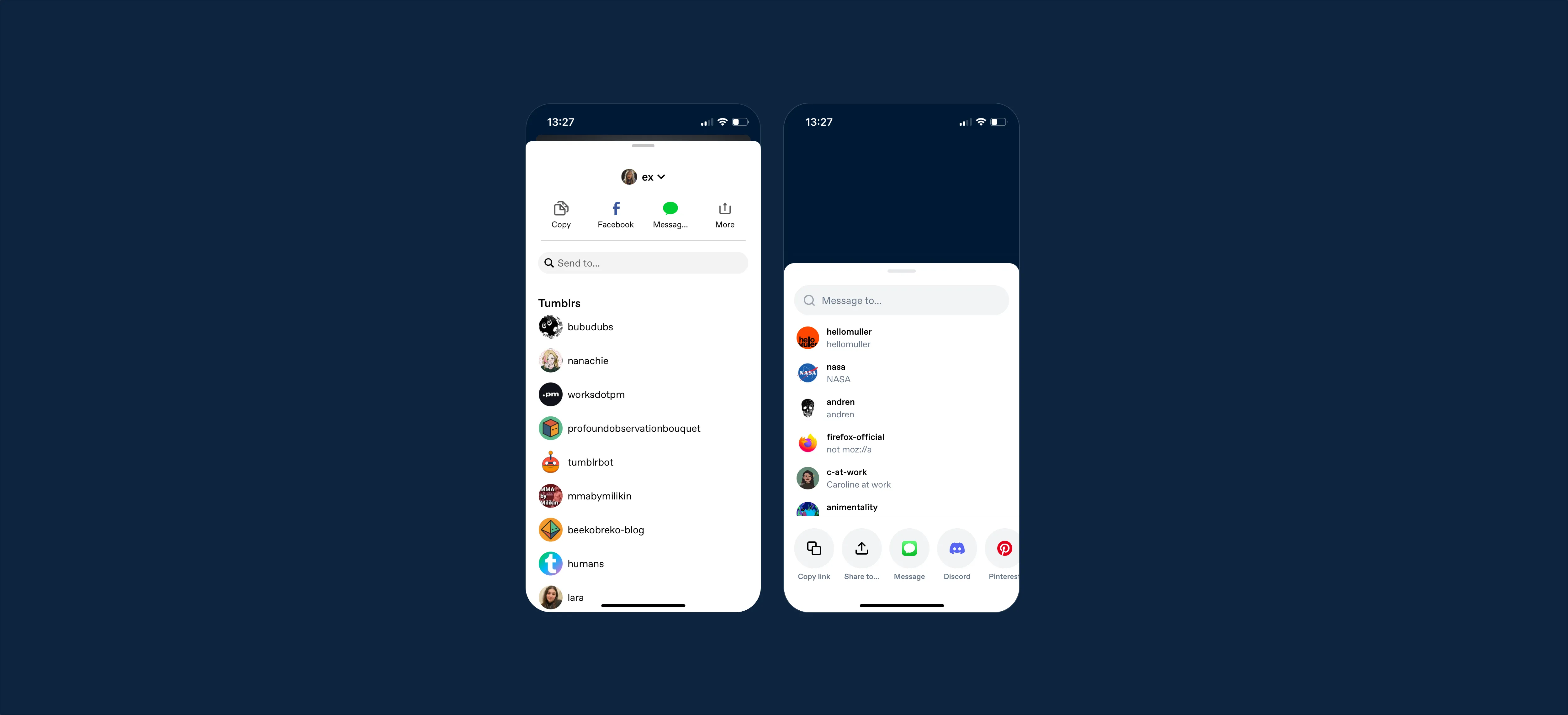
Fig 04 Before and after on mobile. The old share sheet (left) prioritized on-platform DMs with a list of Tumblr users. The redesign (right) leads with Copy link, Share to, and platform icons.
Key design decisions
Platform ordering by data. I ordered the external app icons based on installation data showing which apps Tumblr users have on their phones. The share sheet also uses device detection to only show apps the user has installed, then orders by their last-shared-to app. No guessing.
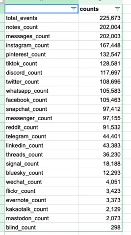
Fig 05 App installation data for Tumblr users.
The web version uses a modal with two rows of platform icons (avoiding horizontal scrolling that only works with trackpads) and a “Message to…” input for on-platform DMs that animates to reveal the conversation UI.
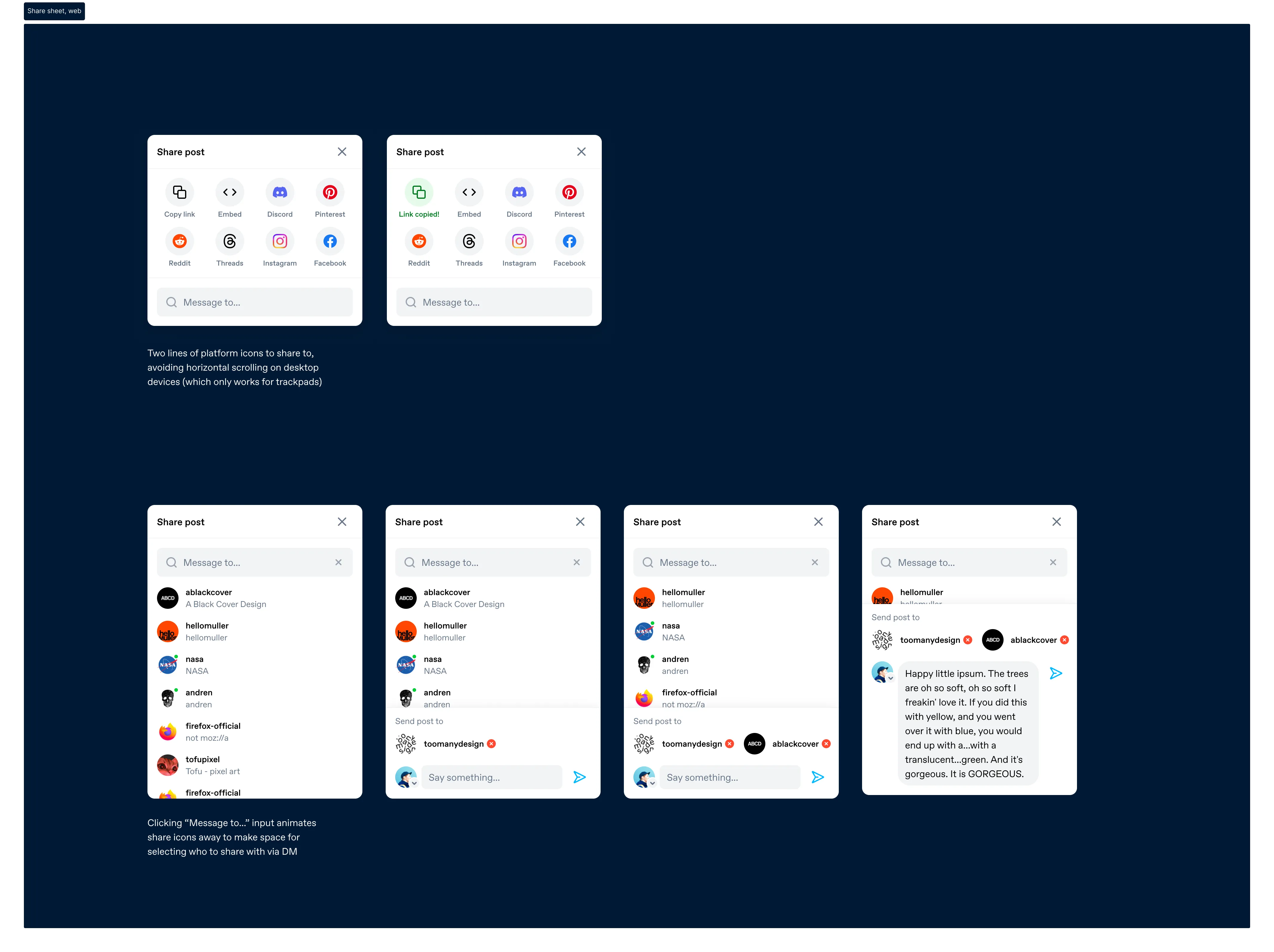
Fig 06 The share sheet on web. Default state (top left), link copied confirmation (top right), and the progressive DM flow: searching users, selecting recipients, composing a message.
On mobile, platform icons are displayed as a grid with Copy link and Share to (native sheet) at the bottom. Tapping “Message to…” slides the platform icons away and brings up a keyboard with the user search.
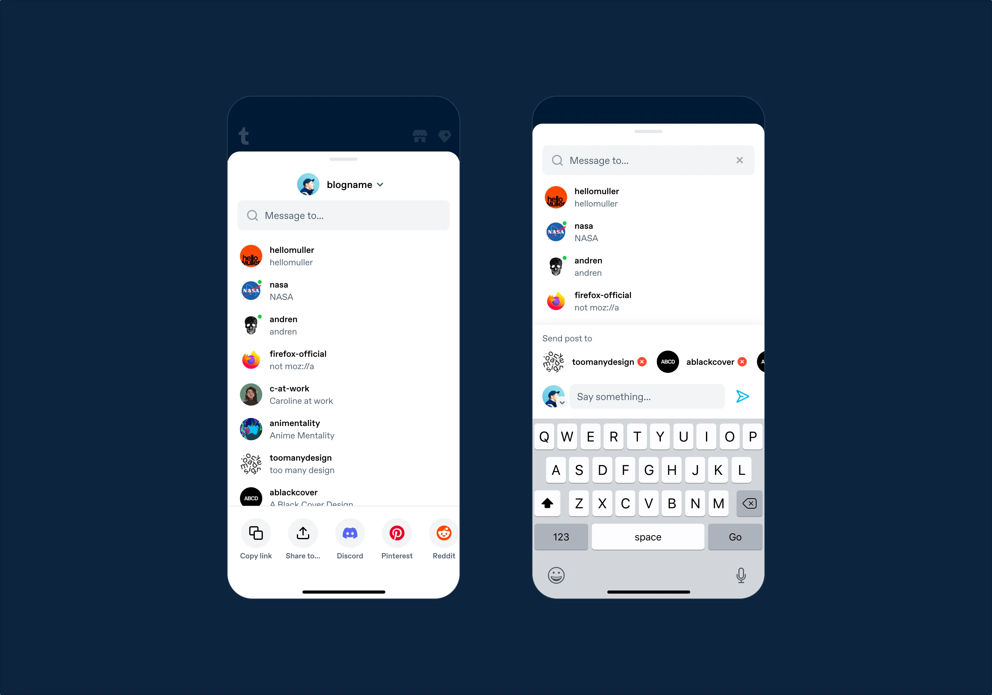
Fig 07 The shipped mobile share sheet.
Instagram Stories + Save as Image
I designed a flow where users can share any Tumblr post as a branded image to Instagram Stories. The post is rendered as an image with the Tumblr logo.
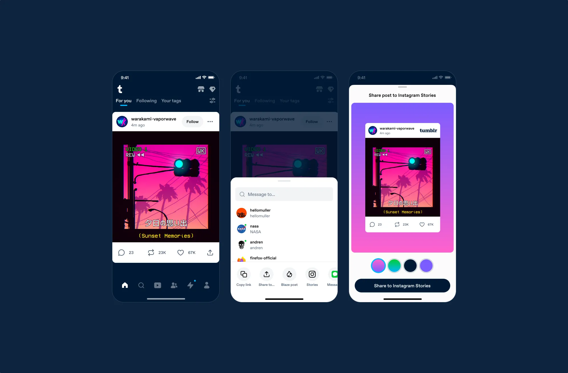
Fig 08 The full Instagram Stories flow: post in feed → share sheet with Stories option → Stories editor.
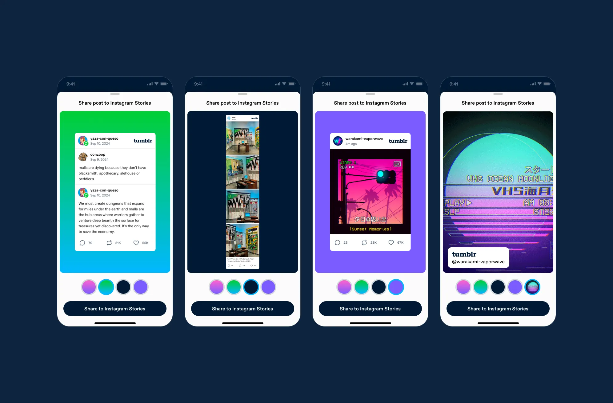
Fig 09 Background variations.
For posts with video or GIFs, the media becomes the background, and the Tumblr attribution becomes the sticker.
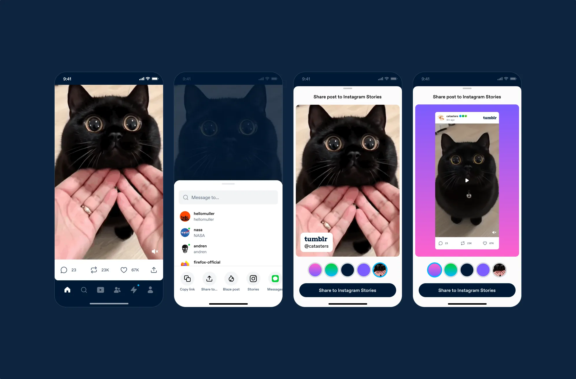
Fig 10 Video posts.
I also added a “Save as Image” option, which saves a post to their device with Tumblr branding.
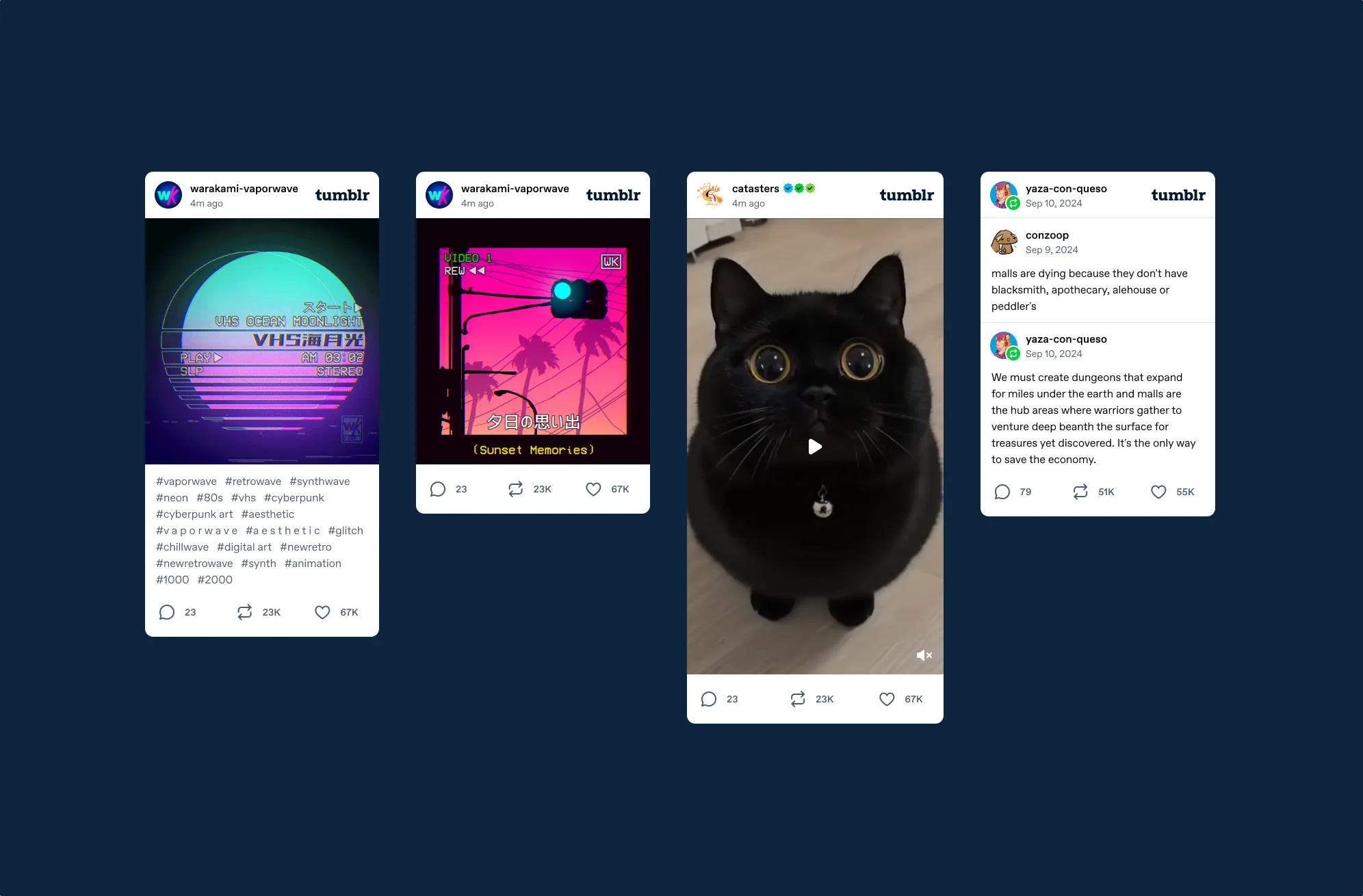
Fig 11 Save post as image.
Results
The share sheet was A/B tested across all platforms:
- App sharing (Android)
- +118–173%
- Share to Instagram
- +45%
Notification copy
Tumblr sends a push notification when a blog you follow posts after being inactive. I noticed the notification titles were being truncated on mobile, cutting off the blog name (the most important piece of information). This was a pattern I’d been writing about more broadly: our interface copy used more words than necessary and prioritized quirky personality over clarity. I suggested putting the blog name first and cutting each variant down.
- “Guess who’s back? It’s <blog>!” → “<blog> is back!”
- “<blog> returns to the scene!” → “<blog> returns!”
- “Alert: <blog> breaks the silence with a post!” → “<blog> breaks their silence!”
- “<blog> is back and ready to rock!” → remove
- “Stop the presses! <blog> makes a triumphant return!” → remove
- “Calling all fans: <blog> resurfaces with a new post!” → “<blog> resurfaces!”
- “The prodigal blogger returns: <blog> is back!” → remove
- “<blog> breaks their silence with a post!” → remove
- “Attention, Tumblrverse: <blog> is back in action!” → “<blog> is back in action!”
- “<blog> emerges from hibernation with a fresh post!” → “<blog> emerges from hibernation!”
- “Attention: <blog> is back in business!” → “<blog> is back in business!”
We A/B tested the shorter copy.
- Notification opens
- +6.5%
- Sessions
- +1%
App Store screenshots
I designed updated screenshots for the App Store and Google Play that better represented Tumblr’s current experience.
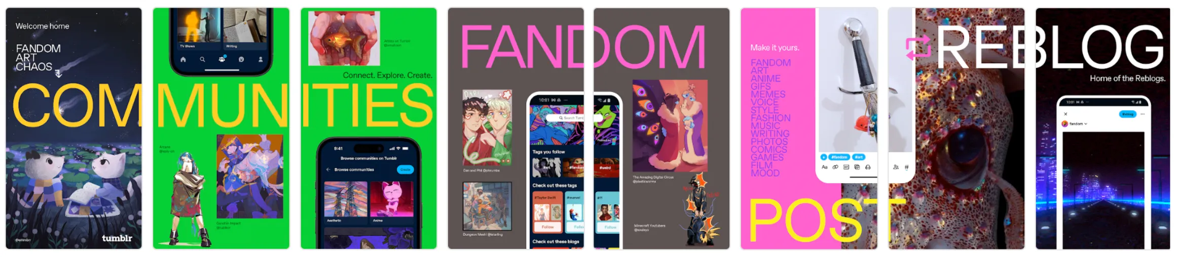
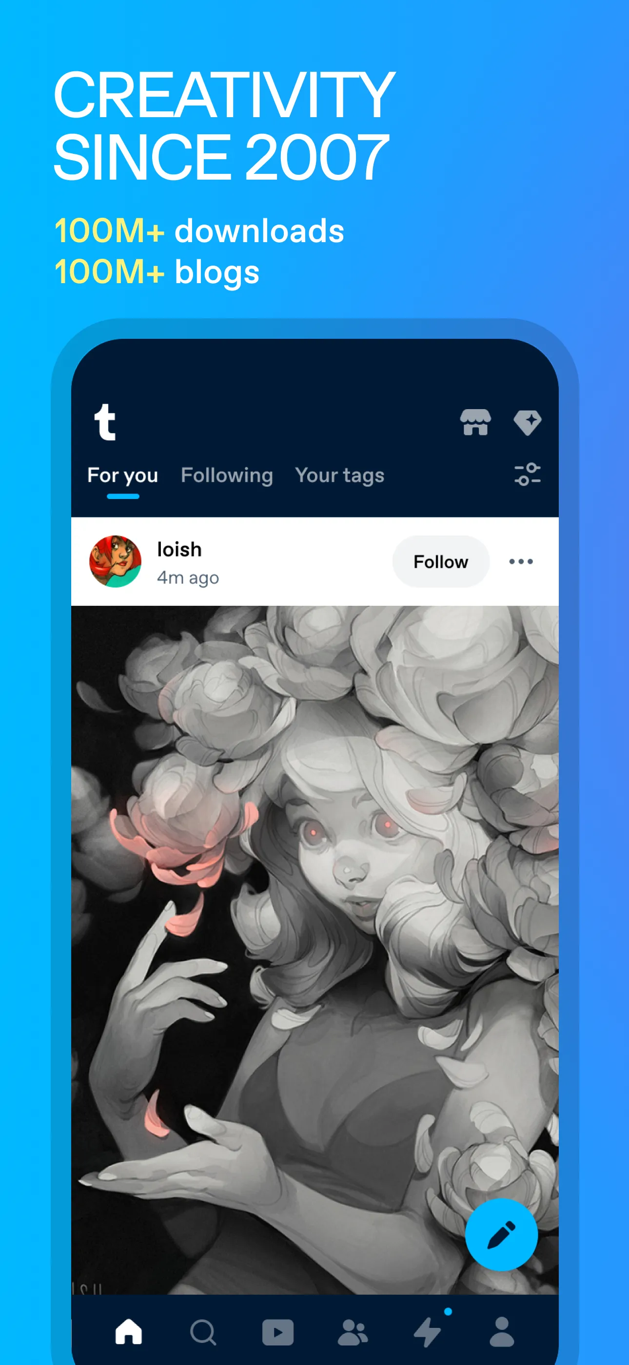
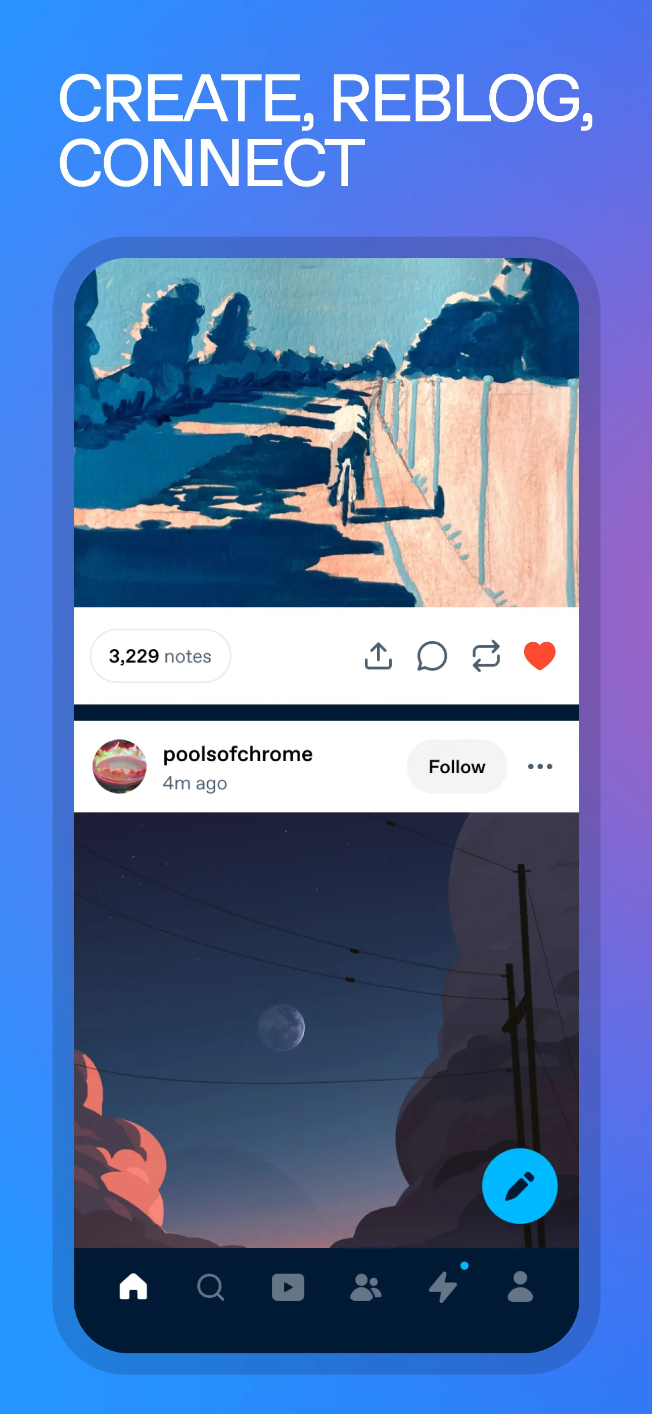
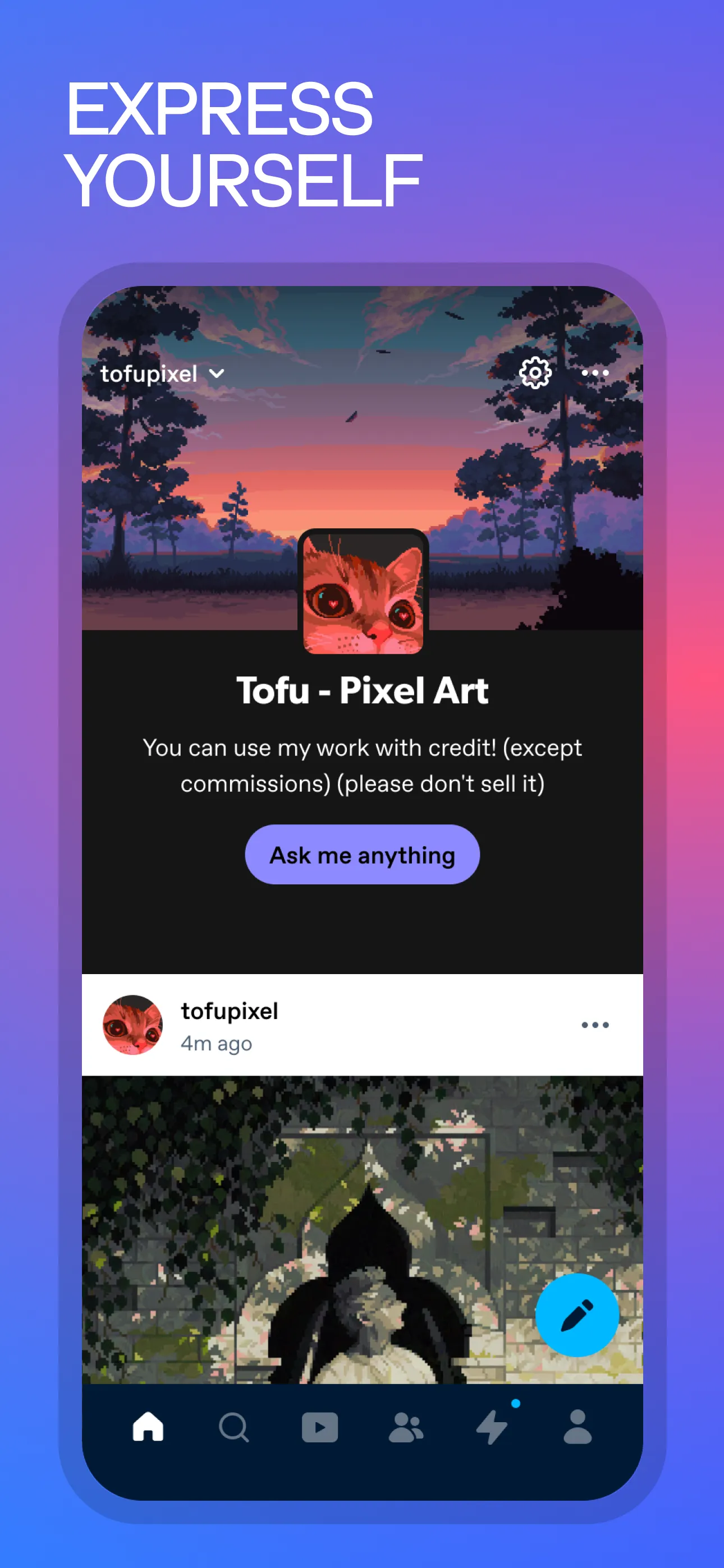
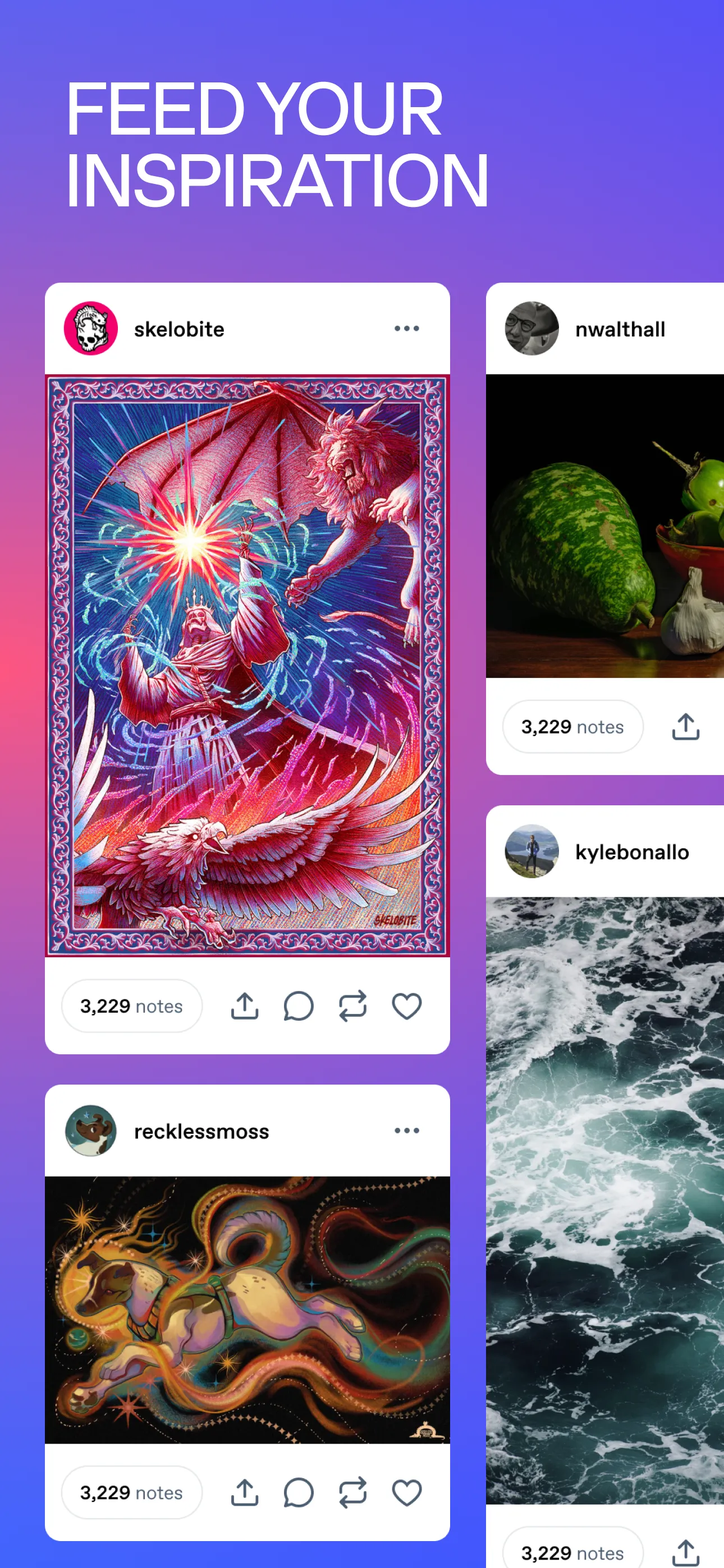
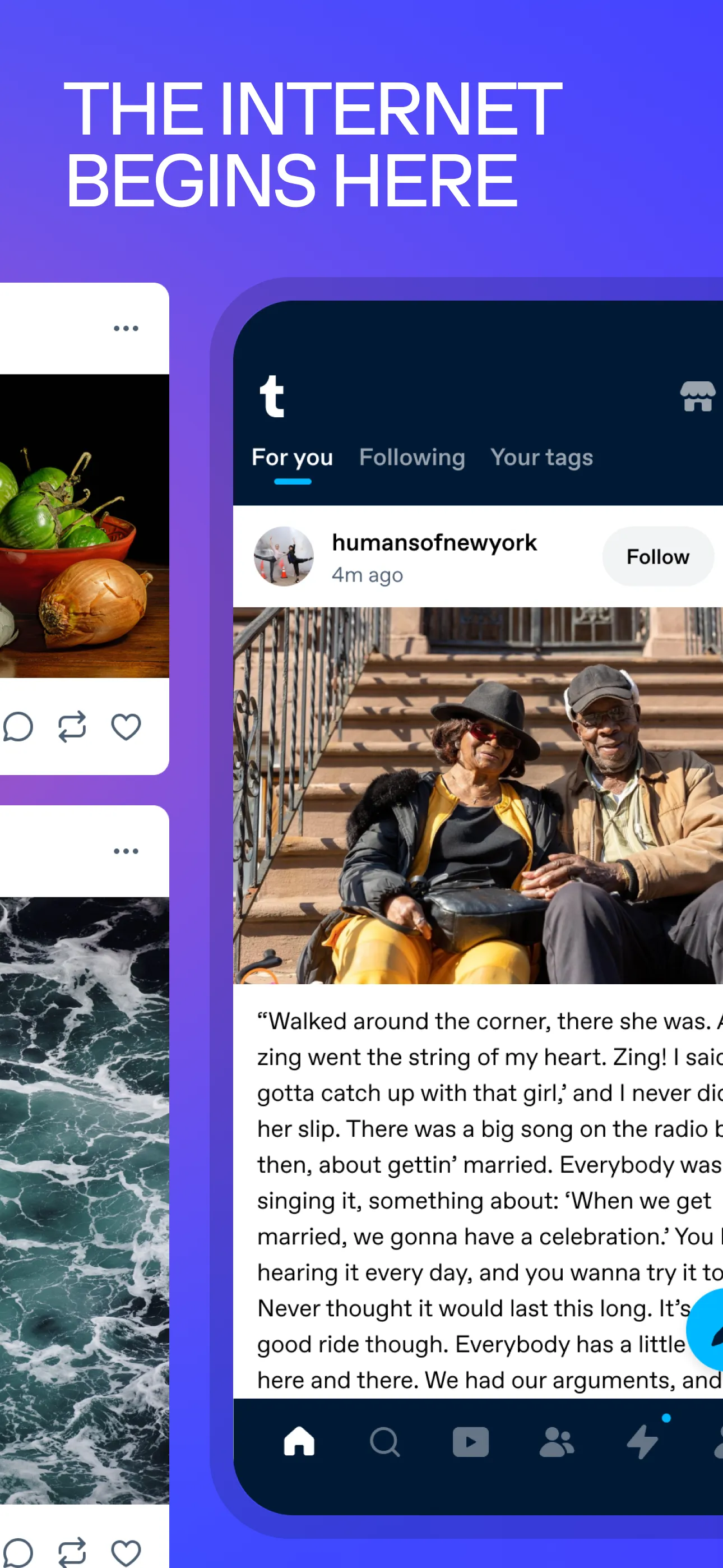
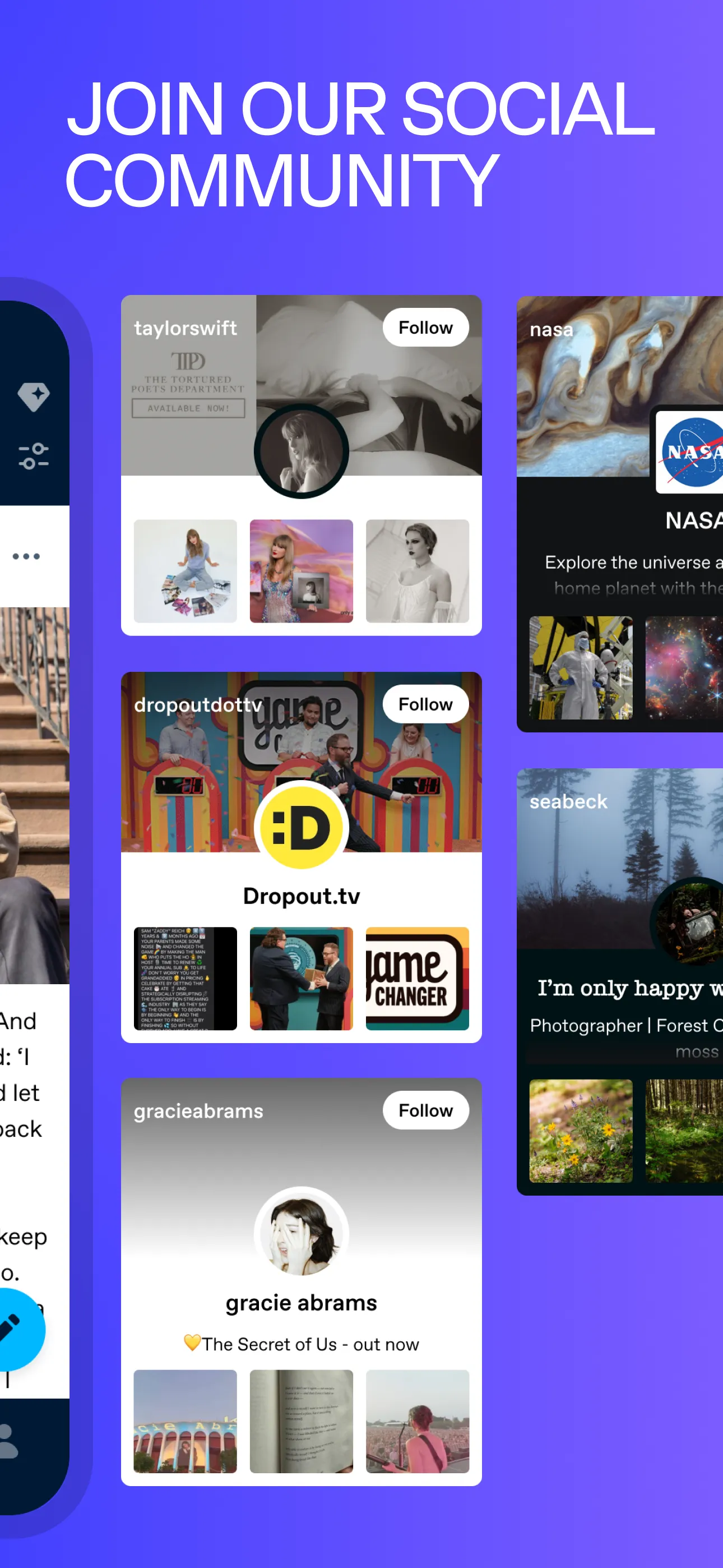
A/B tested via App Store Optimization:
- Install rate
- +1.6%