The problem
Tumblr’s onboarding showed a lot of general topics to follow, with some breakdown into subtopics, but after they finally reached their dashboard for the first time, many of them never came back for a second session.
We audited the flow, ran usability tests with non-users aged 18–25, and conducted research focused on Gen Z new users who’d been on the platform two to six months. Here’s what we found:
Content was static. Topics to follow were a static list that needed manual updating. We weren’t doing that frequently enough, and they were stale. The splash screen welcoming new users displayed work made by creators on Tumblr, but the selections showcased older work, instead of current creators.
Topic selection felt like a broken promise. New users meticulously chose topics from our list, but the feed they landed on afterward didn’t reflect what they wanted. Part of the problem was the stale list, another was only following high-level topics, and not being given a chance to say what they came to Tumblr for, if they wanted to. They weren’t given a reason to come back.
Login and signup were separate flows. We needed to serve both new users and existing users who downloaded the app to log in. It might seem obvious that someone should remember their account email, or whether they had an account, but when the platform is as storied as Tumblr (you might have an old account, or have multiple accounts and blogs), it’s not always a surefire thing. Pick the wrong one and you have to back out and start over.
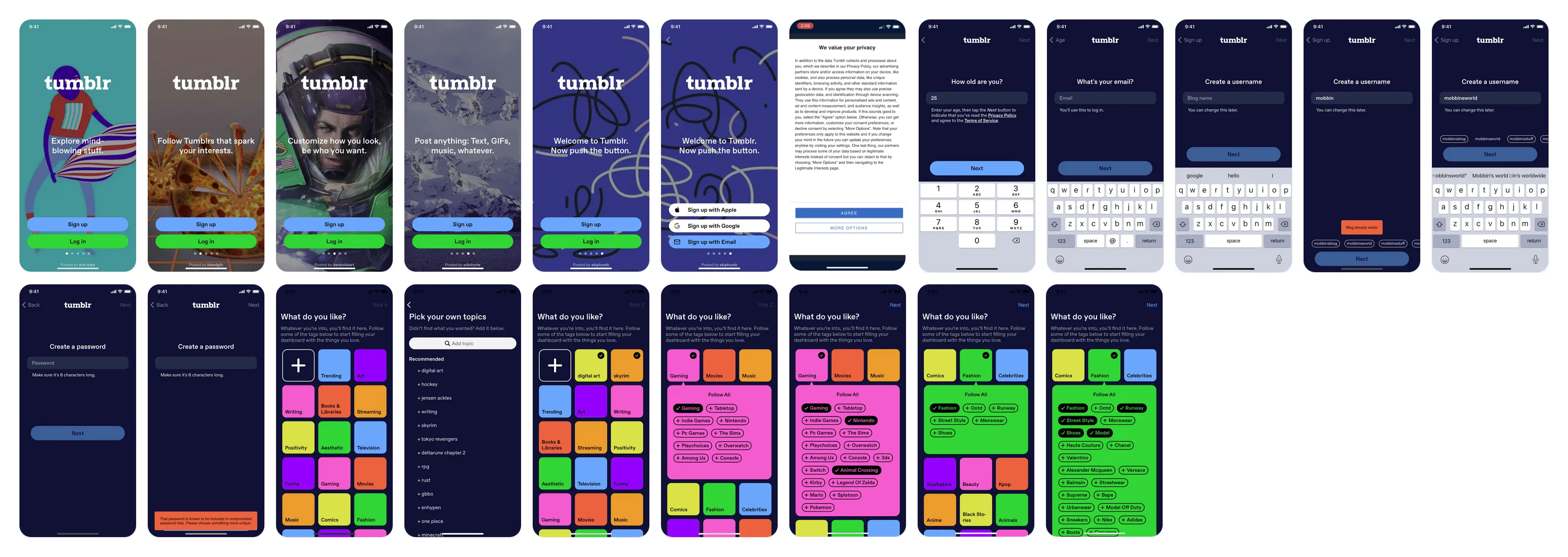
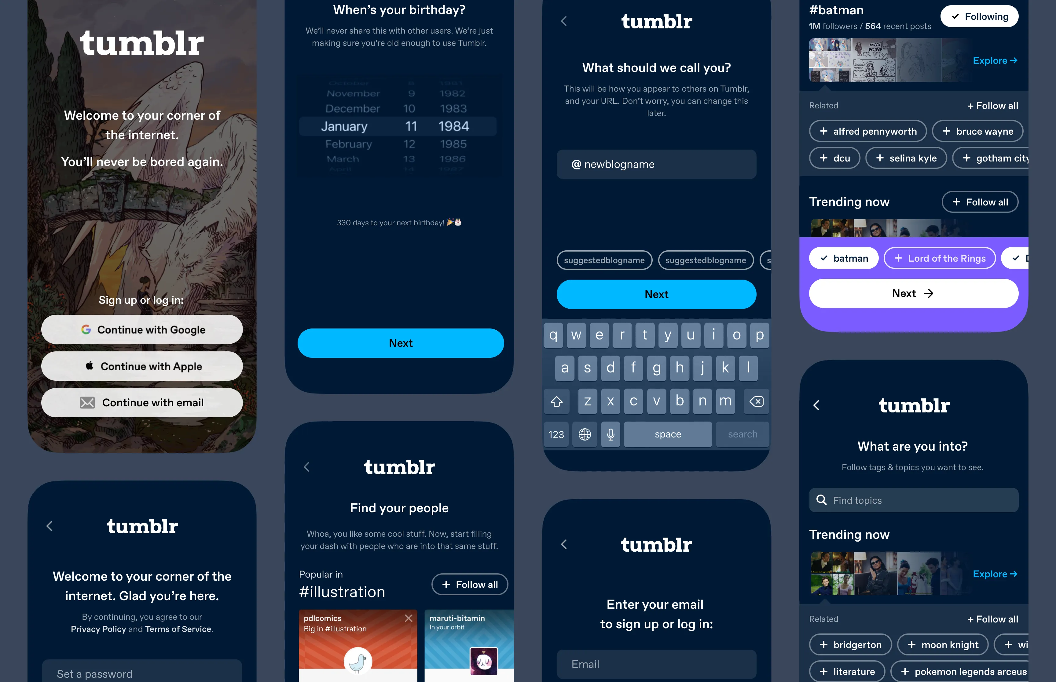
Fig 01 The full existing app onboarding flow.
Fig 02 The topic selection area. Dense, but static.
What kept new users around was both finding content that resonated, and having early engagement with another person, through a like, a reblog, or an ask. Topic selection alone was a more indirect path to finding someone to vibe with.
Topic onboarding was static and hand-curated, didn’t show a taste of the content, and the supertopics were so general they didn’t lead to interesting enough content. So a possible solution was to provide a more direct route to people, the communities creating the interesting posts in the topics they just said they were interested in seeing.
Exploring flows
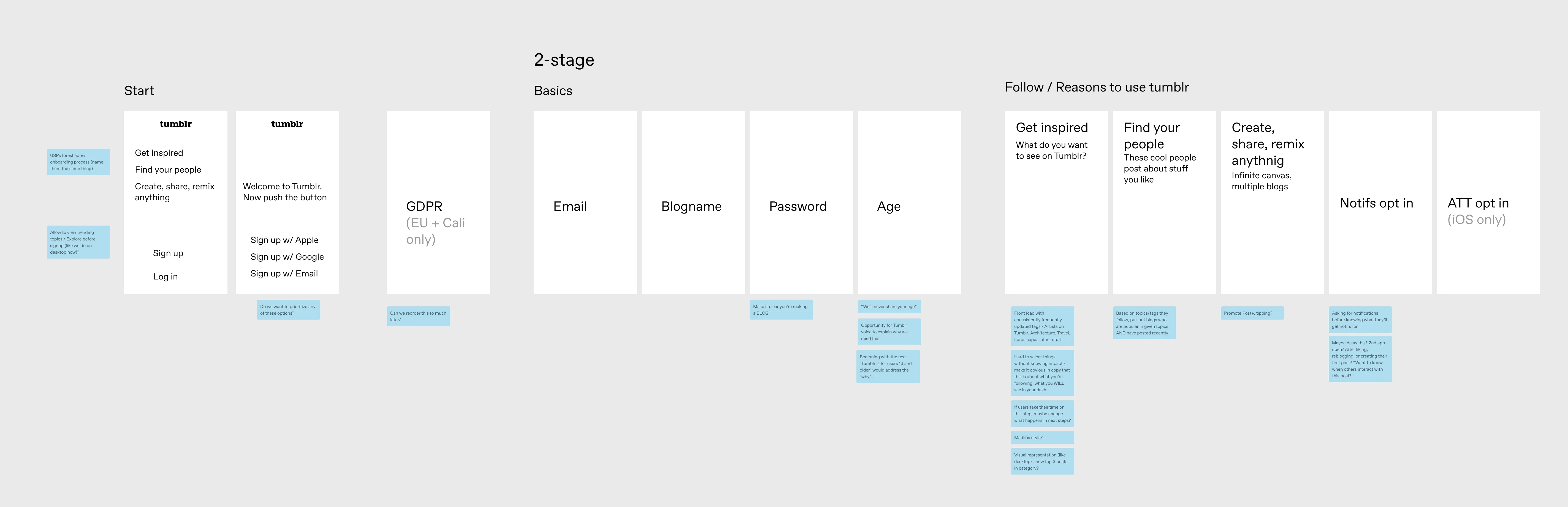
Fig 03 Mapping possible flows against user goals and technical constraints.
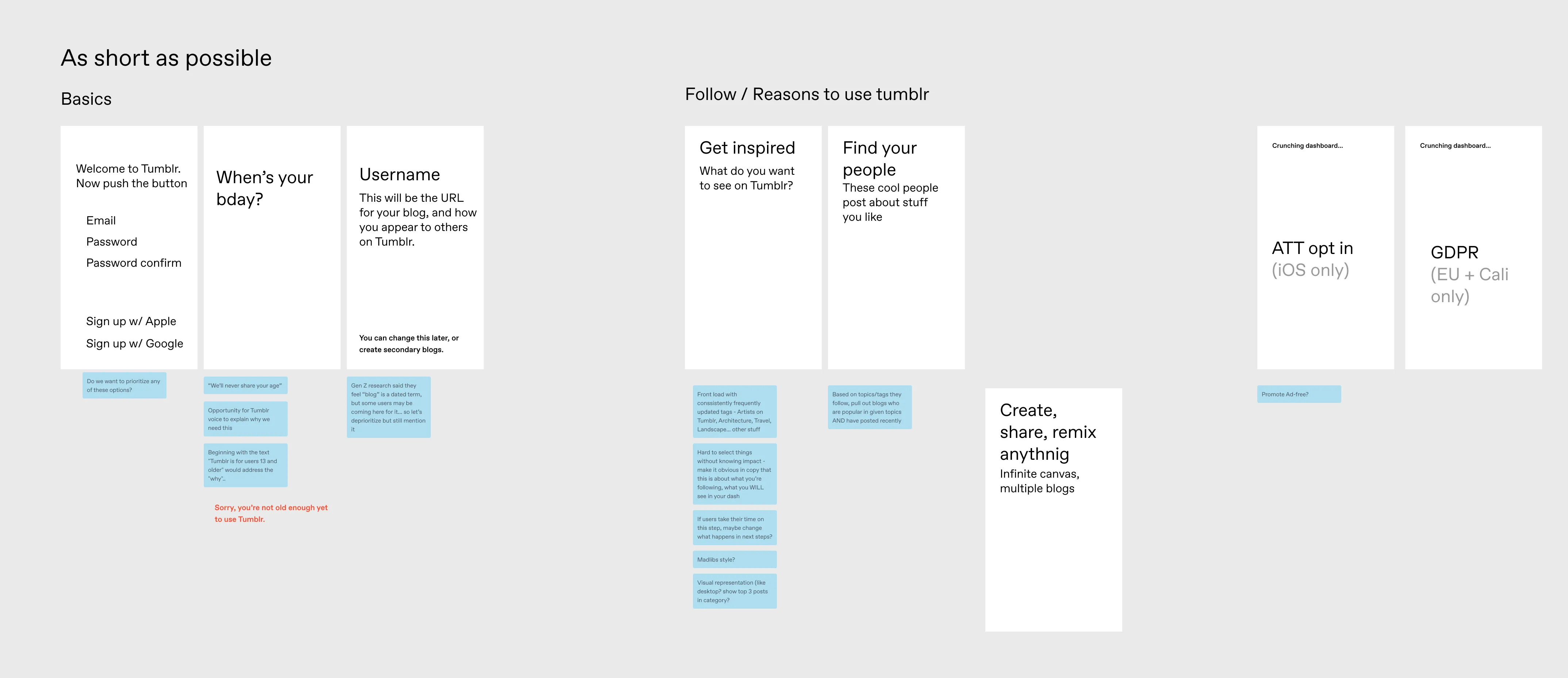
Fig 04 Shortened flow. Prioritize finding content, get administrative info out of the way quickly. This is the direction we went with.
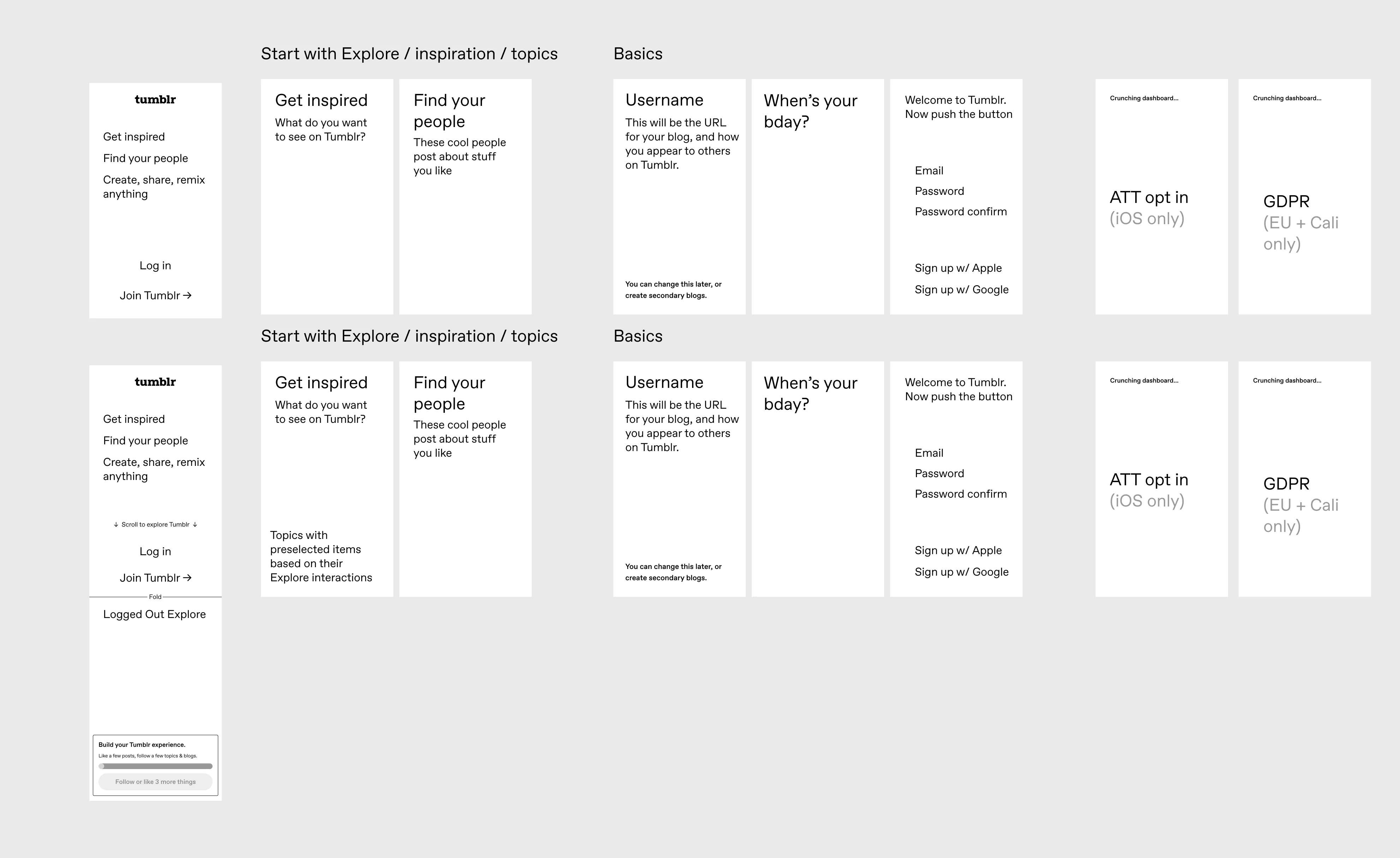
Fig 05 Allowing exploration to encourage interactions before account creation.
We liked the idea of letting users explore and find content the liked to inform the account they hadn’t created yet. But attributing interactions without an account to link it to proved difficult, so we went with the shortened flow and focused on getting users to follow real blogs faster.
What we tested
Login and signup were combined into a single flow. Sub-topics were visible by default, updating dynamically so the editorial team didn’t have to curate by hand. Imagery was surfaced from each topic to illustrate what you’re getting. If you know a specific topic you’d like to follow that’s beyond the usual topics, you can search for it, see how popular it is, follow it.
After you select your topics, you’re recommended popular blogs in those topics to follow, so new users would follow blogs with recent posts, not just tags. I hypothesized that if your feed is populated by blogs you actively chose, your first session is more likely to contain something worth engaging with.
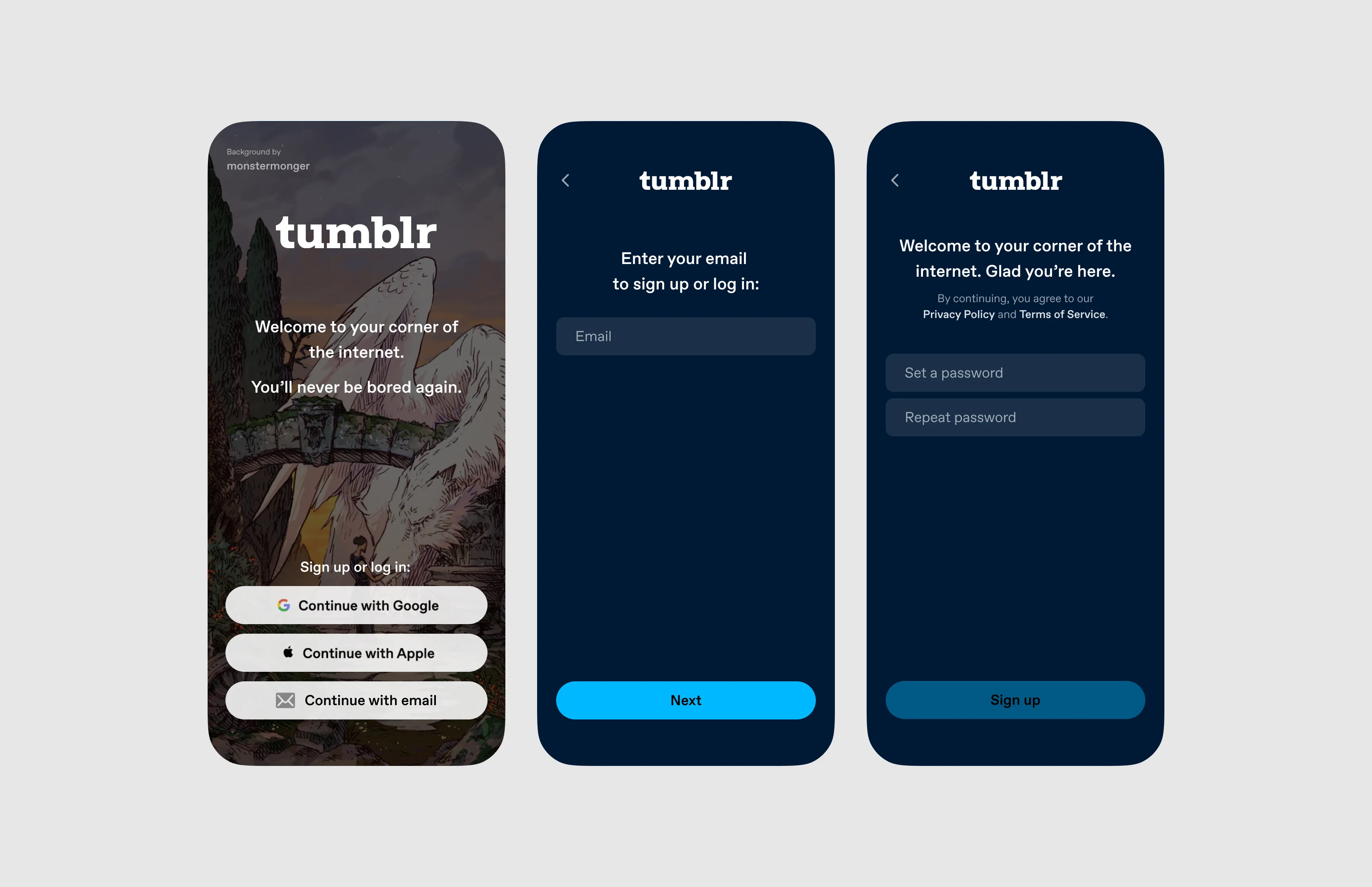
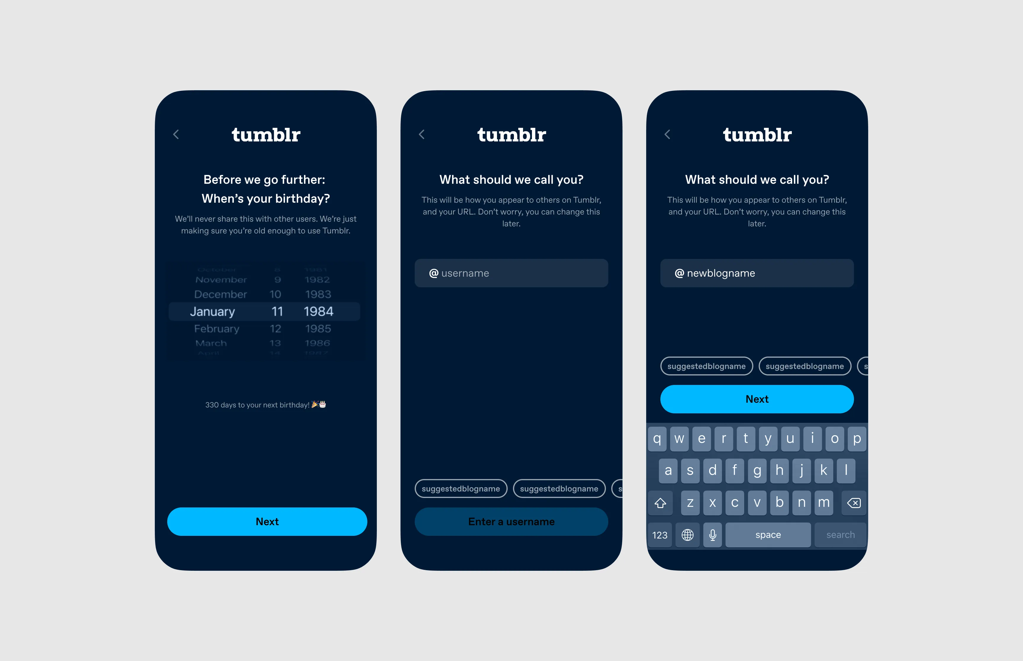
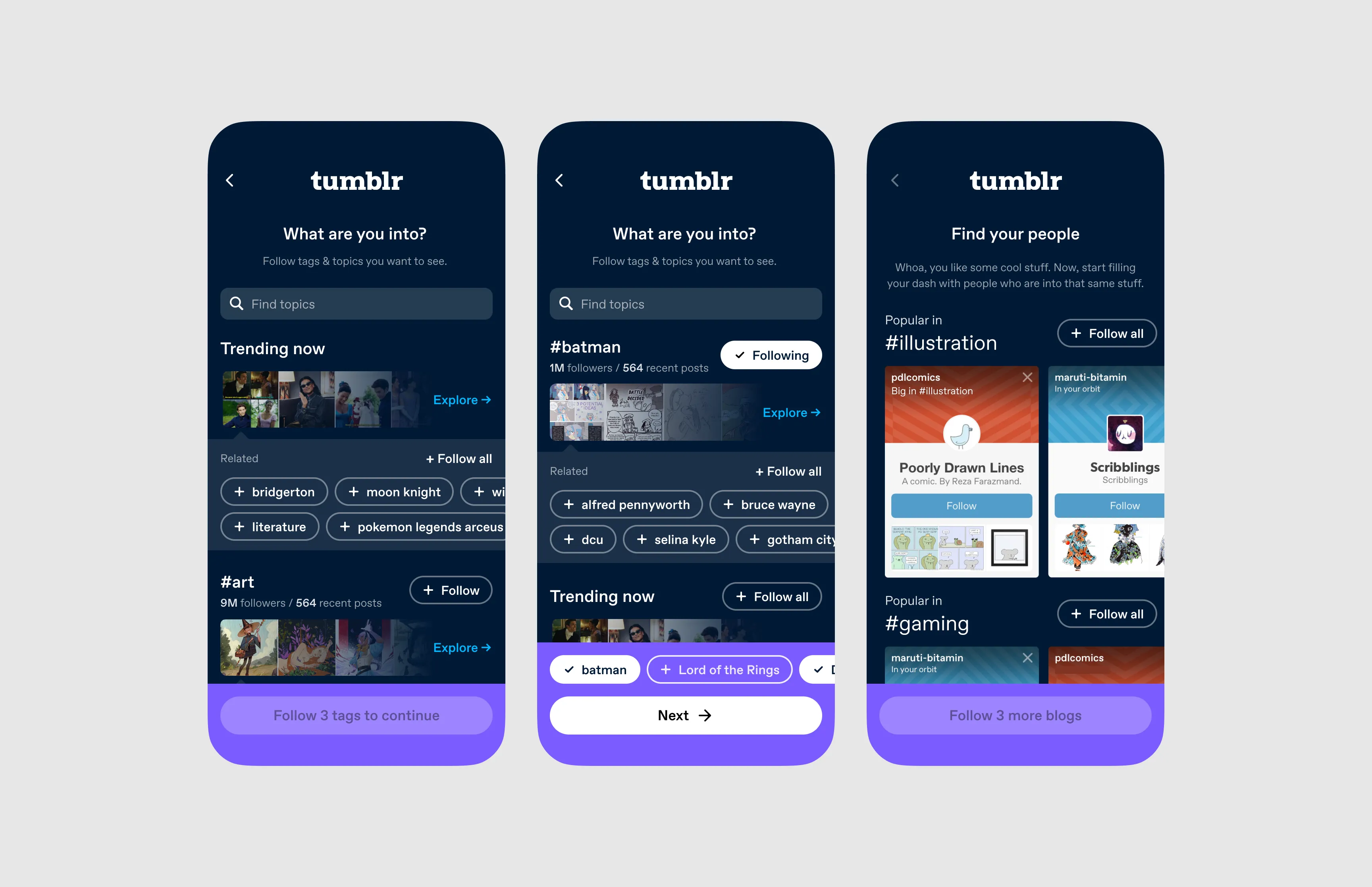
Fig 06 The shipped onboarding flow.
Results
We A/B tested on 50% of iOS traffic over a month. Blog following surged, as expected (the step was brand new).
- 28-day retention
- ~2x
Nearly doubling 28-day retention confirmed we were giving people a reason to return. We scaled it to Android, mobile web, and desktop.