This project predates both the design system and the post footer redesign. The screenshots reflect the old visual language.
The problem
Tumblr had been building features for years: “For You” feed, “Your Tags,” Explore, TumblrMart, Blaze, domain purchasing, badge management. But we hadn’t rethought where these things lived on desktop. Every new feature got squeezed into the Account dropdown (which had become a junk drawer) or left as an unlabeled icon in the header.
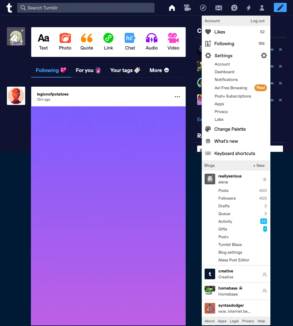
Fig 01 The Account dropdown: a junk drawer. Likes, Following, Settings, Change Palette, blogs, and every feature added in the last several years, all in one menu.
Web signups and DAUs were climbing, approaching Android levels for the first time. But we hadn’t prioritized the desktop experience. Our navigation icons were unlabeled. Research from NN/g consistently shows that the best icon is a text label. We had the screen space to label things, but we weren’t using it.
A few things I knew going in:
- We had a wealth of recommended and trending content in Explore, but far fewer people visited it on web compared to the apps. The icon alone wasn’t enough to communicate what was there.
- Most people who post original content on Tumblr do it via web. Original posts on web were consistently more than double those created on mobile.
- I’d first run into scalability problems ten months earlier, trying to figure out where to place dashboard tabs on desktop and finding no good spot in the existing horizontal layout. “For You,” “Your Tags,” and the configurable tabbed dashboard were UI afterthoughts on web, requiring animation workarounds to avoid eating too much vertical space.
The hypothesis
Clearly labelling navigation would make Tumblr easier for new users to understand, and move all users beyond the main feed.
I framed the objectives around two lenses:
Business: Increase post impressions and ad impressions by giving content more vertical space. Set a foundation to make it easier to scale features, so that new additions like TumblrMart, badges, and masonry layouts had a clear home.
User: Make it easier to discover settings, customization, and messages. Give content more room on every page.
The design
I started from mobile web. Our mobile navigation already had some of the patterns I wanted (expandable settings, a bottom tab bar with labels) and I worked upward from there to keep parity between mobile and desktop.
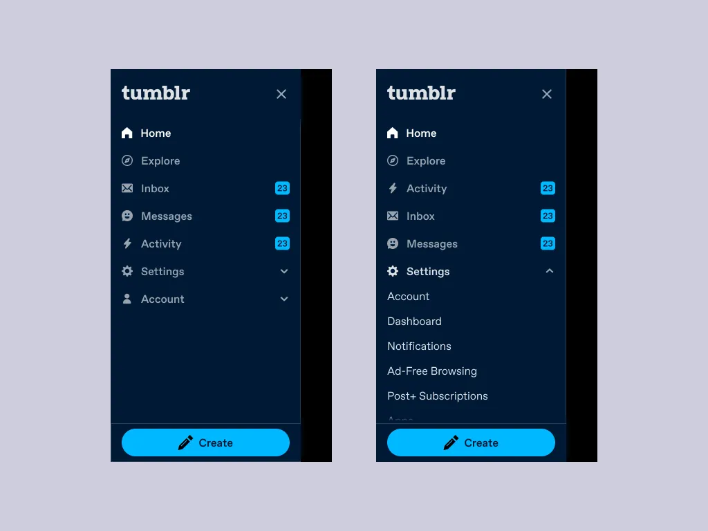
Fig 02 The mobile web navigation. Collapsed (left) and with Settings expanded (right). These expandable sections informed the desktop left rail.
The core idea was a three-column layout: navigation on the left (1–2 columns on a 12-column grid), the content feed in the center (7–8 columns), and the right rail (3 columns). This replaced the site header entirely, freeing up vertical space at the top of every page. It also meant letting go of the scrolling avatar, a desktop feature I genuinely liked, where your blog avatar floated alongside posts as you scrolled. It belonged to the old architecture.
The navigation needed to work across three breakpoints:
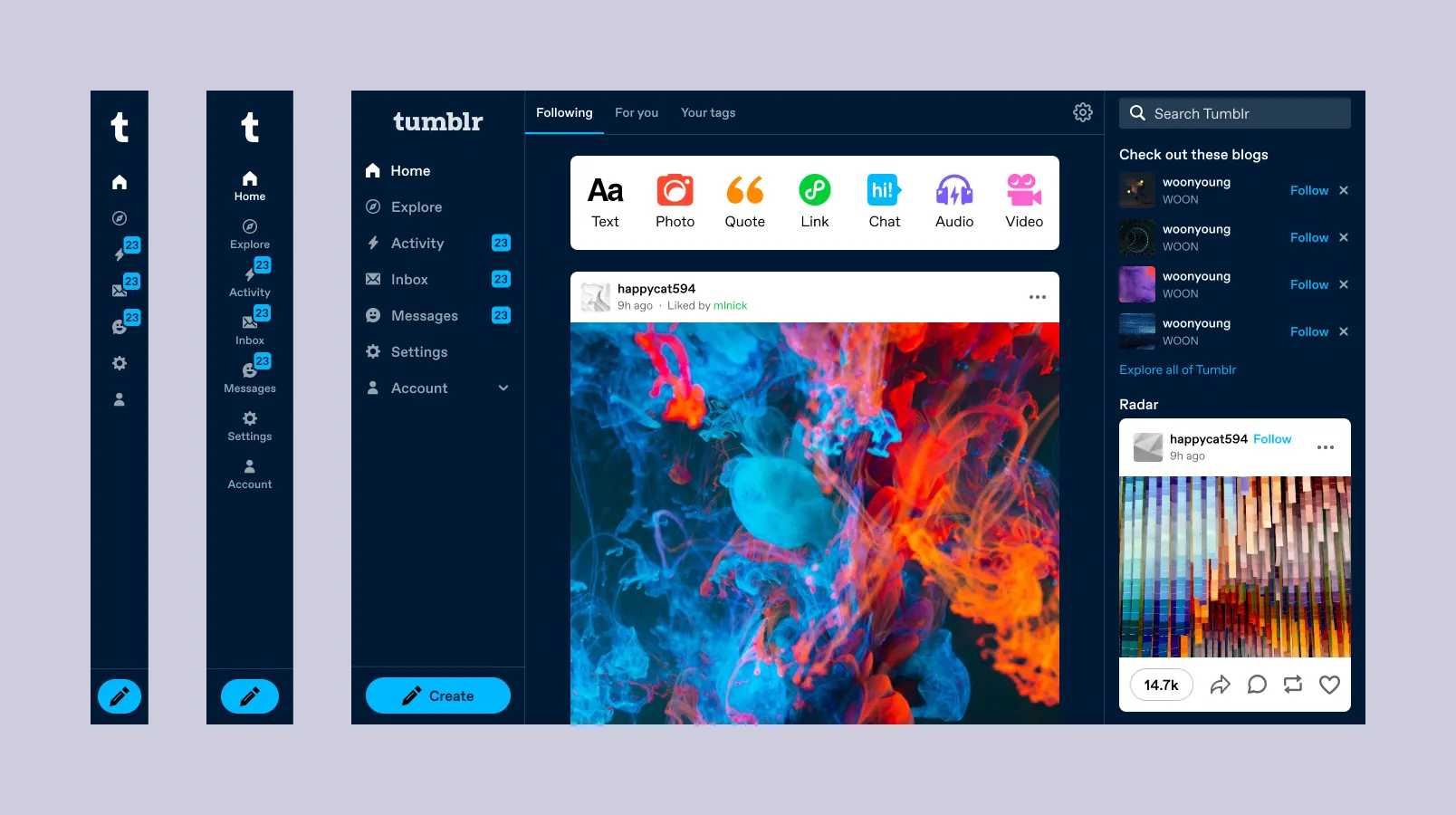
Fig 03 Three states of the left rail: icons only at 768px, labeled at 990px, expanded with sub-items above 1120px.
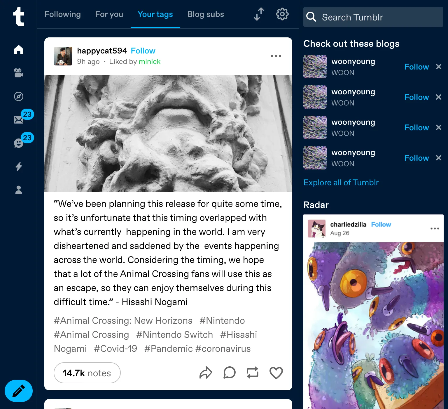
Fig 04 768px. Icons with activity indicators. Even without labels, the vertical orientation frees up the header.
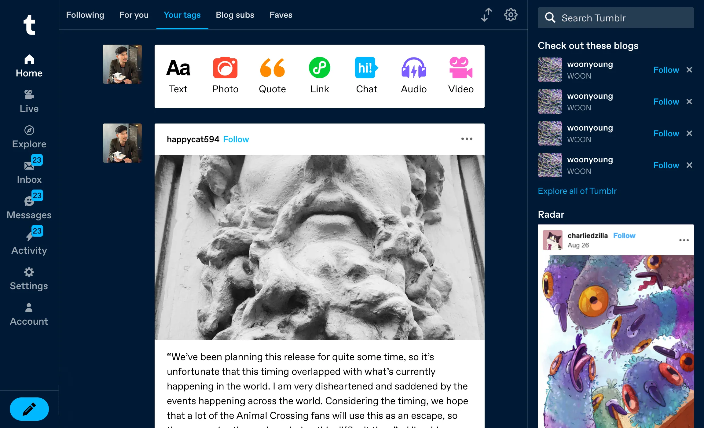
Fig 05 990px. Labels appear. This is where people stop guessing what the icons mean.
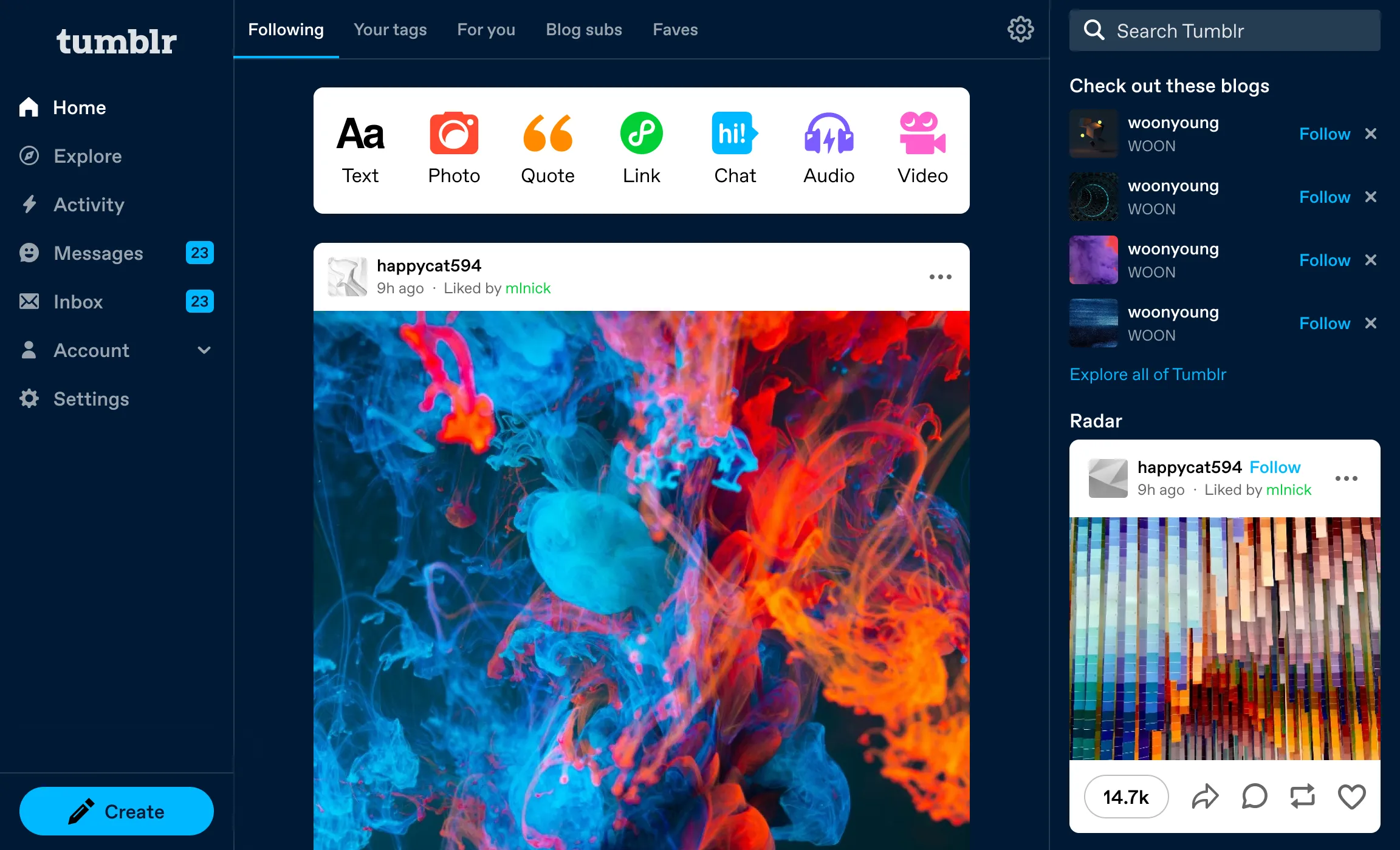
Fig 06 1120px+. Sub-items, dashboard tabs, post composer, and premium features all visible without a dropdown.
Beyond the dashboard
The left rail needed to work across every page: Explore, Search Results, Tag pages, Inbox, and Settings. The Explore and Tag pages actually inspired much of the layout. They already had masonry/feed toggles and right-rail related content. The vertical navigation made the rest of the product consistent with what Explore was already doing.
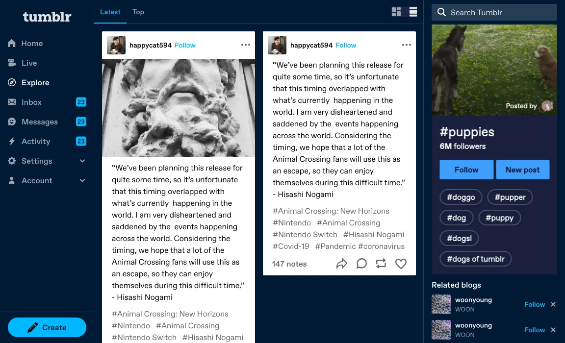
Fig 07 Tag page with left rail navigation.
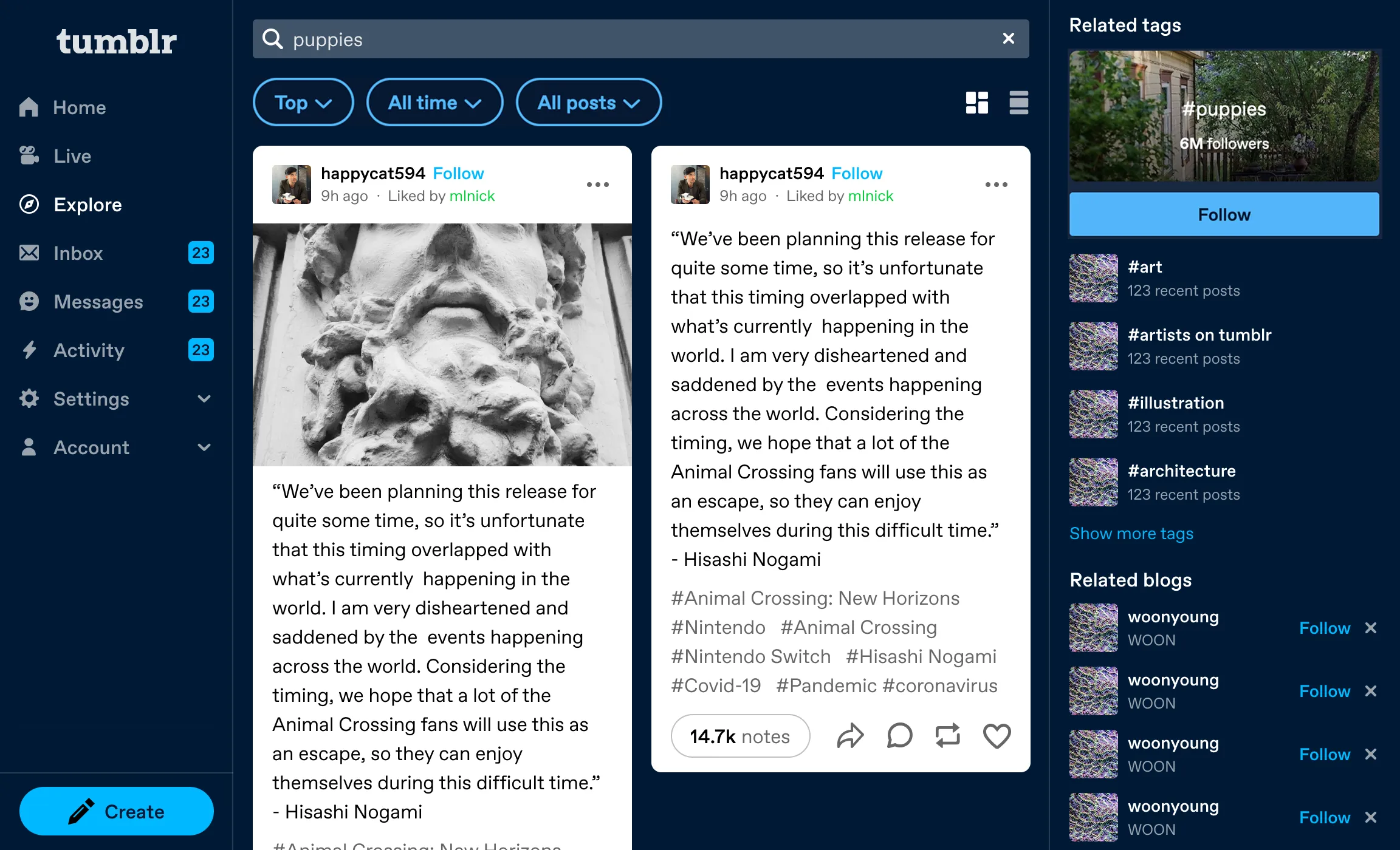
Fig 08 Search results: masonry layout with related tags in the right rail.
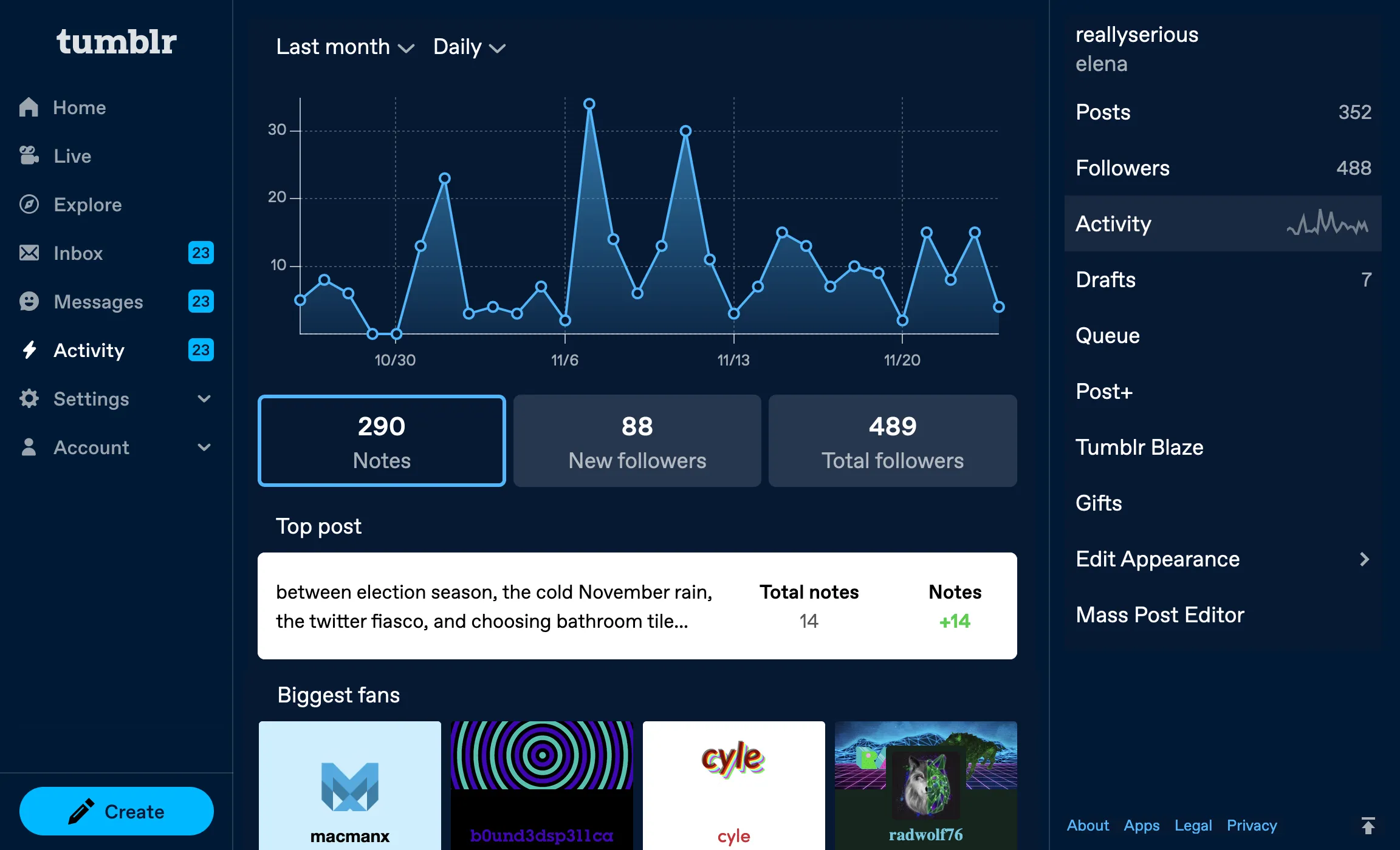
Fig 09 Activity page. Stats, top posts, and biggest fans with blog management in the right rail.
The results
After three weeks at 50% traffic:
New user retention
- Day 1 retention
- +1.97%
- Day 3 retention
- +3.30%
- Day 7 retention
- +3.93%
Making Tumblr easier to understand made new users come back. All results statistically significant (p < 0.01).
Navigation clicks
- Explore
- +174%
- Settings
- +103%
- Live
- +106%
- Inbox
- +45%
- Messages
- +18%
- "Go Ad-Free"
- +1,088%
- "Get a Domain"
- +290%
Premium features like Ad-Free and Domains went from buried to visible.
Engagement
- Follows per user
- +5.40%
- Users who liked
- +0.69%
- Ad clicks per user
- +7.38%
A few tradeoffs
Post impressions per user dropped 2.17%, but more users were seeing posts overall (+1.06%). They were spending time in Explore, Settings, and other newly-visible areas instead of scrolling the feed indefinitely. We expected this novelty effect to normalize.
Account clicks dropped 36%. This was desirable. We’d decomposed the junk drawer. Everything people used to access through Account now had its own spot, where usage exploded.
TumblrMart clicks fell 48%. The unlabeled icon had been earning curiosity clicks. With a label, only users who actually wanted it clicked. Better signal.
Takeaways
New user D7 retention went up nearly 4%, which told us the learning curve had been a retention problem. Labeled navigation fixed it.
Every layout choice trades visibility between features. Surfacing Explore increased its usage 174%. Reducing the prominence of Search decreased its usage. There’s no neutral arrangement.
The post chrome redesign, the share sheet, the split note count, the communities tab: everything we built on desktop afterward shipped into this structure.