The problem
Tumblr’s blog view is the profile page for every user. In addition to the username and the follow action, the header had accumulated icon actions over the years: search, message, gift, and the user icon that opens a menu with all other actions, including subscribe. Each had equal visual importance. It all made for a very crowded header with no clear indication of action importance.
Blog subscription notifications are Tumblr’s highest-performing push notification for open rate and reactivations. It was buried behind a menu. Most users never found it.
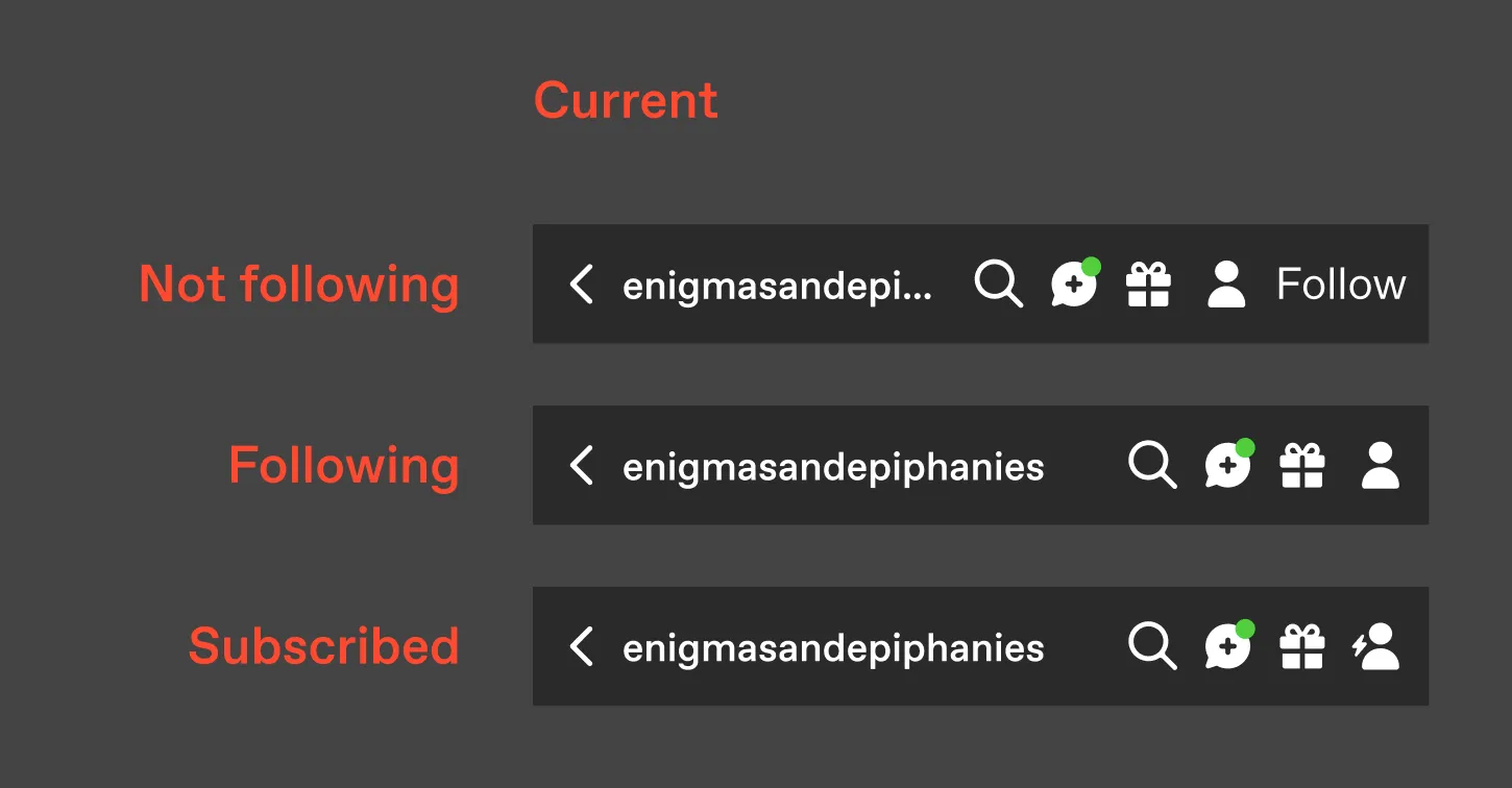
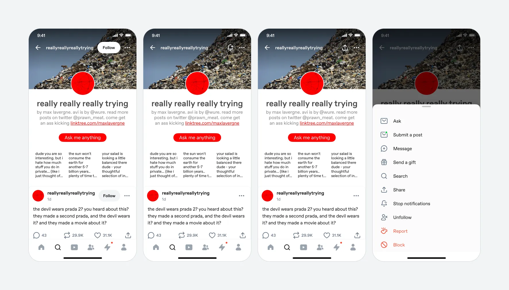
Fig 02 The blog header as of October 2024. 4 icons, a “snowman” overflow menu, and no clear indication you can be notified when this blog posts.
One action, a clear progression
I ranked the header actions by importance and set up a progressive model: Follow the blog first. Once you’ve followed, the button becomes Subscribe. Once you’ve subscribed, it becomes Share.
Everything else (search, messaging, gifting) moved to a bottom sheet behind an overflow menu. These actions deserved an exploration of their own place in the interface, but none is as important as Follow or Subscribe.
Results
We ran a 50/50 A/B test on Android first over two weeks, 720K users per bucket.
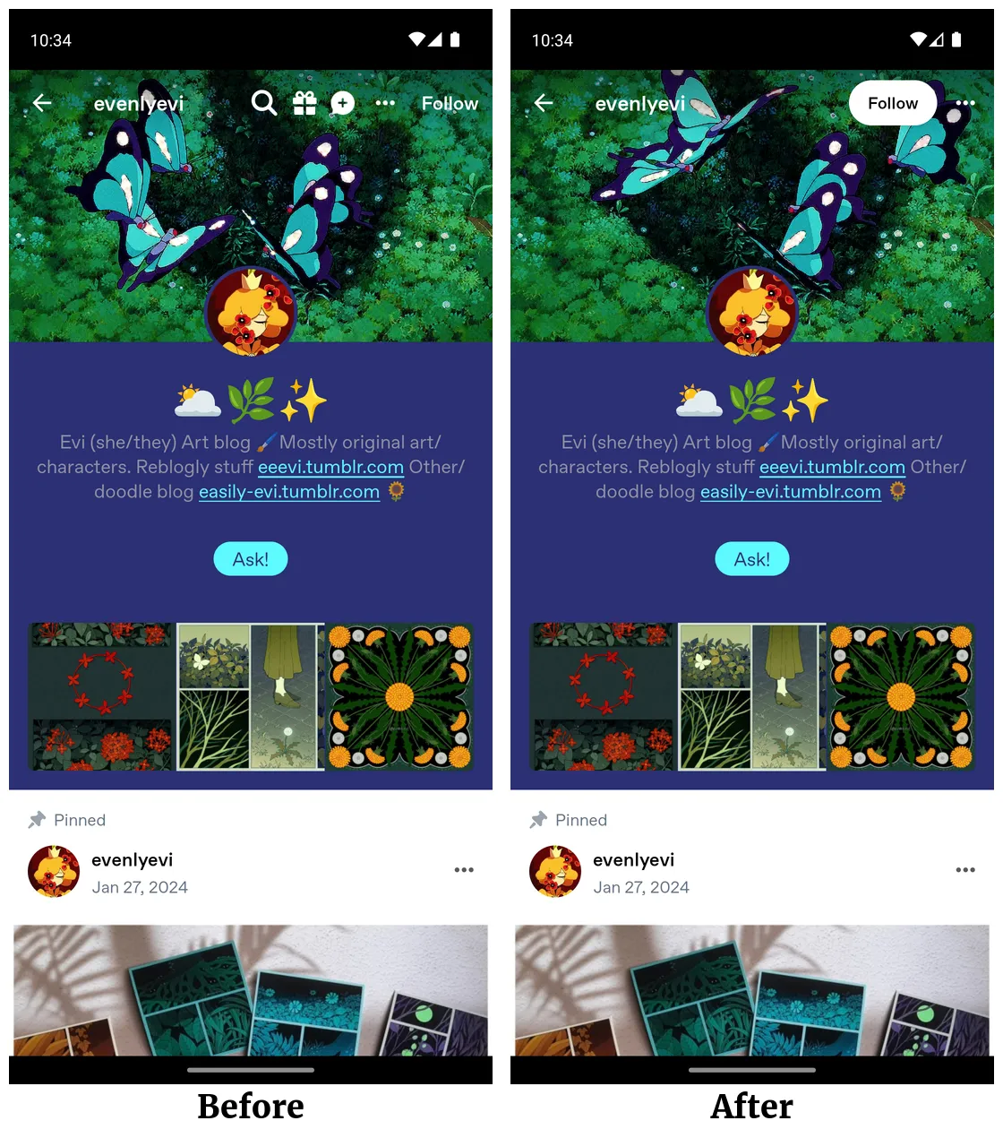
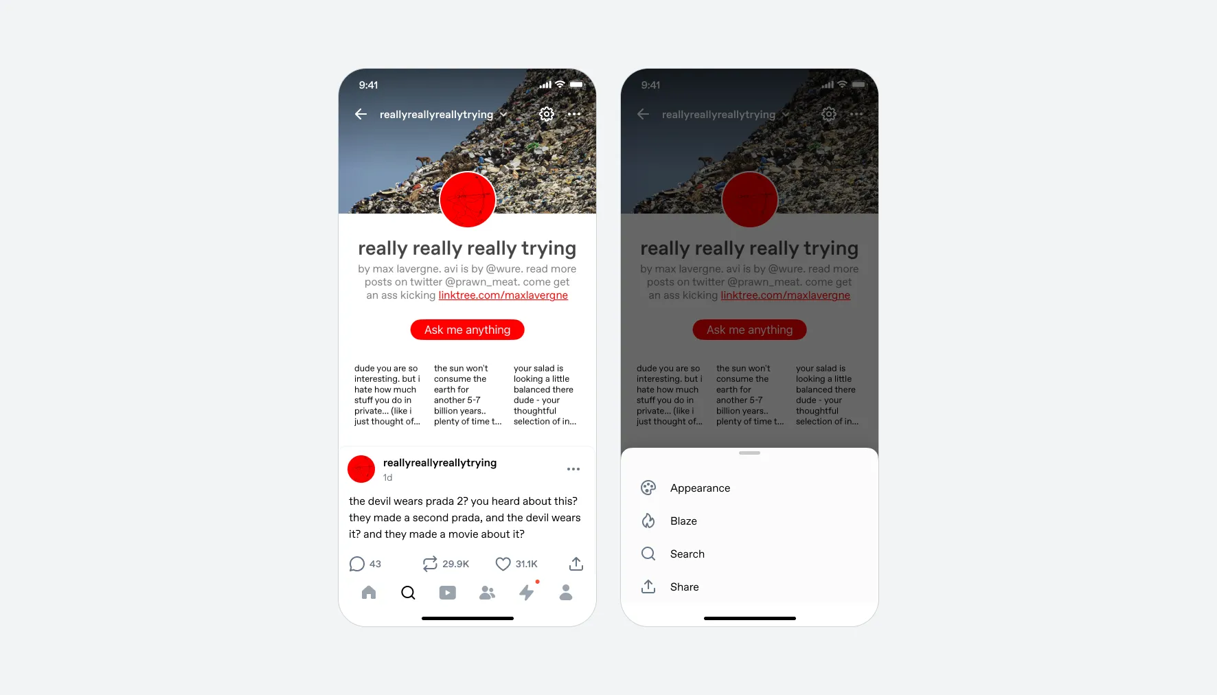
Fig 03 Control (left) vs. test (right).
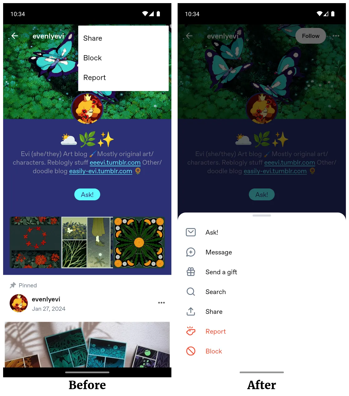
Fig 04 The overflow menu.
- Blog subscriptions
- +38%
- Subscriptions per user
- +39%
- Push notification opt-ins
- +101%
- Users following blogs
- +1.7%
- Asks per DAU
- +16%
- In-blog searches
- -15%
The decrease in in-blog searches was the trade-off we’d planned for. The increase in submitted asks was a surprise; we’d made the Asks entry point more discoverable on more blogs. Rather than re-crowding the header, I proposed moving search into the blog’s tab bar (Posts / Likes / Following), a place with more room that could eventually surface post count and filters. That work is in progress.
Some users tried the Subscribe action and then unsubscribed, but new subscriptions outpaced them by an order of magnitude.
iOS shipped the same design.